1. How can a message be enhanced through the medium in which it is implemented?
Lecture Comments & Reflections
Sam Winston – Form and Function
Reflections and Key Points:
– ‘There is craft within the screen’
– ‘learning through touch’
– ‘Seeing the unknown rather than the know’ – Seeing just the known doesn’t excited and entice the viewer to engage and stay intrigued
– Don’t be concerned about the outcome – if you go straight to thinking about the outcome you are closing the door on the potential opportunities around you.
– Trust yourself – ‘Trust and fear’
– Not knowing and just listening to what is around you
– Using time as a tool (structuring your day) saying to yourself I have an hour to get this done – referring back to last week’s research around Brain Eno Oblique cards.
Removing the ‘ I wish this was like that’ and doing that ‘wish’ turning that into the project and seeing what happens. You have found the narrative already by saying ‘I wish it was like this’ that is your story.
Design Development (weekly Challenge)
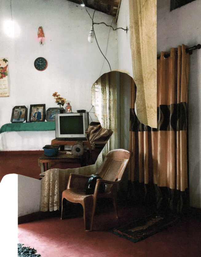
Words of my location: I have started looking at my location in a few different ways. The immediate response I get from the location, the emotions I feel on it’s first hand look, the emotions of what the location could be and the feelings from it’s structure and texture.
Immediate thoughts: Frustrating, on-edge, subdued , annoyance
Emotion response on it’s look: Sad, disappointing, failure, alone
Emotion of what it could be: Positive, interest, involvement, creative, uplifting
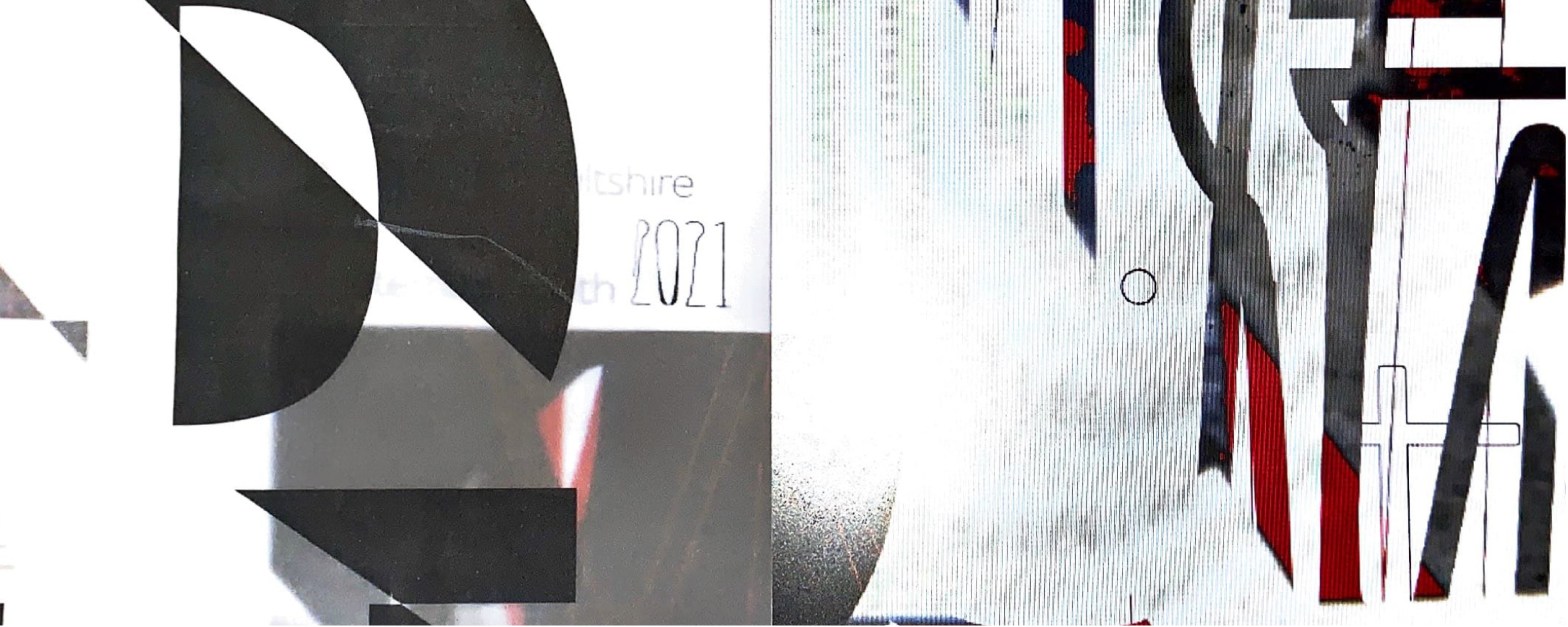
Feelings from it’s structure: Intrigue, investigation, historical, thriving, creative, cultural, heart of wiltshire
Response from others:
On its look: Dull, uneasy, dejected and bleak
What it could be: Safe, successful, friendly
Structure: Old, rundown and forgotten
Emotion – Dejected responses
using the medium of typography and image to showcase the emotion of my location. Creating a contrast between the immediate emotional response – dejected to a promising emotion (what it could be) – Positive with interest.
Inspired by the work of Cecil Touchon and his de constructing of words – almost representing the location as an untangled location however alongside this I see my location as a place for growth, interest and promise (from it’s history to its future)
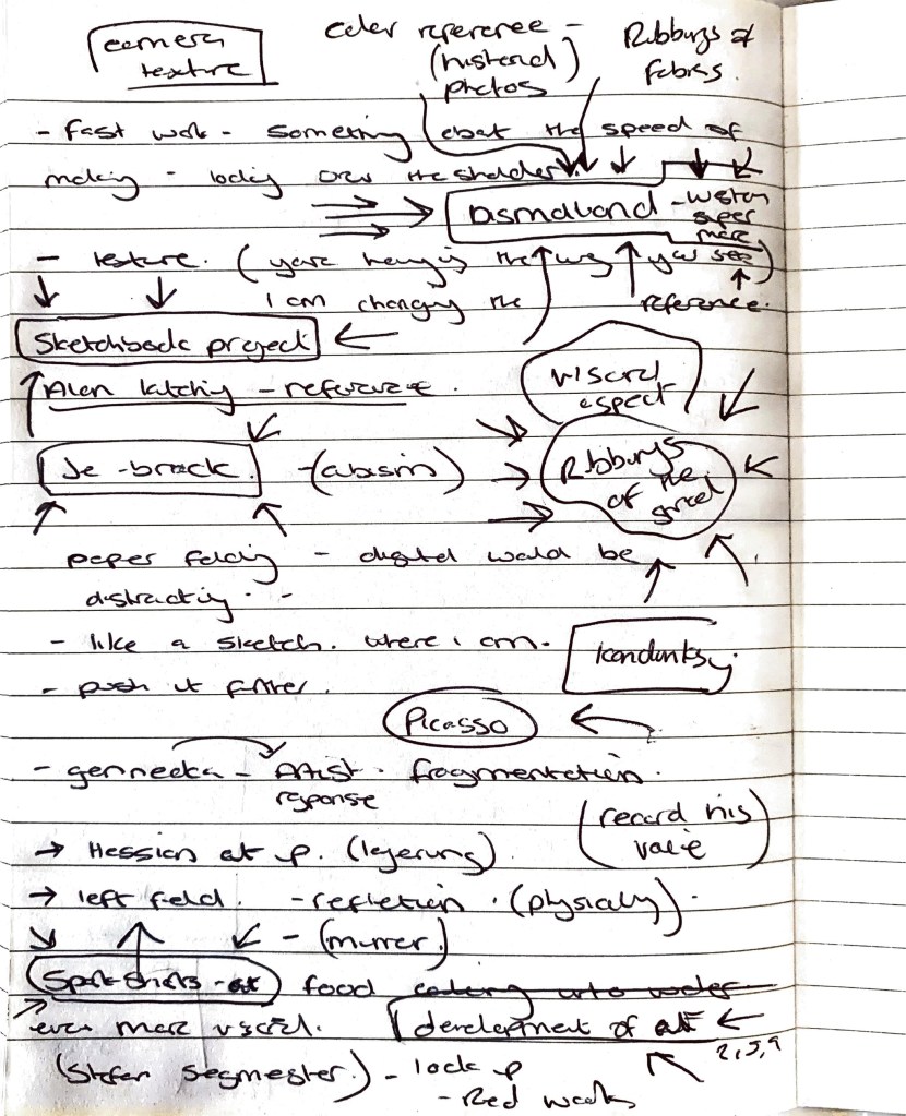
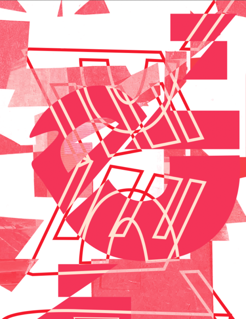
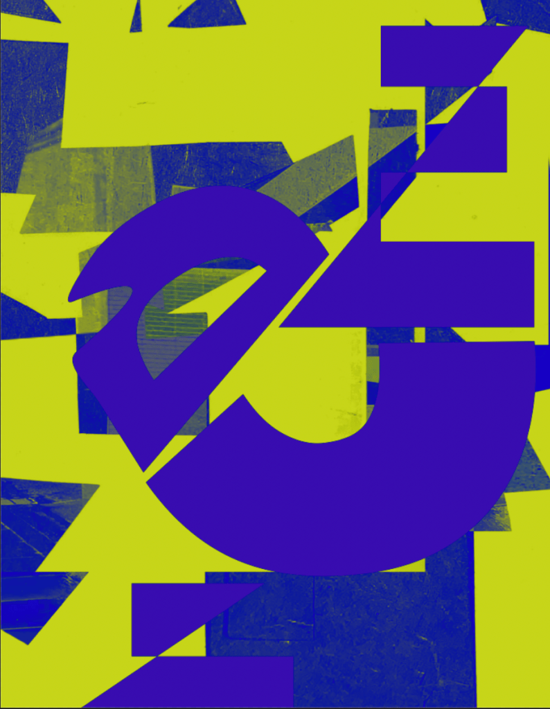
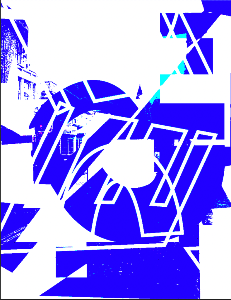
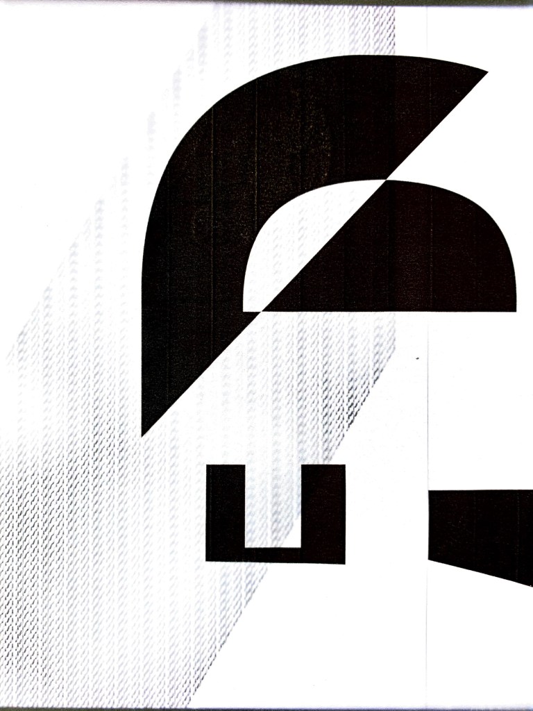
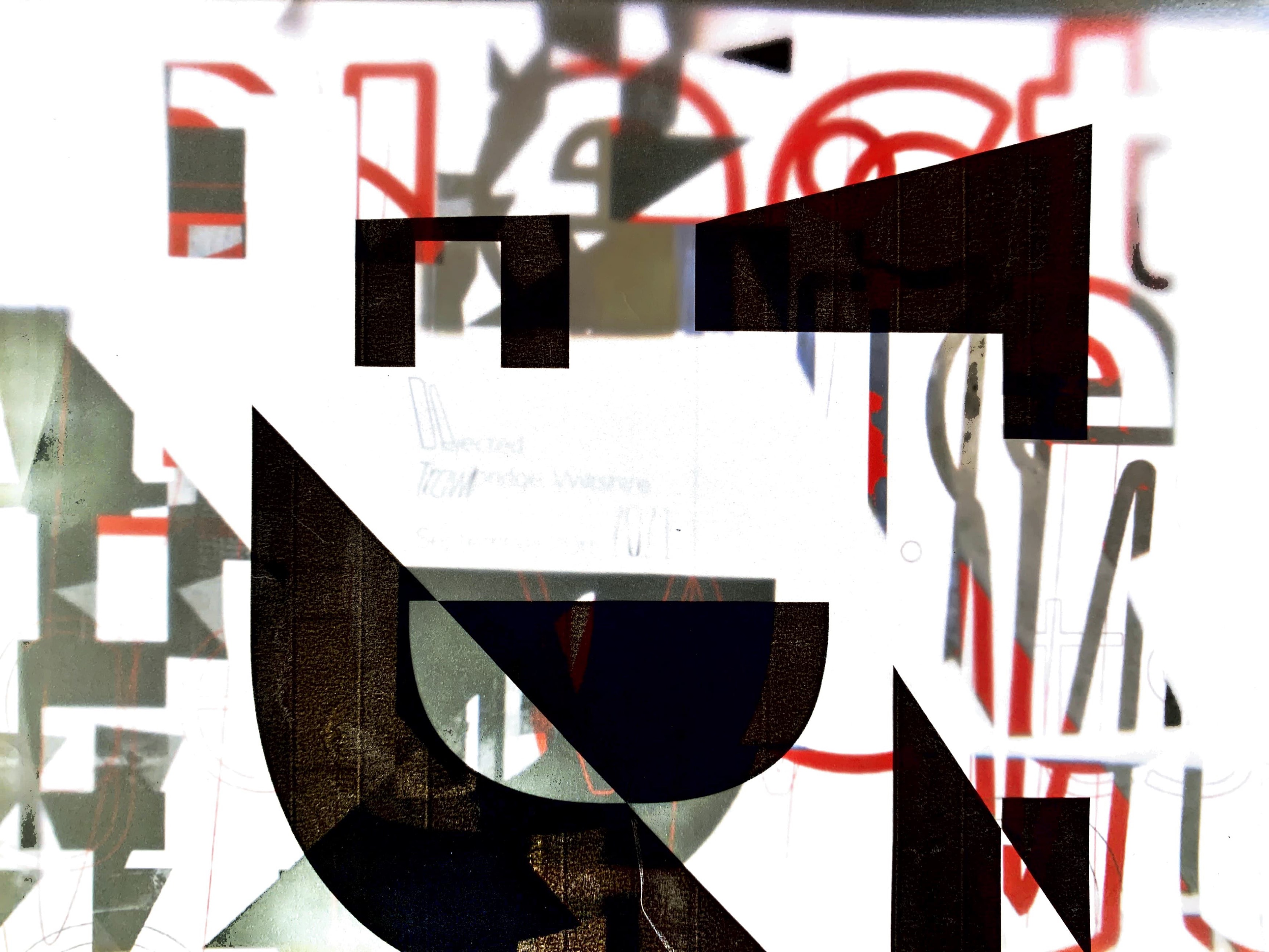
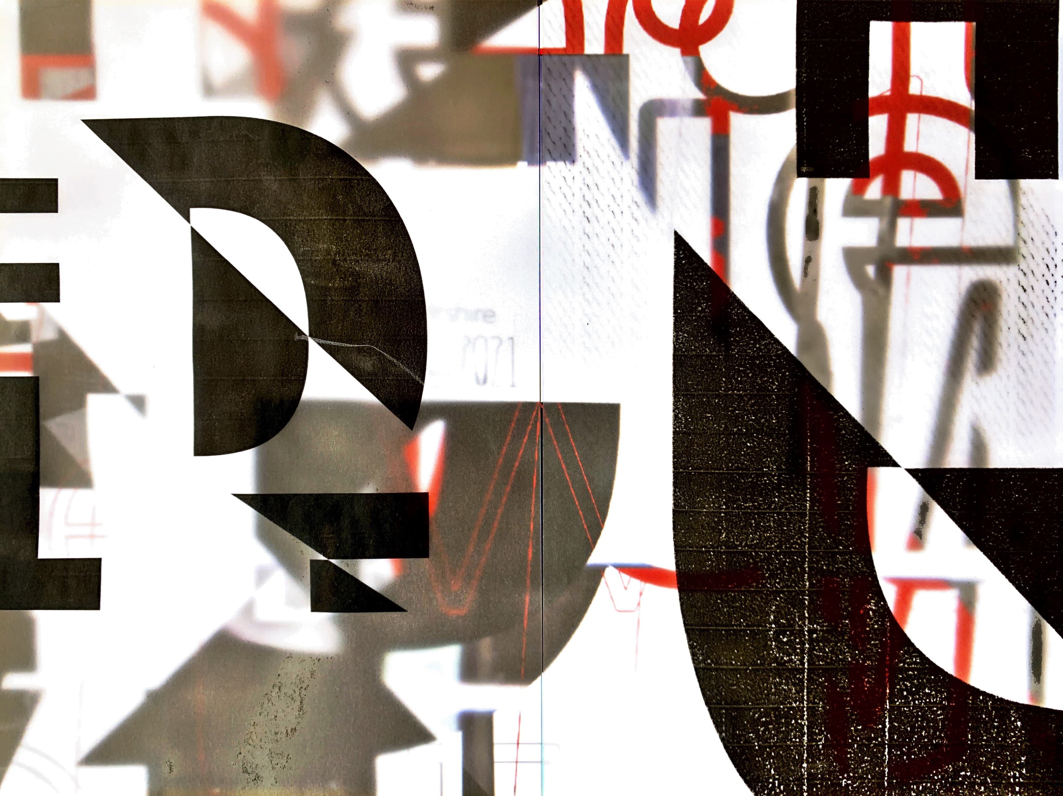
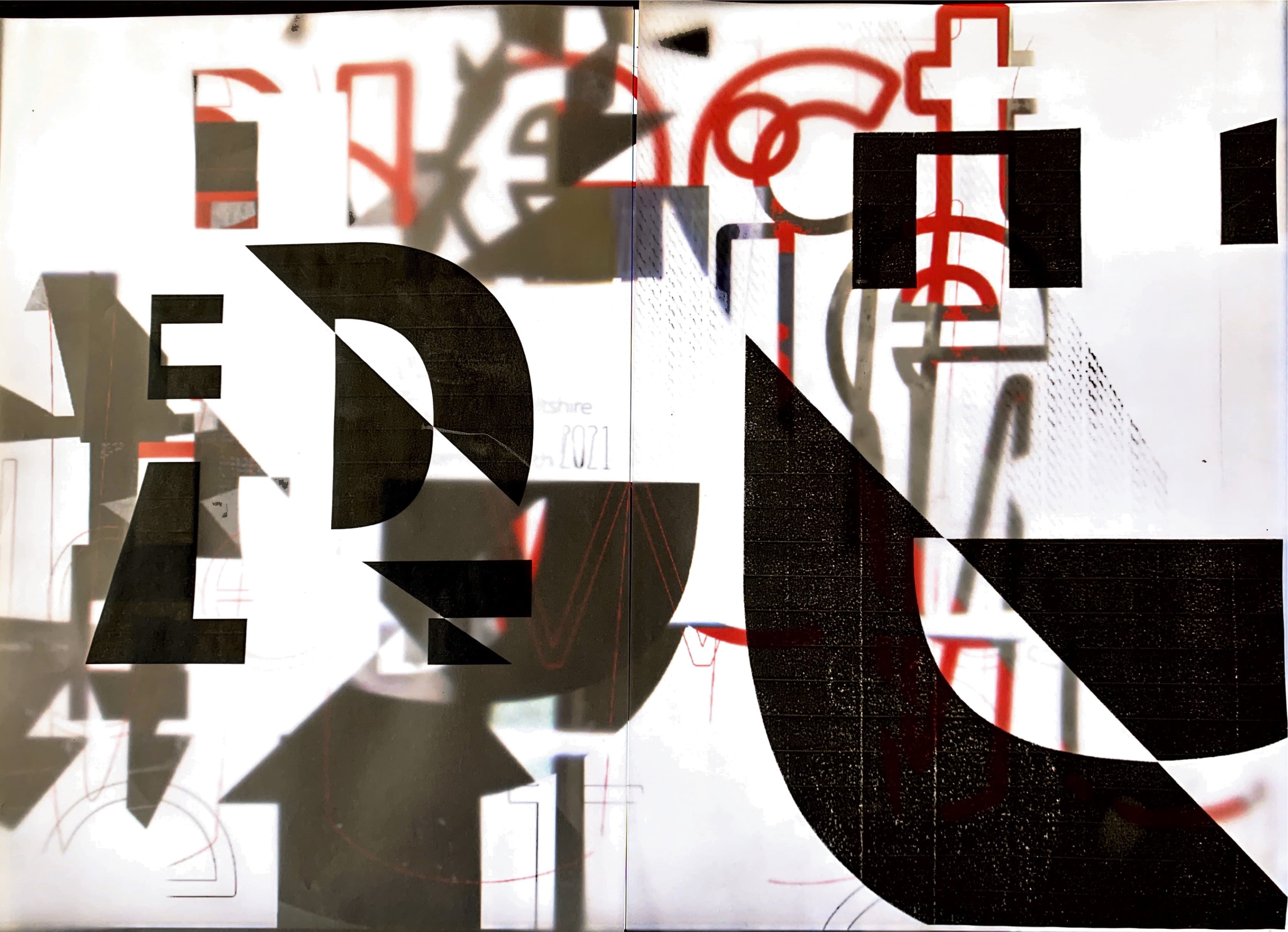
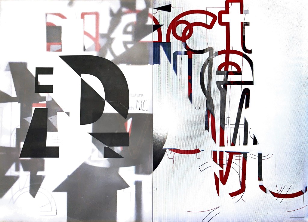
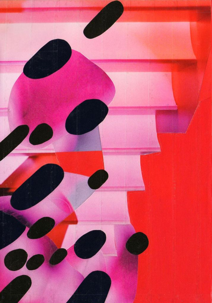
First initial experiments – digital. Exploring the use of image and collage to create emotional responses from my location. Cutting up, putting back together, re organising, saturating. The right hand image is intriguing in its development, with the use of deconstructed typography layering over the location imagery.
Could these go further in 3D form? Next is to try further experimental typography… Maybe creating a set of letters for my emotion?
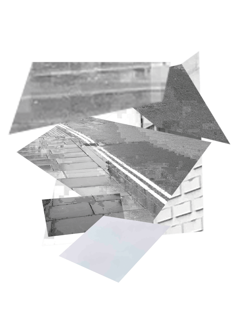
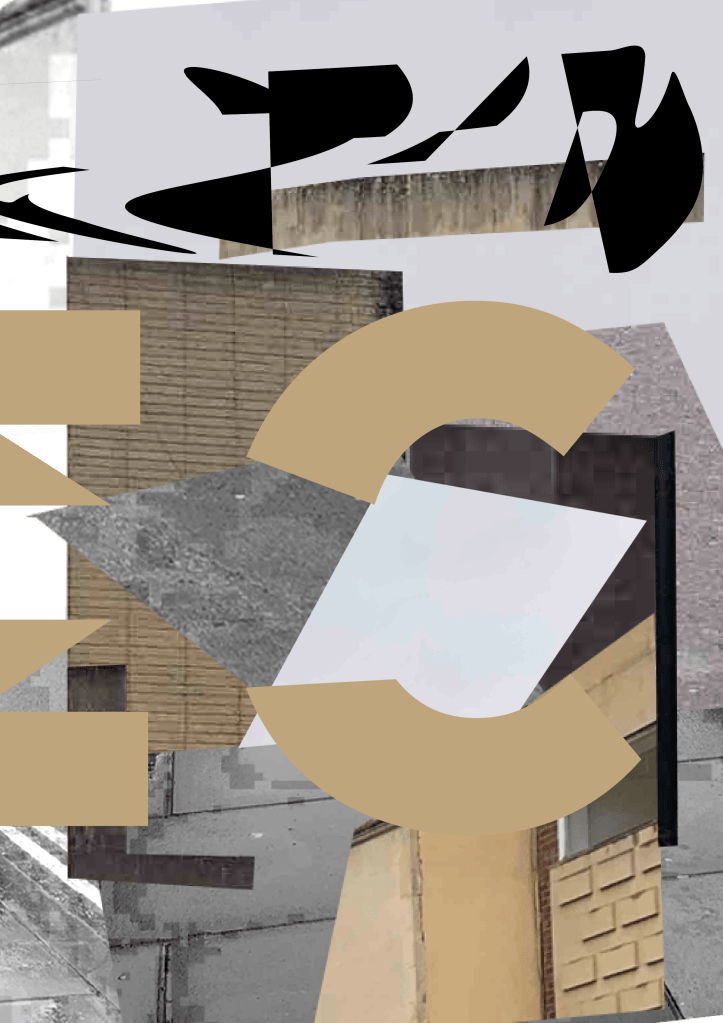

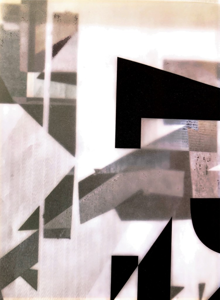
Development: Working with both collage and typography to show the immediate structural form of my location. Keeping the colours muted to evoke the dejected emotion. The typography is starting to work well however I am not enjoying working within Indesign to create the type. I’m almost pushing myself to work digitally whereas I think this needs treatment in analogue form first.
I am going to review my work so far and go back to working analogue with typography, exploring what materials I can use to create this. Maybe look into paper folding? cardboard? printing with ink? to see the results?
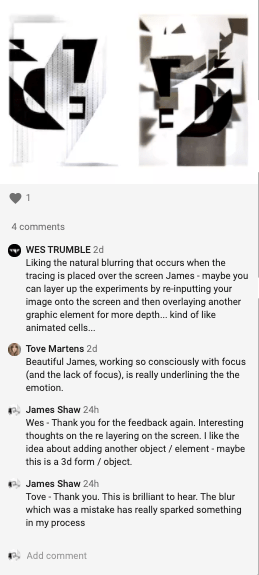
Peer Feedback
James & Alli – Spoke with Alli this week at this stage of development. Great references shared. Alli spoke about continuing to push my analogue work and pushing my typography by hand and not by digital. (she felt the digital typography took away from what I was trying to communicate) Which I agree with, I was forcing myself to go digital.
Key words I pulled from our conversation – Fragmentation, reflection, mirror, distracting, challenge.
Going to take away these thoughts from our conversation and explore where I can take this week’s challenge.
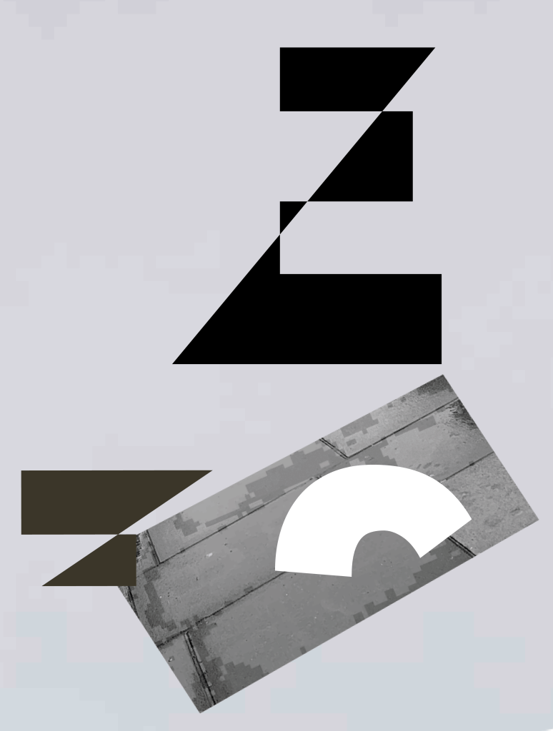
Quick responses to remove them from my head before moving on. Very experimental pieces working with typography found within the imagery I took of my location. Maybe slightly too chaotic for what I was wanting to go for. Maybe look at removing the colour and stripping it back? Could look at the colours of the physical location? Colours too bright and don’t represent the emotion?
Coming back to these and on further reflection these are to digital based. I feel the communication and rawness is lost slightly?
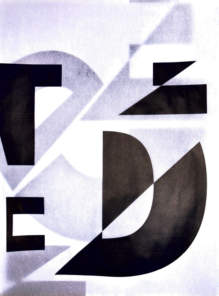
Tracing paper – screen – photo. Layering tracing paper work directly onto the screen to see the results. Want to explore adding in light when it’s dark. Also starting to introduce further layers of typography and manipulating them. Could these turn into almost informative pieces? Add in structured typography and messaging? Almost promoting the town as dejected to raise awareness of it’s possibilities through this creative expression?

Ideas Wall Feedback:
The feedback from Wes and Tove got me thinking about taking my work to the next level and really ‘going for it’ in terms of texture, materials and marks. The location Is so busy within its structure and texture that I feel this needs to be shown in my outcome. However it needs to not be to over the top it looks creative, busy and community led? This would give off the wrong emotion.
Dejected – a festival celebrating the emotion of my location? Could the dejected emotion be a celebration of the beauty of the unknown, dull and derelict areas? Had this idea that the emotion if quite a powerful one however it’s creating a host of intriguing results? Almost allowing the future ‘creative’ emotion filter through? What it could be vs what it is?
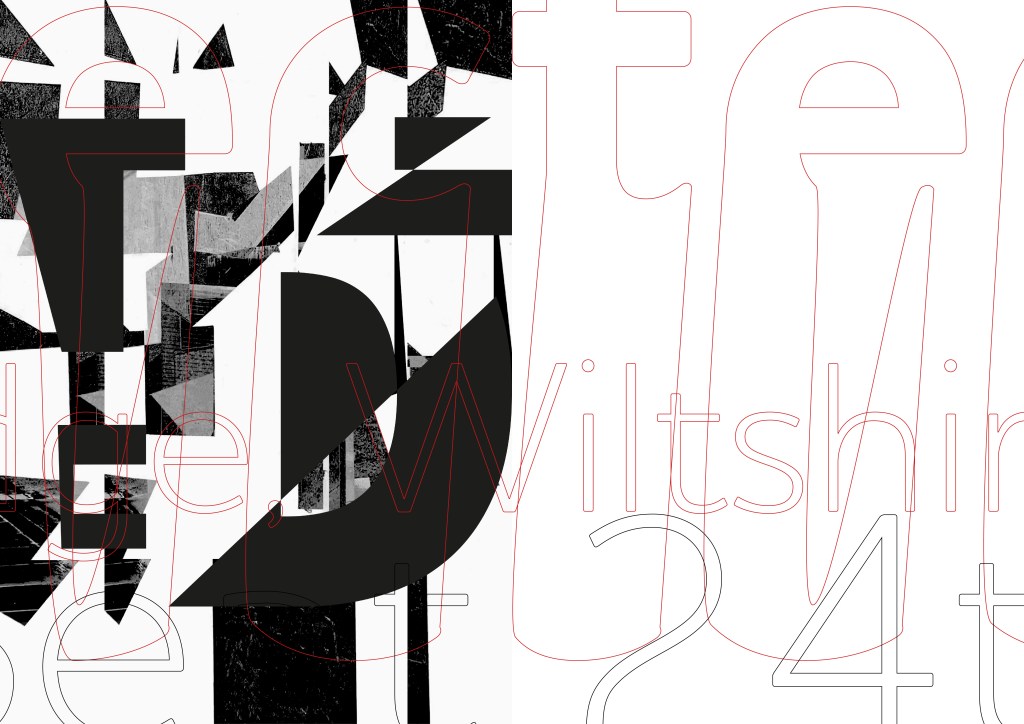
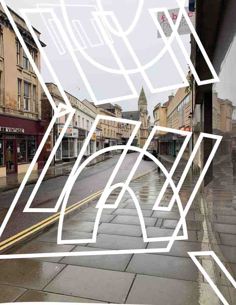
I wanted to keep mainly to analogue this week but as I was using the screen as a material I decided to experiment briefly within illustrator with messing with typography? This has added another layer / elements to the work which raises further questions and routes of investigation.
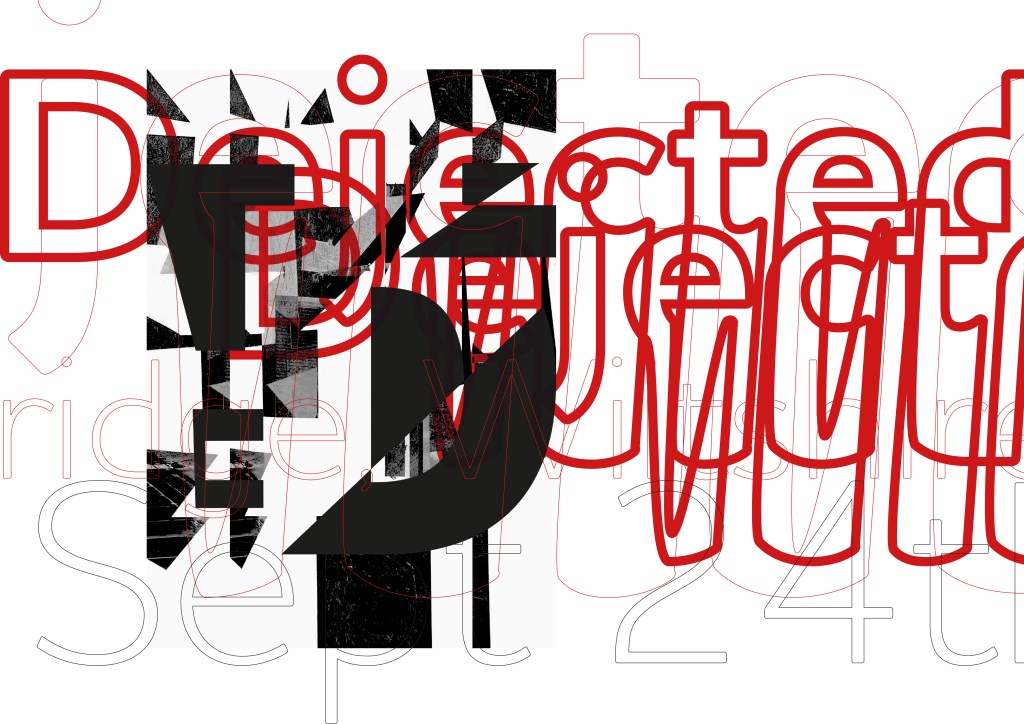
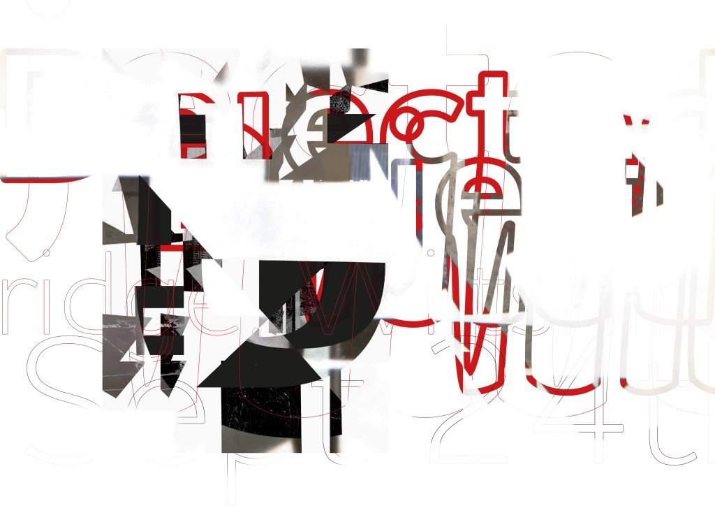
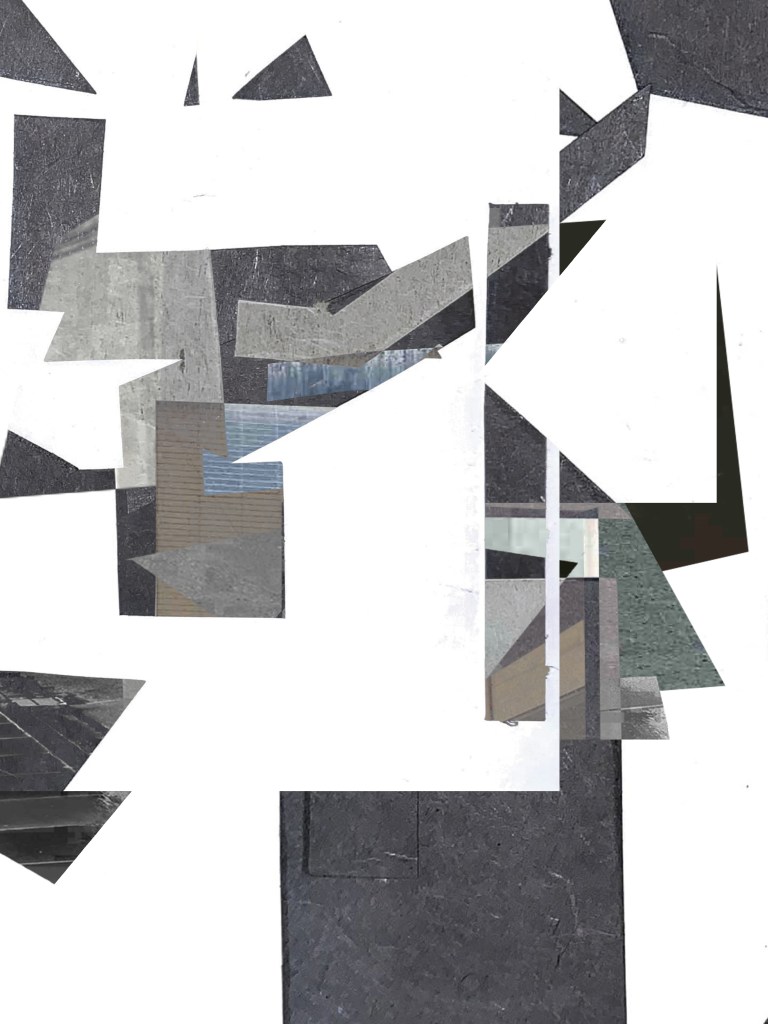
Further analogue explorations using the screen, typography, layering, tracing paper.

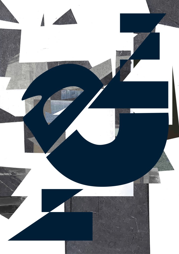
Using the screen as an analogue tool – Tracing paper, texture, digital, type, layering. For me this is really turning into something quite exciting. I feel the two emotions could be merging to make 1 overall representation? Here I have only covered half the screen with tracing paper leaving the other clearer, easier to see. Overall though I feel the dejected emotion is really pulling through.
I describe this as:
“Chaos and form in a location of unknown future”
Can see this being projected and added to (contribution) form the residents of the town? Become an overall graphic response. Then worked together to create an editorial output? or interactive element documenting the town going forward?
Next steps – I now want to start thinking about the future emotion – Creative and Positive. I see this being a complete contrast. Very bright colours, fluid lines and a real sense of movement to the eye.
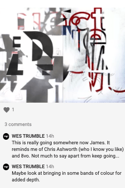
Ideas Wall Feedback:
Wes has suggested bringing in further colour in the form of ‘bands’ – I am going to progress this further and maybe add colour in the form of paper / object and photograph? This adding to the element of the location (Silver Street)
Research
A smile in the mind; witty thinking in graphic design.
I think of ideas already existing, waiting to be found
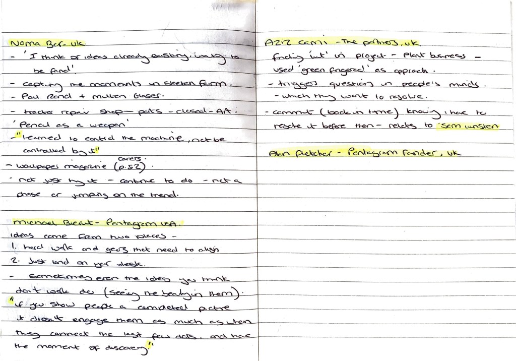
Noma Bar
Reading through Noma Bar’s contribution to A smile in the mind; witty thinking in graphic design got me thinking further from week 7 when we had to choose an object and research it. Objects, things, stories can take on different forms and narratives. Noma’s mention of the tractor repair shop closing down and the owner using the tools to create art is inspiring. He then saw this art all around his town? A shop which one repaired closed but continued its legacy and life in a different shape. Can this happen with ideas? Mistakes we make but don’t see further stories within them? It got me thinking about looking back through old sketchbooks and seeing what stories / sketches / marks could have other ways of living?
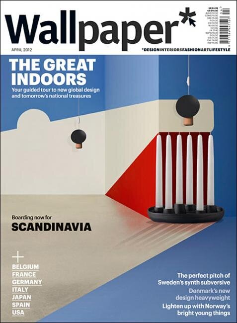
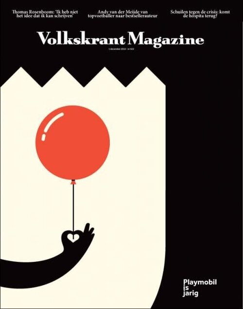
Below are two of Noma Bar’s magazine covers. Left for Wallpaper and right for Volkskrant. Loved their simplicity in using objects (which are on the theme) and perspective.
Jazz Grant’s Emotional Collages
Jazz Grant’s collages are made up of found imagery, meticulously put together from her feeling of what works within the composition. Something here is intriguing… Before these images were cut up and re constructed into these collages they would have had their own emotions that the viewer would interpret? Now they have been put back together with other images do the emotions change? juxtapose against each other and create a mix of emotions? Something I want to explore from this is how different emotions can be placed together to see there visual representation.
The two pieces below are powerful and for me evoke emotions of the unknown? what’s missing and the past? Shadows and outlines of figures within almost untouched surroundings? No words have been used here. If words were added would the emotion change? would we look at it different? What if the lighting or textures were altered? Many of the small and unnoticed parts have their own stories within themself.

Kathrin Kuhn – Collage
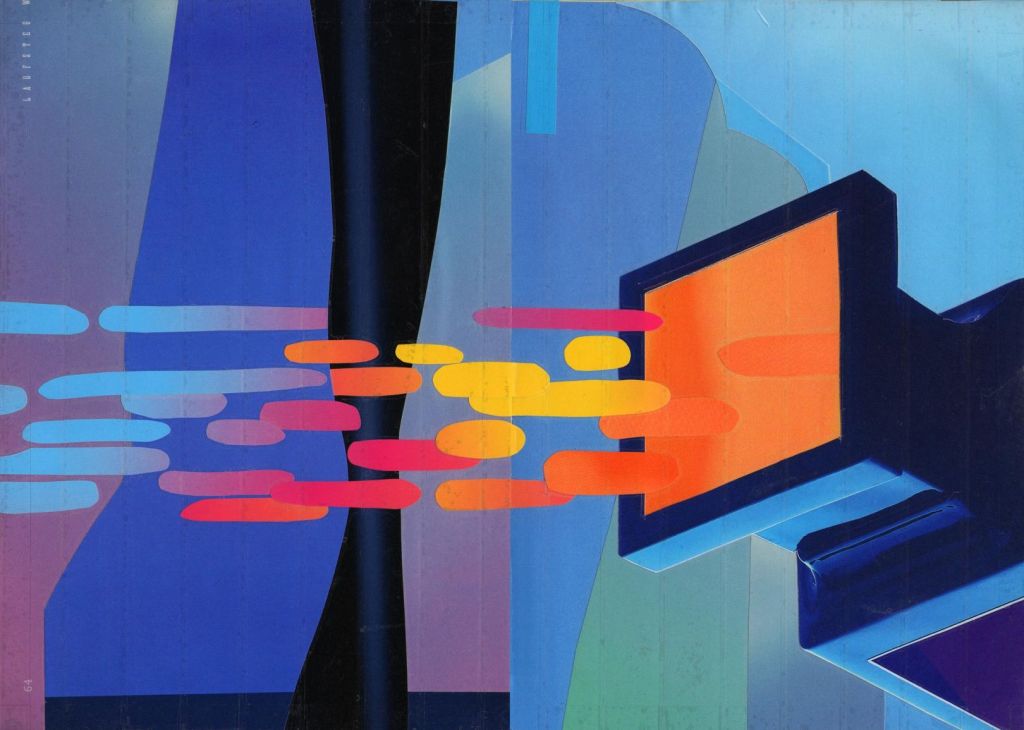
For this week’s challenge I want to evoke both the dejected emotion of my location but also the potential emotion of the future – positive and creative. The work of Kathrin Kuhn oozes emotion, movement and a sense of interpretation. Layers of colour and texture keep you thinking of what to imagine. Shapes are positive, organic and fluid – a feeling I want to add to my future emotion to this week’s challenge.
Final Outcome
References
Giesecke, B., 2021. Björn Giesecke. [online] Björn Giesecke. Available at: <https://bjoerngiesecke.com/> [Accessed 2 August 2021].
Ibrahim, A., 2021. Jazz Grant’s paper-cut collages stem from visceral and personal emotions. [online] Itsnicethat.com. Available at: <https://www.itsnicethat.com/articles/jazz-grant-art-060421> [Accessed 3 August 2021].
Weekly Critical Reflection
What went well: This week got off to a bad start, I felt de motivated and not really sure on the route I was taking. I have mainly been working in analogue forms over the past 8 weeks but and the end of last week I felt I needed to try digital…. But the brain said no. I didn’t want to force anything so stepped back and let go slightly. This allowed me to be quite free for this week’s challenge. I made mistakes, but used the mistakes, I kept hitting a brick wall but again I feel this allowed me to push further on with the project.
This week my outcomes have felt quite emotionally led, presented from raw feelings and emotions of my location? This has opened my creative mind up to exploring objects / locations in a different way? Leading to interesting and communication led outcomes.
Going into next week: Not to force digital means if it doesn’t feel right. Continue to work in a way where I feel creatively challenge and am exited about what I am creating. Continue to get peer feedback – this has benefited me this week and helped me progress my work in different ways.
Continue – Explore, Freedom, Emotion, Stories
