This week’s question – How can typographic conventions and design inform and imbue the meaning of a given text?
Lecture Comments & Reflections
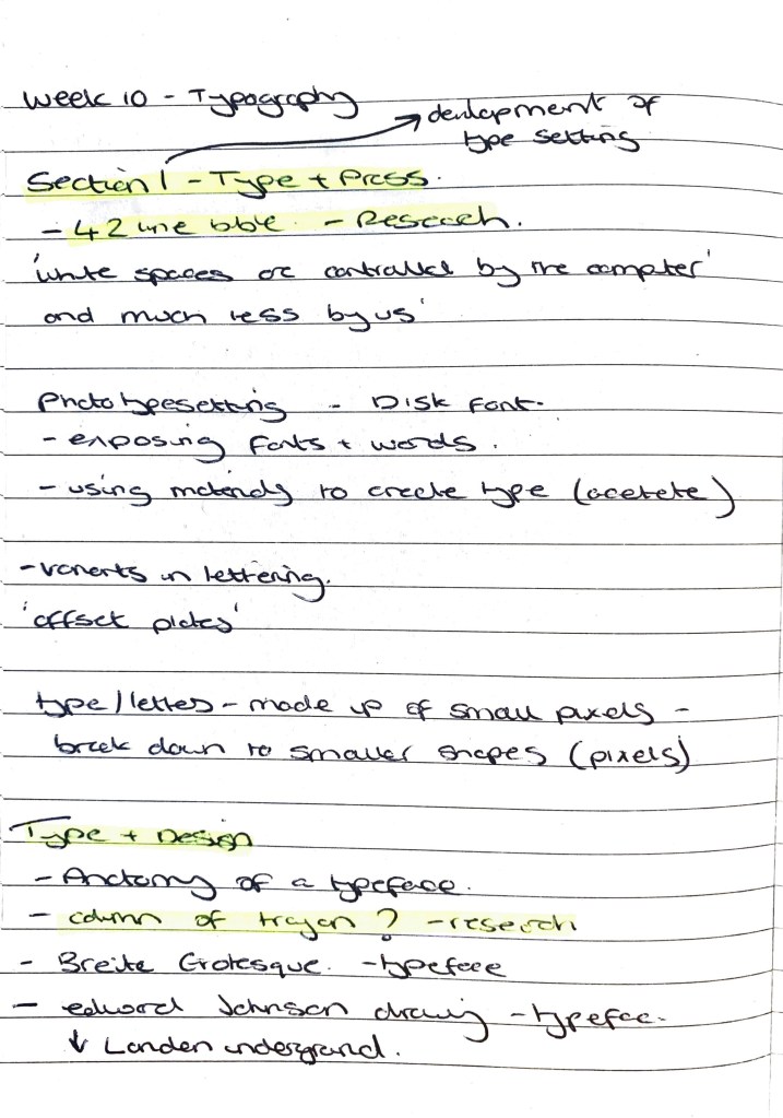
” White spaces are controlled by the computer and much less by us”
Interesting comment on the computer and how we are being almost controlled by it. I agree with this comment but also think we can control the white space to a degree. Yes the computer automatically sets the kerning and leading as standard but this is where I think we need to use the computer more as a tool to create, rather then just an execution tool.
– Research into Edward Johnson Typeface (Underground)
– How type can be deconstructed from its original form.
–
Design Development (weekly Challenge)
Chosen Writer – Road Dahl – George’s Marvellous Medicine
Chosen Excerpt –
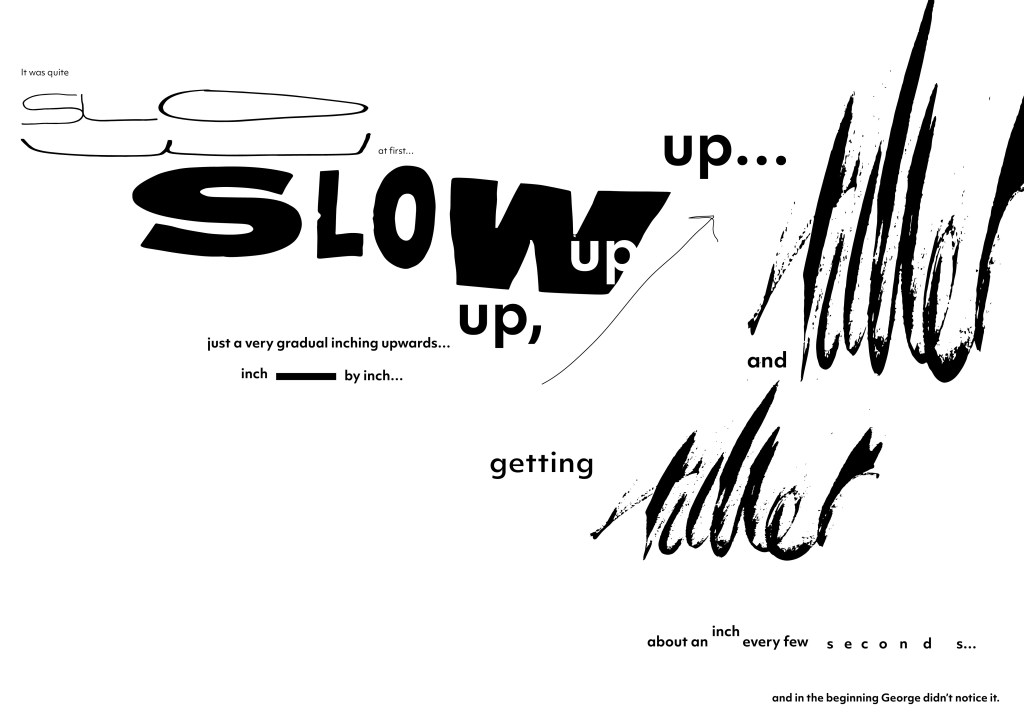
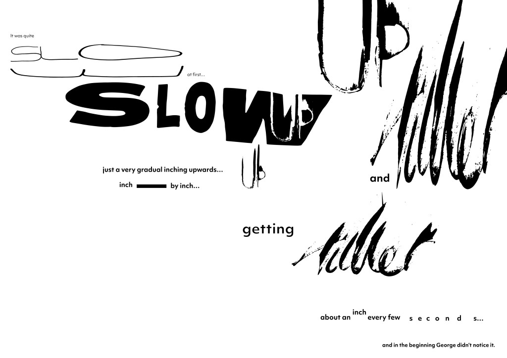
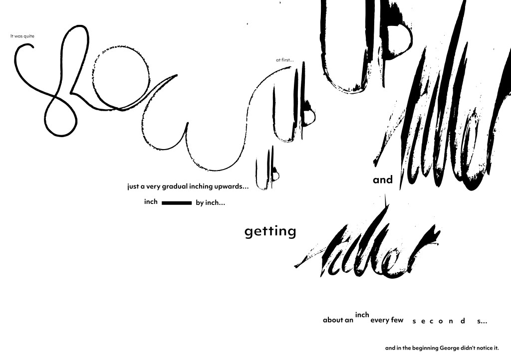
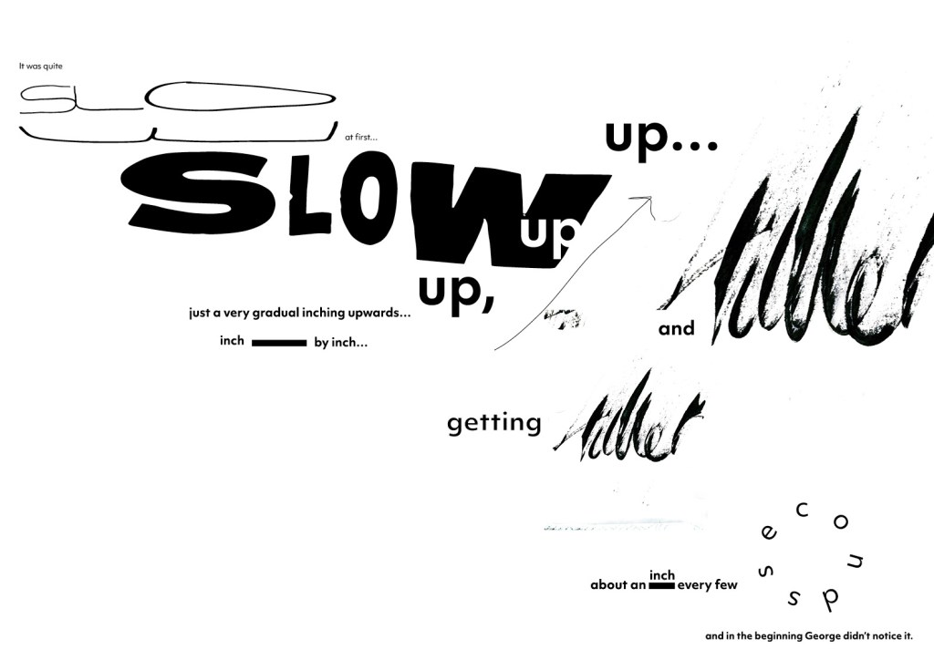
It was quite slow at first… just a very gradual inching upwards… up, up,
up… inch by inch… getting taller and taller… about an inch every few
seconds… and in the beginning George didn’t notice it.
Both pieces would allow me to be bold with my typographic direction. Allow me to really add movement and not be afraid of using other materials. I want to use both analogue and digital elements in this week’s challenge
Below – First initial sketches for my typographic response to my chosen excerpt. Thinking about how the text can move around the page and respond to the words as you read them. I think the design should potentially be composed over multiple pages? So the text has space to fall off the page in line with the words. Bring in elements of hand scanned text? hand written text?
This can be a expressive and moving piece… Can’t be static and stationery. Could the use of colour help show the movement? Brights not just monochrome.

- Take the first line – draw it, typeset it, build it;
- Then take the body of the text and typeset it.
- How does leading, positioning, stresses on particular words and detailing affect the power of the piece?
- How is meaning affected by interpretation in a tangible way?
- What is the relationship of the page?
First Line initial experiments
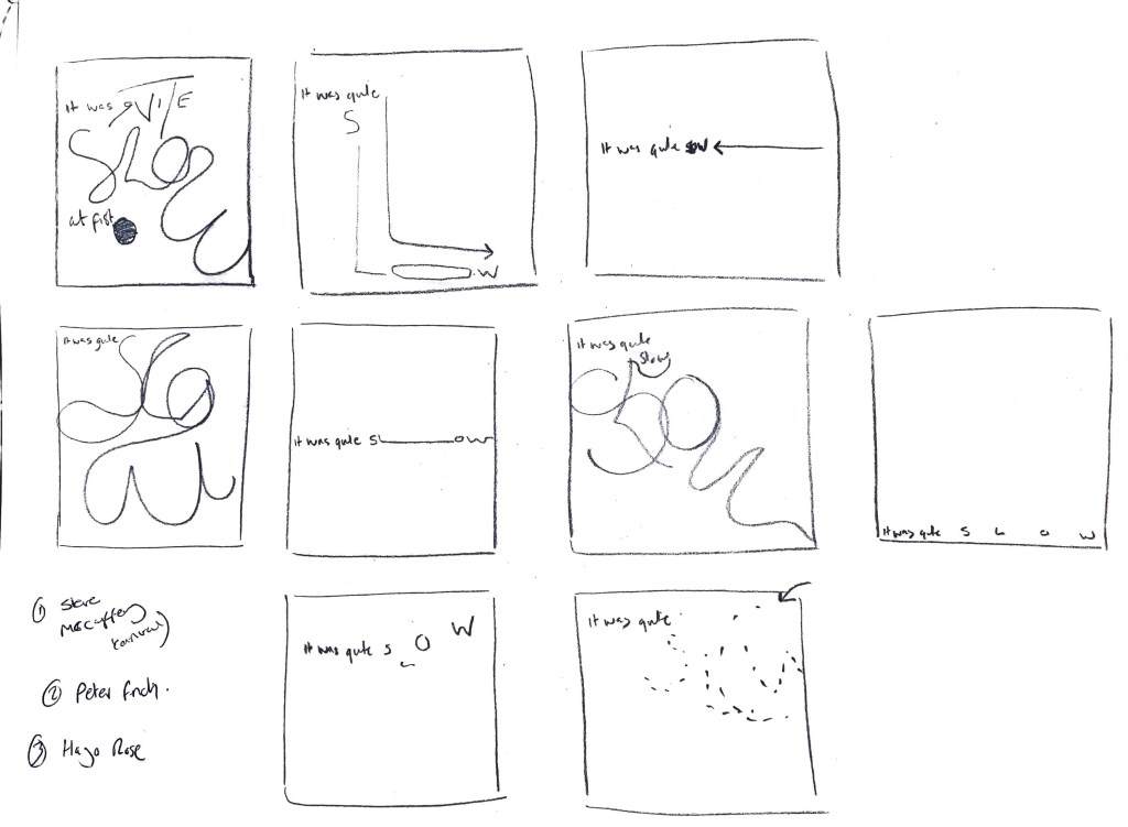
Initial Sketches – Weekly Challenge part 1
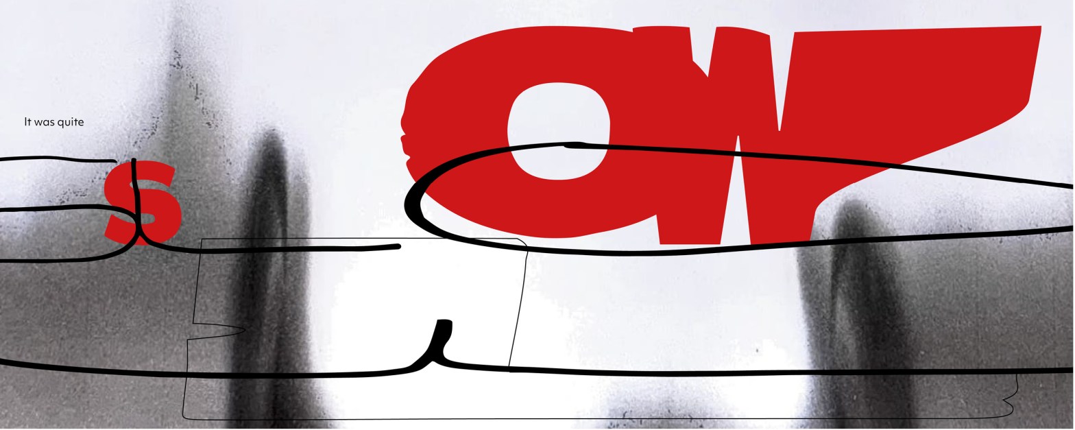
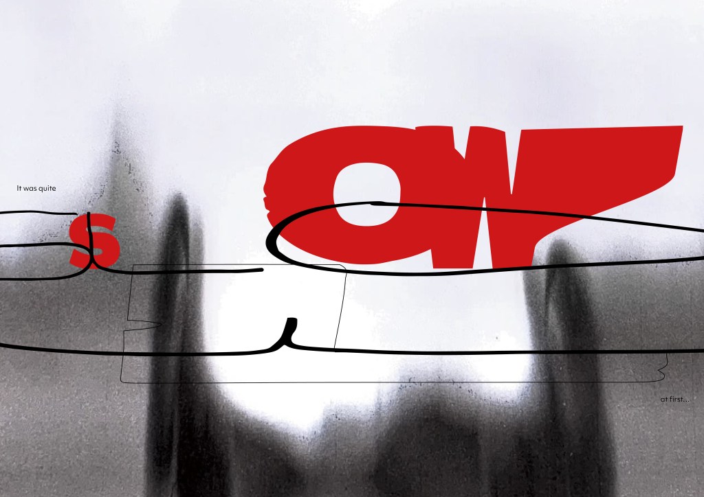
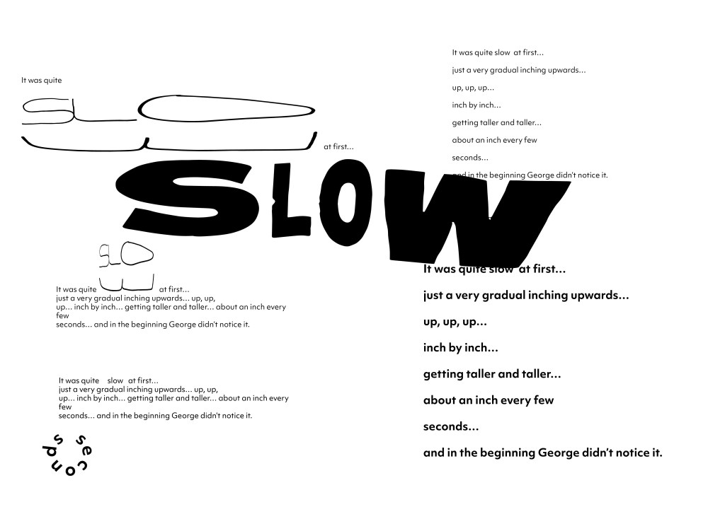
Taking the first line from my exceprt I wanted to play with one of the words to slow down the reader. I want the reader to journey through the word to get to the next.
Medium Choice – Pen and digital – A part of me wanted to hand draw the word slow to give a nod to the original illustrations within the book, I also felt it added more fluidity and motion – guiding the viewer.
I want to continue exploring this way of working into the second part of the challenge. Next steps are to work with more hand cut type, scanning and digital elements. Layering the text and being playful – breaking the grid and adding elements of chaos. (which are reflected within the book)
Below – Further experiments with hand drawn type and letterpress. Again thinking about how the ‘slow’ can be a journey for the viewer. I think what works well here is the contrast of experimental typography to the simple start and end words? The balance works.
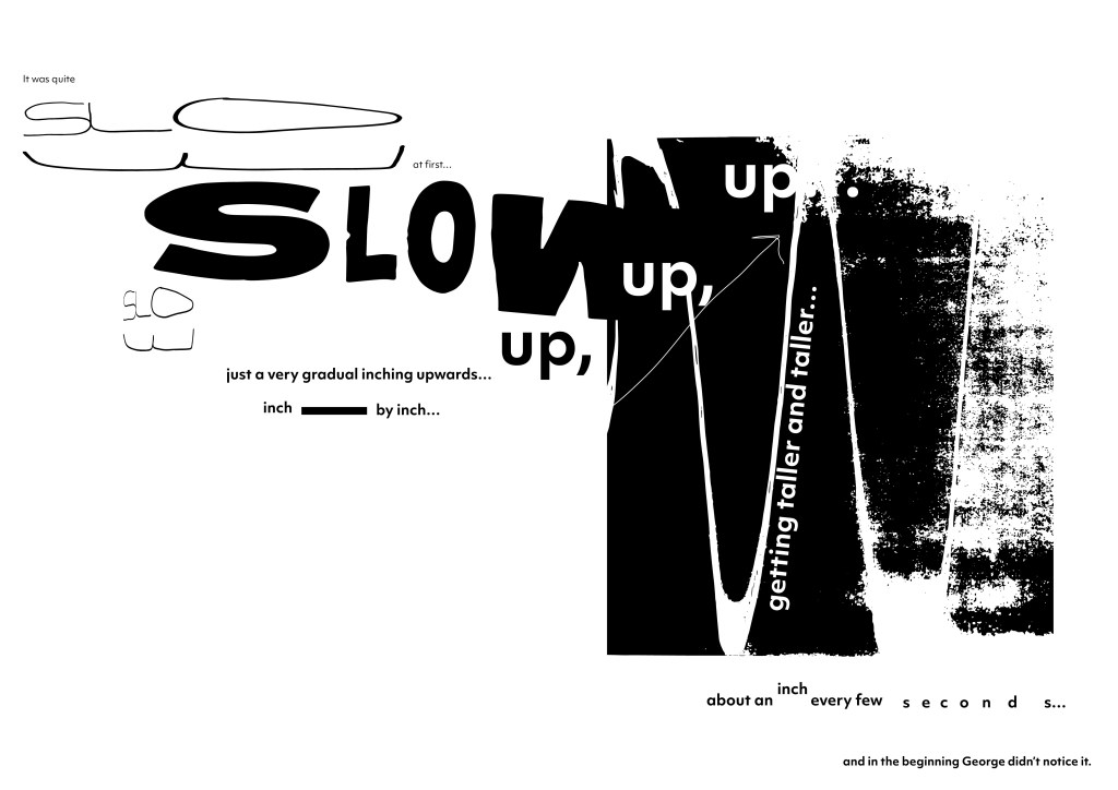
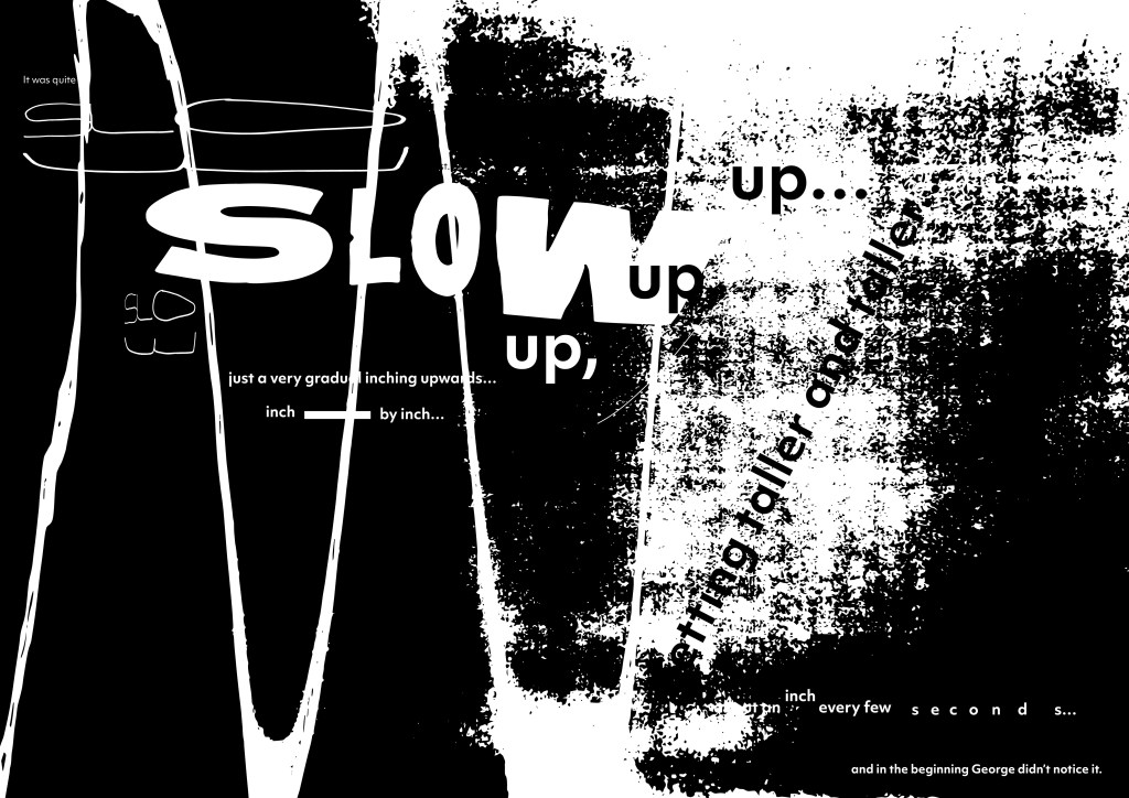
Below this is where I have pushed it even further and started to bring in other elements such as texture. Adding to the overall story that I have pulled the excerpt from. Is the black and white to dark though? Should this be a more energetic and colourful piece? Does the black dull it down?


Feedback from ideas wall on above outcome
Ellie mentioned that the black and white worked but made a good point about how the story is ‘marvellous and ‘experimental’ – I want to start working with colour / backgrounds going forward with this challenge, I feel it will help elevate the overall design?
Rosie also mentions colour and highlights the success in the smaller text inputted? I wanted to have a contrast of almost quite and loud.
Wes shared an awesome reference which I am going to explore and research further on. Reid Miles record covers are beautifully executed and work with typography in different ways – I feel I can take inspiration from these for this week’s challenge if not going forward

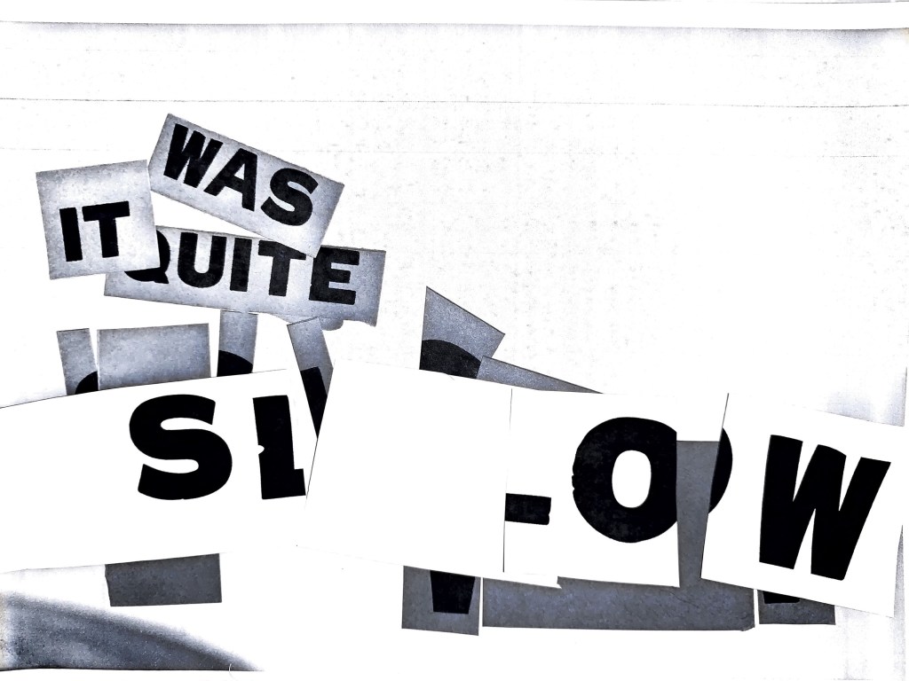
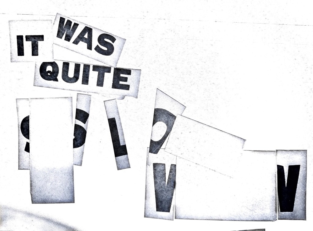
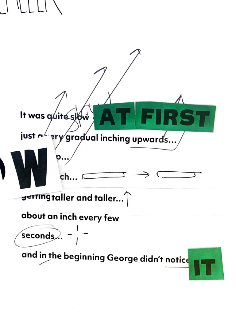
Printed letterpress and re arranged.
Exploring how cutting up and re arranging the type by hand would look. I introduced blank spaces between the ‘SL and ‘OW’ of ‘Slow’ to create that sense of slowing down and space to take the word in, it always caused a break in the text.
These for me are working really well, something interesting about the space between the letters. Could this be worked across the full excerpt of text? Again could adding colour bring this more to life? Monotone dulls the story down, however it does add that element of slowing to it.
Unintentional mistakes reveal interesting outcome
Above – I took a step back from what I was developing and started to thinking about the whole excerpt together. Thinking about placement, scale, and where word could be louder and more prominent than others.
Peer Feedback – Wes
WES – ‘I like the black of the middle one but it goes too dark on the right hand side for legibility to happen’
WES -‘The last one with the cut ups is also nice… maybe your up up is paper floating to the surface… I think you should stay with colour. The readability from left to right is peferct on the first one so its just a case of enhancing details. The background is a bit hard and I wonder whether you can soften this with a blur or similar but having said that I like the texture in the second one so it might be a bit of playing between distressed and soft to evoke an emotion’
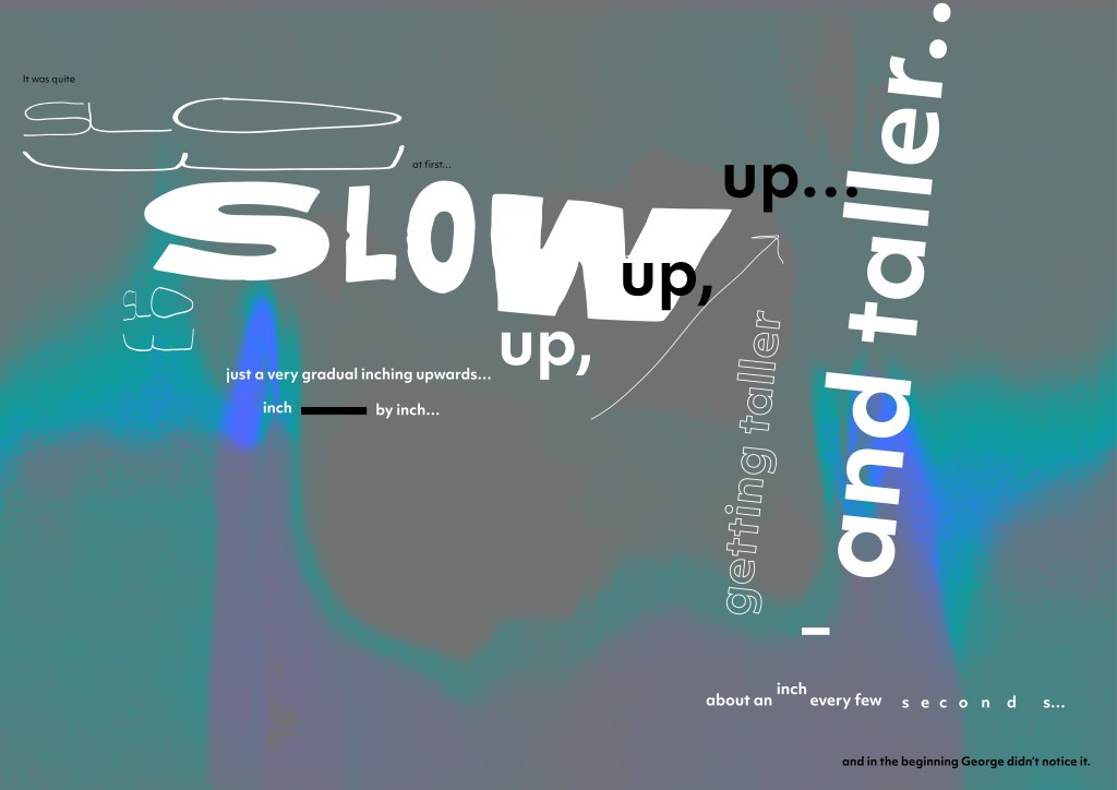
Development of full excerpt – Here I have taken the full excerpt and started working on it as a whole piece, starting to introduce colour and texture. Inspired by the work of David Carson. These recent developments are really starting to work however I think they can go further? Could I use a different typeface? Could I hand write elements of it? Could parts of the text be more expressive? for example could the ‘taller, taller’ feel like it growing? letter by letter?
Next steps – explore further with the typographic elements and potentially bring in images? or some form of other graphic element. Research the work of Reid Miles as recommended by Wes on the ideas wall.
Ideas Wall Feedback
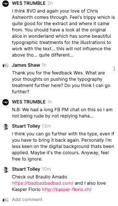
After speaking with Wes and also the feedback from the ideas wall I want to take a step back slightly and work on the typography more before applying backgrounds and colours. The reason I applied the background colour was to inject some energy but I think the type is doing this on it’s own and doesn’t need the extra layer? However part of me likes the background texture. I am going to push the design further from this and see the results.
Next Steps: Research the designers Stuart has linked to get some further inspiration.
Play with different materials and type? Water and type – add texture in a more analogue organic way?
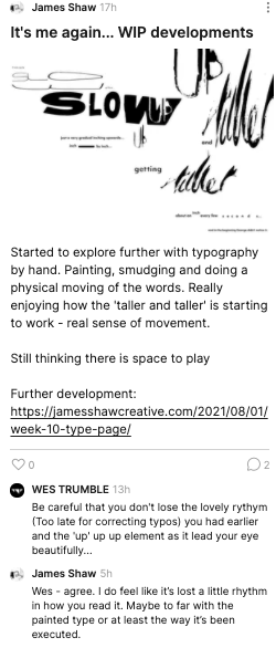
Below – I felt the typography needed to go further and since the ideas wall feedback and peer to peer with Wes I have experimented with hand drawn type and physically moving the type as it grows. On the first image I am still now 100% on using the ‘up, up, up’ in a standard font and layout I wanted this to also feel like it was moving.
Ideas Wall Feedback
Posted latest developments to the ideas wall (which are also posted below)
Wes mentions it’s starting to loose it’s rhythm when looking at the ‘up up up’ which I agree which, it’s almost gone to far? There needs to be some clam within the chaos to let the eyes rest? As following that is the ‘taller & taller’ which is intense again.
Waiting for further peer to peer feedback to action upon.
Feedback from Abbi:
I do like the second one I have to say, I like the ‘scratchiness of the up in the W, but the first one is definitely more structured and easier to follow.. I suppose it depends what you’re going for!I absolutely see Roald Dahl tho, nail on the head!

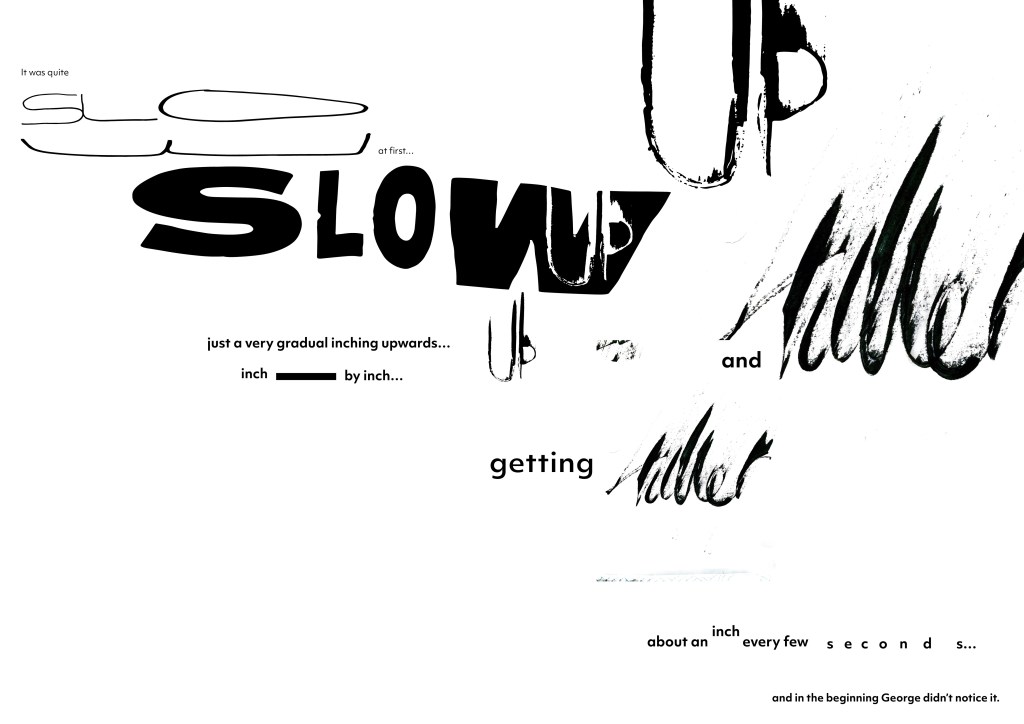
In the above experiments I am really pleased with how they are working. I have continued to work with no colour as it just doesn’t seem to work / looks clumsy. I experimented with a texture in colour before but I am not sure what it’s purpose was? I think if colour was to work if would be within the text and jump out? At the moment I don’t see the need for colour? the expressive use of type gives of emotion and tension in areas.
Next Steps – Look at areas of the smaller text to see what can be improved there? The ending text on the bottom right seems left out slightly?
Peer to Peer feedback from Wes –
I think you should stay with colour. The readability from left to right is peferct on the first one so its just a case of enhancing details. The background is a bit hard and I wonder whether you can soften this with a blur or similar but having said that I like the texture in the second one so it might be a bit of playing between distressed and soft to evoke an emotion. Almost like a passing of time between two states of conciosuness

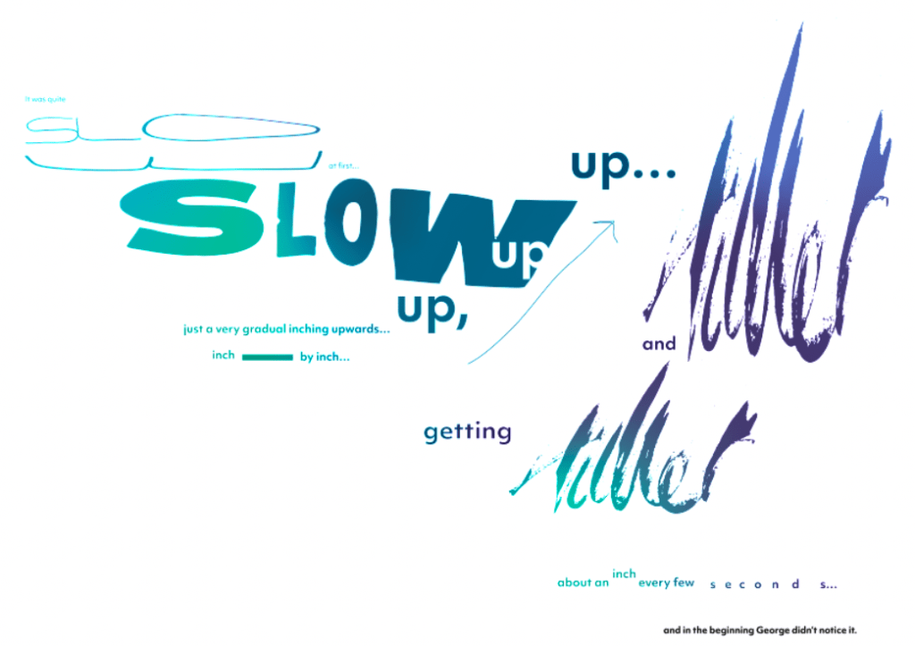
The below two developments were explored from feedback. A few mentioned they wanted to see how a colour gradient would work behind the design. (influenced by the narrative)
For me it’s striking and adds another dimension to the piece, making it even more interesting for the viewer, however is it a layer to far? Is the typography strong enough on it’s and within it’s movement? Even when applied to just the text it becomes a distract rather than another element which works?
With more time I think it would be interesting to explore how colour could be incorporated in a different way? Maybe with moving image or 3d elements. Something to explore down the line
Group Crit Feedback on colour variant – Thursday 12th August
Weekly feedback to the below design. Overall feeling was the colour was a good addition to the design however it didn’t add anything in it’s current application. Ideas to be explored are to add colour in a different way – potentially through graphic elements. OR remove the colour and start to work with a texture in the background to add another layer.
Wes commented he appreciated the application of colour but felt the gradient applied was the wrong shape and motion. Wes suggested making the gradient more in flow with the typographic treatment so the whole composition flowed. – This is something I want to explore into the future when developing this series as I think colour could elevate if used correctly.

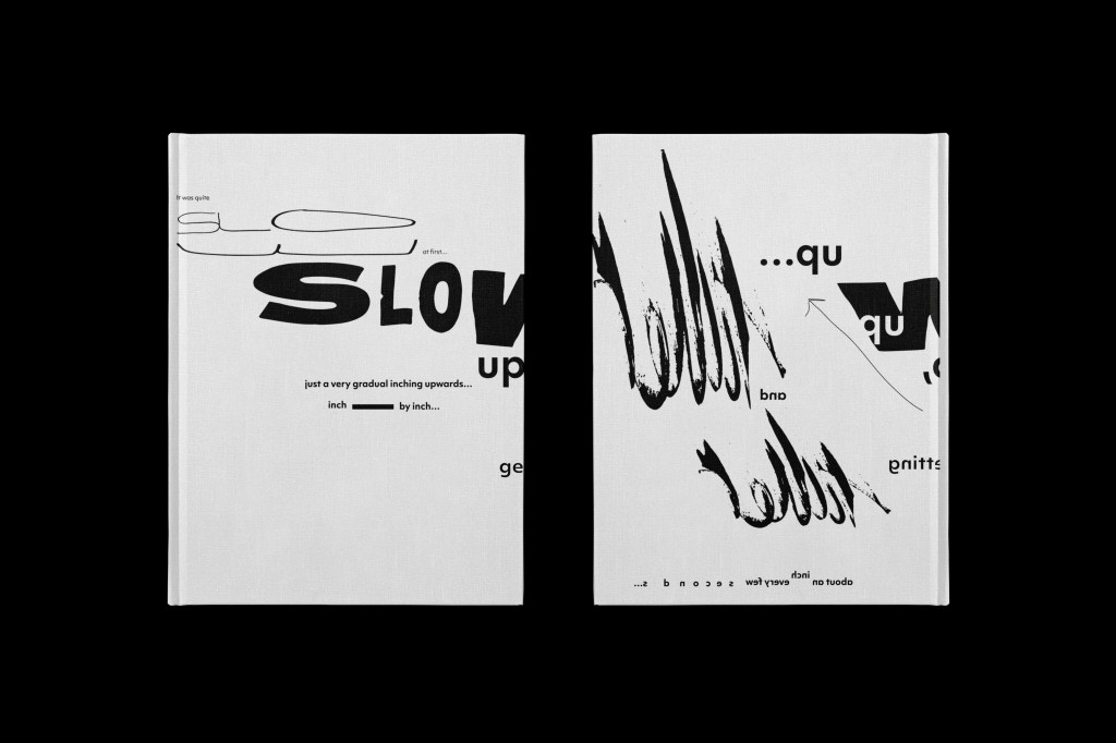
Typographic Celebration Cover artwork for George’s Marvellous Medicine
With this typographic treatment to the excerpt I wanted to create a ‘limited edition’ cover design which you could collect. I could see there being a series of these made from different excerpts of the text. Alongside this launch there would be an exhibition showcasing all the works.
Research
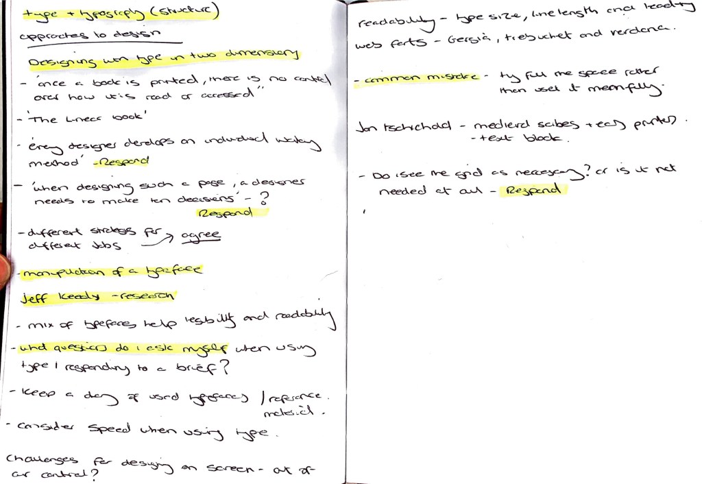
Recommended resources reflection – Type & Typography (Structure)
What question do I raise to myself when responding to a brief which will use typography?
1. What typeface will work with the theme / style of work
2. Does the typeface need to work across both print and web?
3. Accessibility? Font size, leading, choice of font, kerning
4. Colour applied to the font
5. Weight of the font
6. Is there already a set brand font? (if so can this be manipulated)
Type choice and use is can be such a huge part of a project especially when it’s the main focus to communicate to the viewer. Careful considerations and studies need to be undertaken before picking a font. You can’t just go onto google fonts / adobe fonts and go ‘ I like that one I’m going to us that’ Questions need to be asked about why that font will be used. It might be the case you need to source and buy a font – and work with the client on how it’s used across multiple applications.
Other points raised which I want to research further into are:
– Keeping a diary of all typefaces I use, see or like. Help build a reference for future projects.
– Research into Jan Tschichold medieval scribes and early printers.
– Using variants of typography in bodies of text
Another point raised within the book was around the use of the grid. I wanted to address from my point of view if I see the grid as a necessary need?
I see both sides. I think the grid is a tool designers should be able to understand and implement, I have learnt that using a grid can create much stronger, legible and interesting text formatting, rather than just throwing text on a page. However I think there is an argument to say the grid is there to be broken? To push the boundaries of graphic design we need to break the rules? When the grid is broken new avenues of exploration take place… It can also help the designer to be more free and not restricted but also on the other hand the restriction of a grid can push you to be more creative. I want to further my understanding of grids and when and when not to ‘break them’
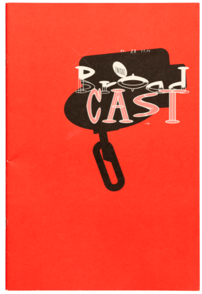
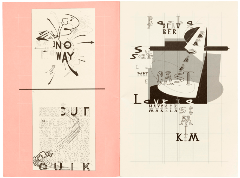
Zuzana Licko – Type Design
I was drawn to the work of Zuzana Licko through the expressive movements involved within the compositions. There is something so elegant but fun at the same time within these pieces below. There construction seems ‘random’ but also balanced. For this week’s challenge I want to really push what a typographic composition can be. Zuzana has me inspired to also bring in other elements to help support the typography. There almost sketches before the final?
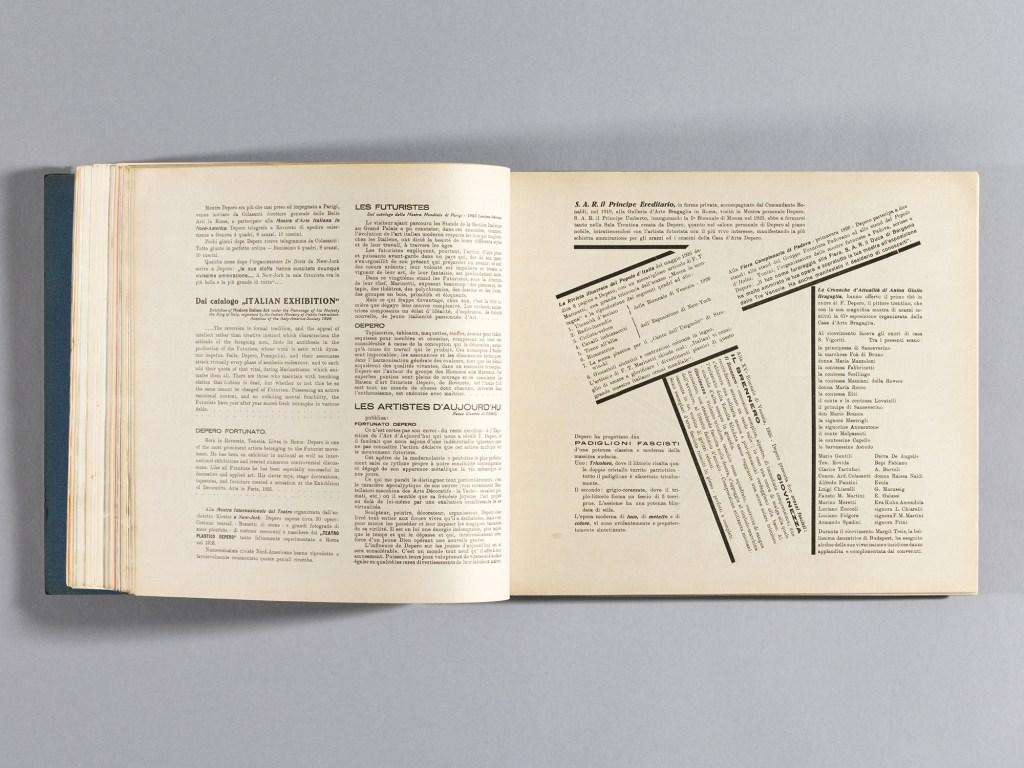
Fortunato Depero – The Bolted Book.
A typographic encyclopaedia of visual delight. Typographic compositions across multiple disciplines of designs. Fortunator Deperos boldness within his work is balanced against grid type throughout the bolted book. I want to take away the light and dark of his work this week and how at times it’s ok to be calm and on grid but to contrast that with energetic typographic compositions.
(Above) Image Copyright – Center for Italian Modern Art and Designers & Books
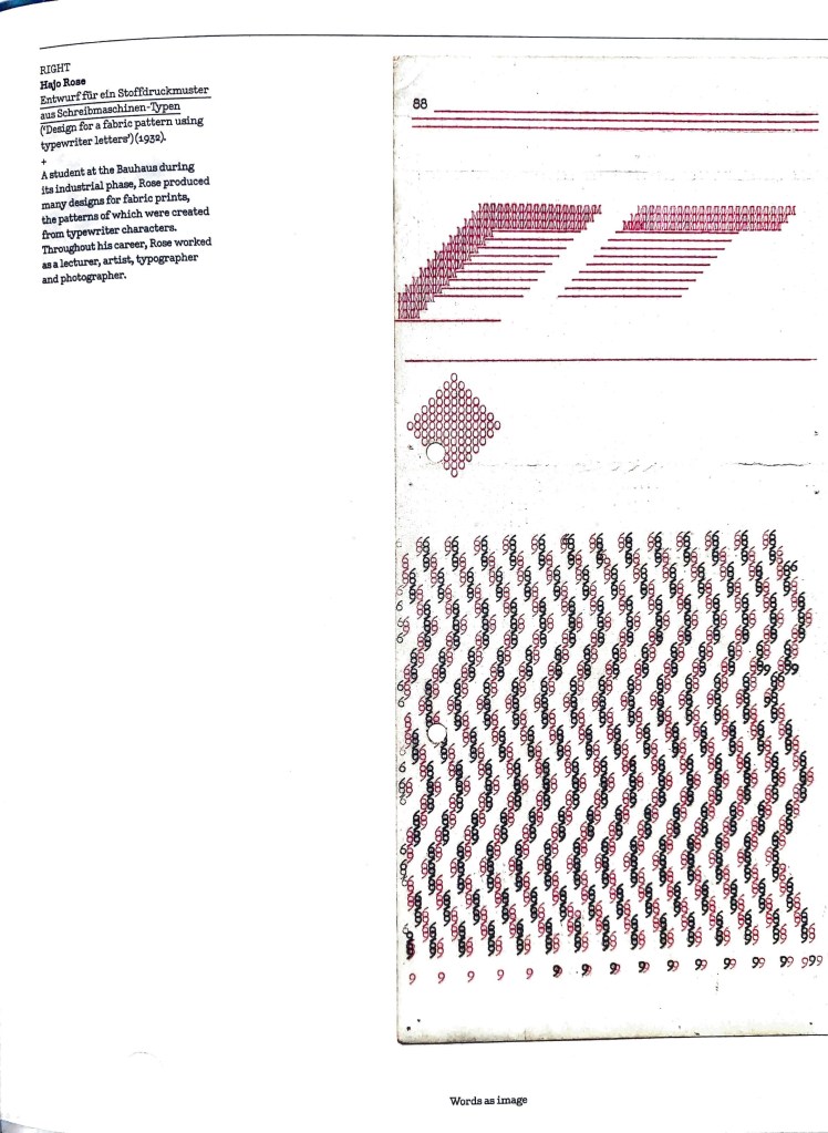
Hajo Rose
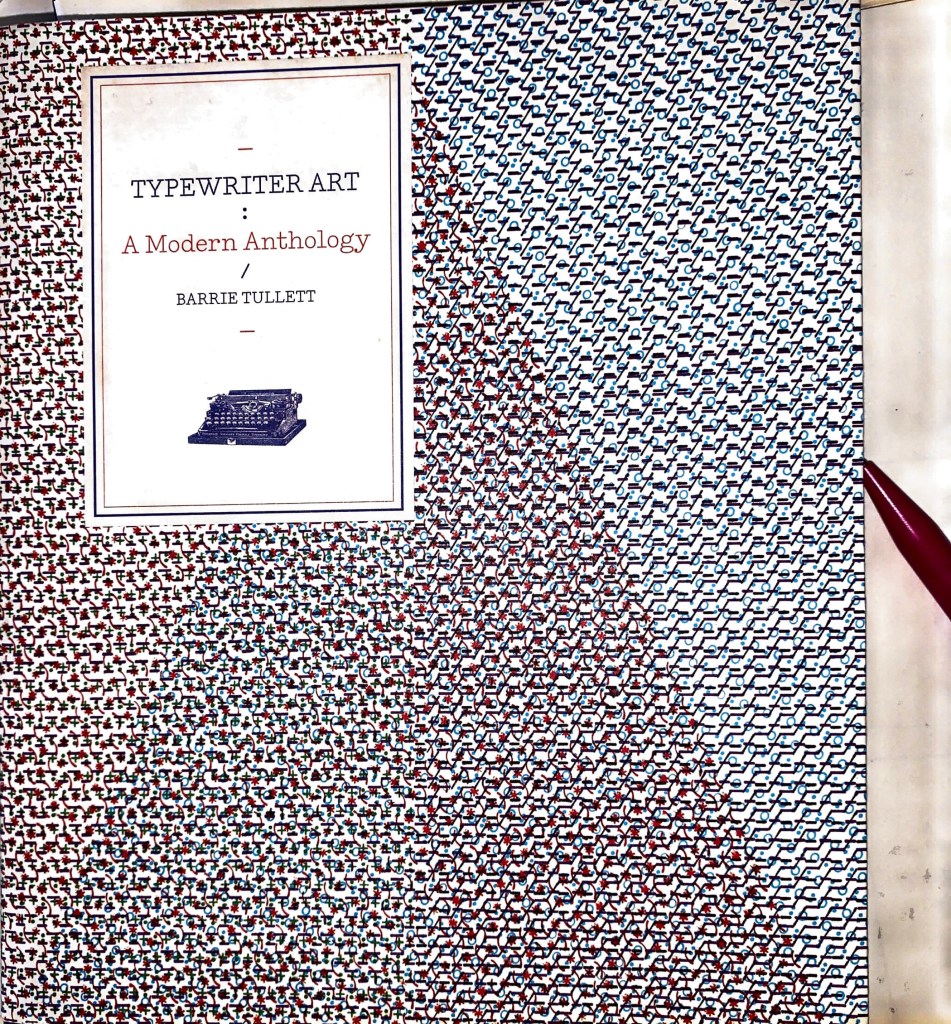
From the book ‘Typewriter Art: a modern anthology’. Typewriter forms composed into delicate, meticulous compositions. It’s the detail and placement which drew me in. What I most like is the typewriter was a machine used before the keyboard so to have these beautiful compositions raises a few questions around the rise of digital. We have lost a portion of craft within design but designers like Hajo Rose continue to celebrate this. I can see these simple forms and structures being applied to words or creating letters within themselves. The top two red designs look like an ‘e’ and ‘t’
Reid Miles – Record Sleeves
Bad Studio
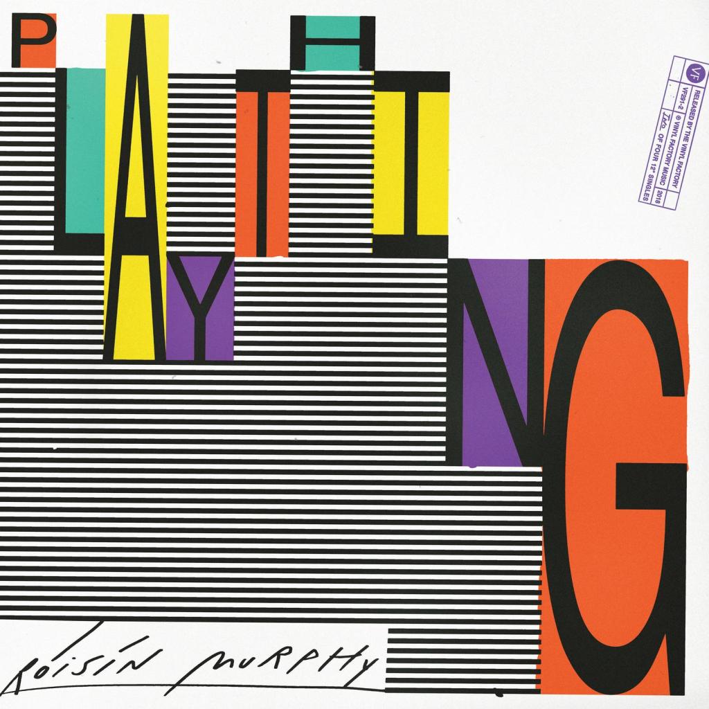
Stuart referenced Bad Studio on the ideas wall and I am slightly taken back by the work. I have really found a groove recently in working analogue and putting compositions together if thats by hand or then digitally . It’s given me a renewed energy within my practice and I’m appreciating the process more. The record cover designs by Bad Studio have this feeling of tactile, rawness and energy? The two below which stood out for me play simply with the typography but it’s the way they have been composed which is so striking? That mix of physical marks and type really echoes the titles and takes you on a journey. hints at what the music within could be like?
Final Outcome
References
- https://oa.letterformarchive.org/search?searchType=1&searchText=*
- https://oa.letterformarchive.org/search?dims=Name_KEY&vals0=LICKOZUZANA&friendly0=Licko%2C%20Zuzana
- https://www.boltedbook.com/
- https://viljamis.com/2015/the-iconic-work-of-reid-miles/
Weekly Critical Reflection
What went well: I really enjoyed the challenge this week and the creative output I created. One of the areas I highlighted which was lacking in my skills/knowledge was typography and this week allowed me to explore typography further and what can be created & communicated using type. Through the week’s I think I have been strong in the exploration and development stage of the challenges, pushing ideas and letting go to see the results, this supported with research, inspiration and new gained skills.
My final outcome: I am really excited by what I have created this week and where it could go if I had further time. I can see my outcome being applied to other excerpts of text and being accompanied by music / moving visuals to share the story. There such expressive pieces there crying out for another layer, potentially 3D elements? materials (fabric, wood, grain)
Things that didn’t work as well: If I had more time I really would have wanted to push my typographic outcome further into other elements as mentioned above. I felt this week I had a strong week, took on feedback and actioned. The success for me shows knowing that it can continue to be developed and expanded into others areas. A small negative was knowing when to stop and not over do the work, I did get to the point where I was just going going going and stopped thinking about the outcome.
Into next week: Explore, push the boundaries, share feedback (peer to peer). Take a step back within the week and then go back to the creative side?
