Lecture Comments & Reflections
- What are potential future definitions of design practice?
Pull out points from lecture 1.
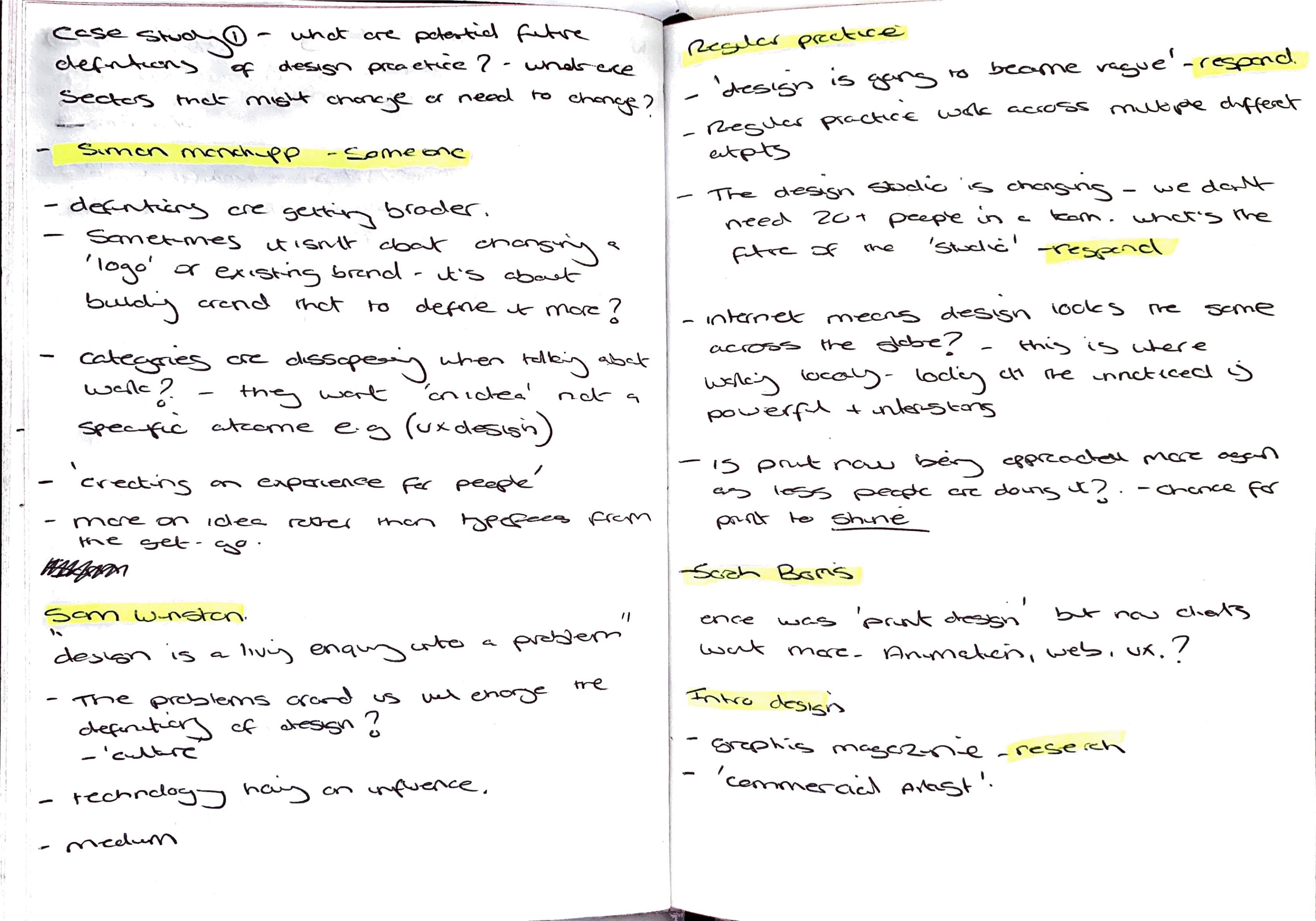
Simon Manchipp mentioned it’s not always about changing the logo or existing brand, it’s about building around it and help develop a stronger brand which connects with the people/viewer. Interesting point made and I don’t think I have looked at a project in this way before because we always think ‘something new’ is better? but actually maybe what already exists works it just needs building upon, refining in areas?
It’s not just about creating a visual it’s more about creating an experience for the viewer? This point stood out for me as I want to explore further how my work can develop into more experiential work. Really thinking how that viewer experiences the work? physically or visually. How do they interact? How to they share, how do they connect? how do they feel? I feel we need that interest and draw at the moment due to the overwhelming amount of content which is thrown in our faces daily. We want to be stimulated, excited, we want to talk, we want to share with others, we want to collaborate.
Regular Practice made a point on graphic design becoming more vague? I’m not sure I 100% agree with this. I feel there is a few reasons behind this. 1. I think there is so much going on within design across the world it’s hard to sometimes see what’s new, what’s already been done? what’s exciting? This almost waters down design in some areas? However I think there is some super exciting, interesting, boundary breaking design being created? Maybe the question is more around will the term and category of graphic design become more vague? Will the category encapsulate a multitude of disciplines? That I can see happening.
They also made another point around the design studio changing and evolving. Something I am passionate about is creatives coming into the industry. Over the past few years even I have seen a change, fulled even further by the coronavirus pandemic of studios changing, shrinking, moving out of studios and working remotely? I really can’t see the design studio being around for much longer apart from the studios which are well established, but even this i would question?
What about freelancers & smaller studios coming together to deliver work? teaming up to pitch for new work? They can do this! Imagine the collaboration and variety across the individuals involved? This is an area I want to explore further and how I can be part of this. Could there be a platform to support this development?
Podcast with Susanna Edwards & Maziar Raein
“It’s no longer about an individual specialist coming up with solution, it’s about this collaborative” – In response to my point about design studios above. We need to be looking at how we can be collaboratuve and bring in those working in other sectors to support us in delivery. This leading to richer, more interesting outcomes.
“Surving in the world as a graphic designer” (Maziar Raein) – A tough tough sector at the moment. Since graduating I have found the Graphic Design sector to be fast, subjective, competitive, hard going but also rewarding, exciting and ever changing. One of the things which gets to me is anyone can ‘become a graphic designer’ according to these 2 month online courses? It this saturating the design sector? How do we feel about platforms like Fiver and Upwork? offering design working for £5? Are these having an effect on clients in what they expect? Small budgets, tight turnarounds and working when they want you to work?
“What gaps of knowledge do i have and how can I enhance my practice through collaboration, and through bringing another brain and another set of skills into the project“ – Susanna Edwards
‘Playing with the tools that we use and trying to redefine how we use them’.
Design Development (weekly Challenge)
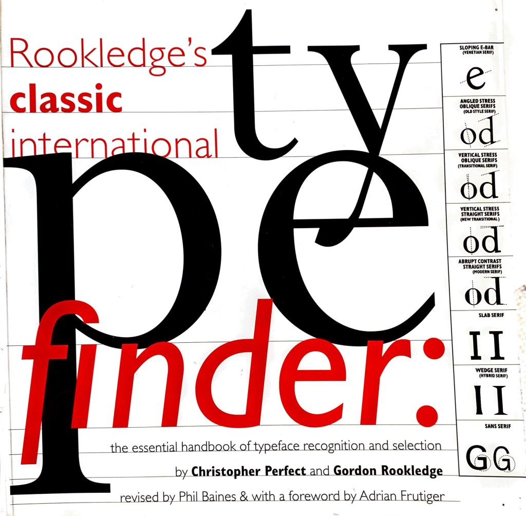
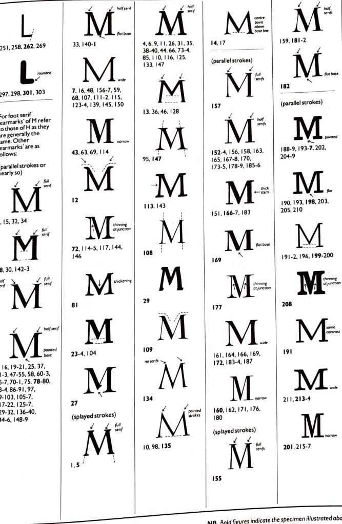
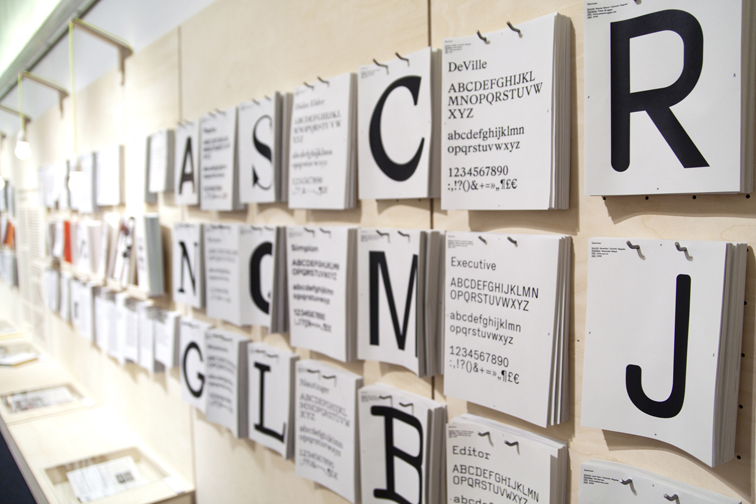
Rookledge’s Type Finder Handbook
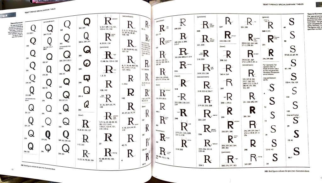
O.
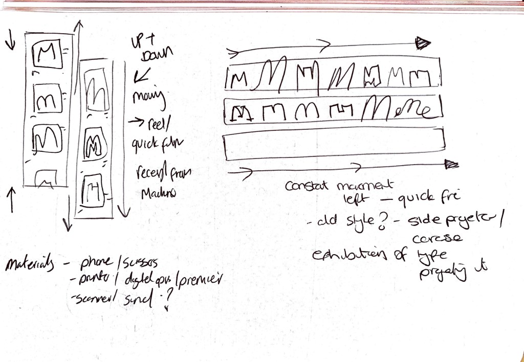
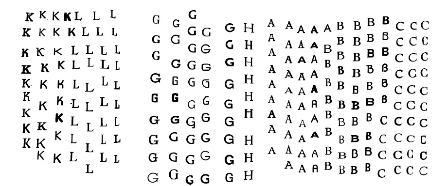
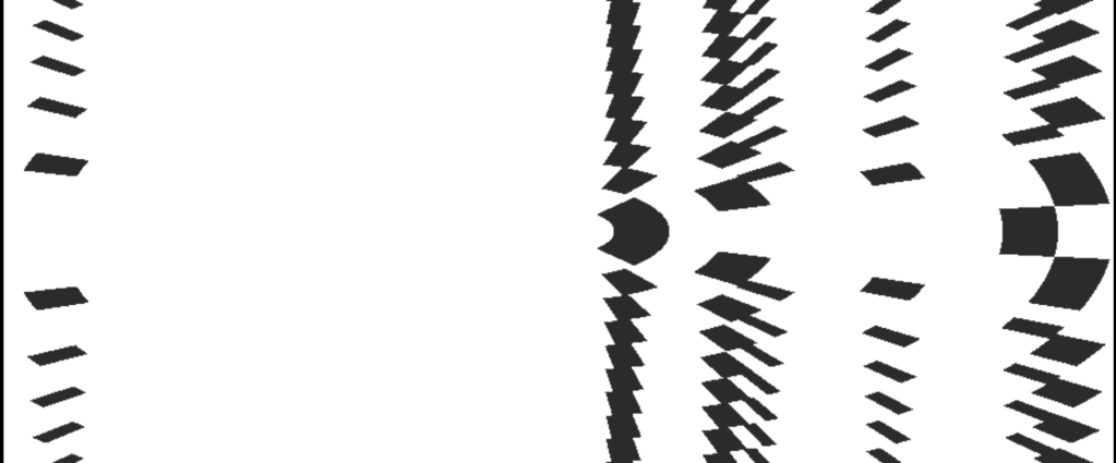
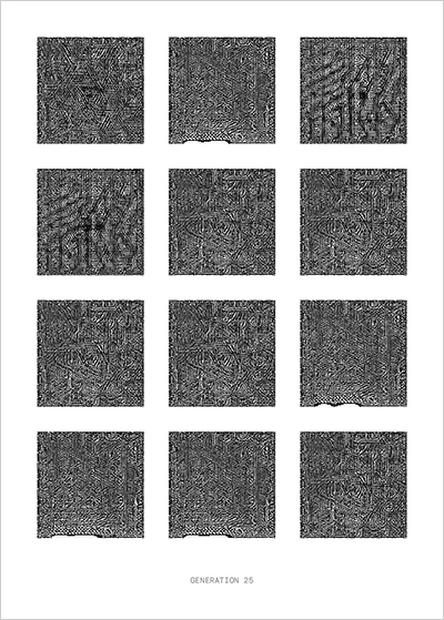
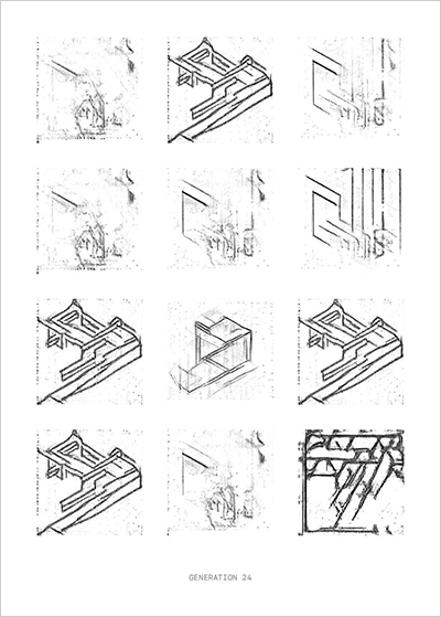
Extracting letters from the handbook to start thinking about movement. Within the handbook all the letters are segmented up in columns. I wanted to break that rule.
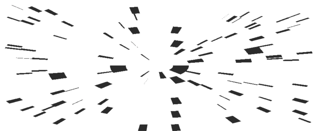
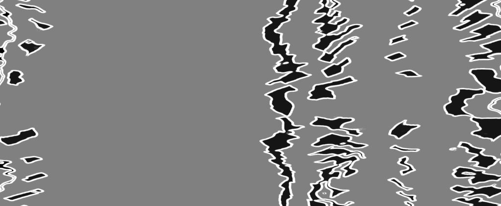
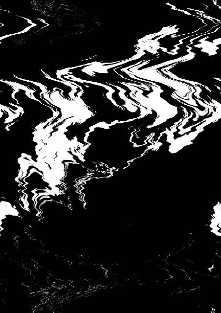
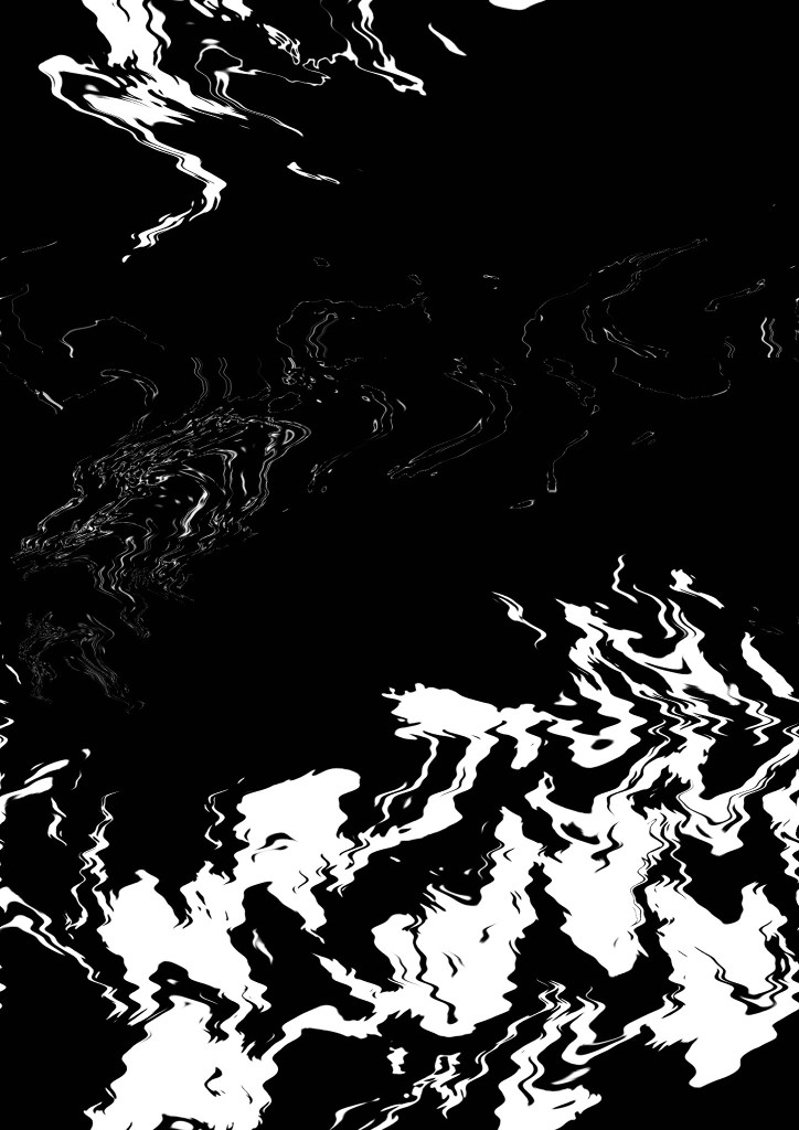
Below are experiments using a simple online tool called PhotoMosh. Wanted to get some initial ideas going. These don’t really work for what I am after -to abstract and taken away from the original? But then again these could work alongside more structured images of the letters?
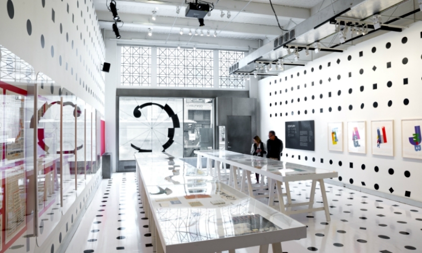
From experimentation I have come across an idea where I want to create an exhibition from the book (which has an element of movement) I want the book to become accessible to more people not just designers. Let’s see what the public choose, cut up, re arrange and upload. Take your design into the 360 immersive room.
The movement idea for me didn’t have enough legs on it’s own? It needed something else to boost it?
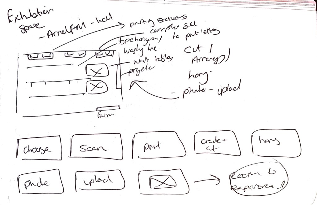
To do – how will the room work, how will they showcase the work, print materials for the exhibition (advertising)
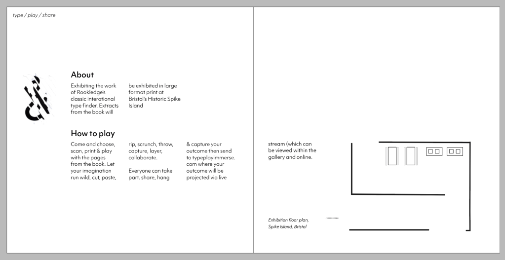
Below – Rough exhibition room plan and process of how you use the space. Choose your type, Scan it, Print it out, Create & Cut, Hang, Capture, Upload (to screen within separate room) Experience your outcome in print form (hanging) and in digital form (to music) within an immersive environment.
How can everyone be playful with typography? How do those who are not designers use the type? Do they see it as a tool? Do they see it as an object? Do they want to write something? Do they want to ignore it’s form and go against the ‘rules’
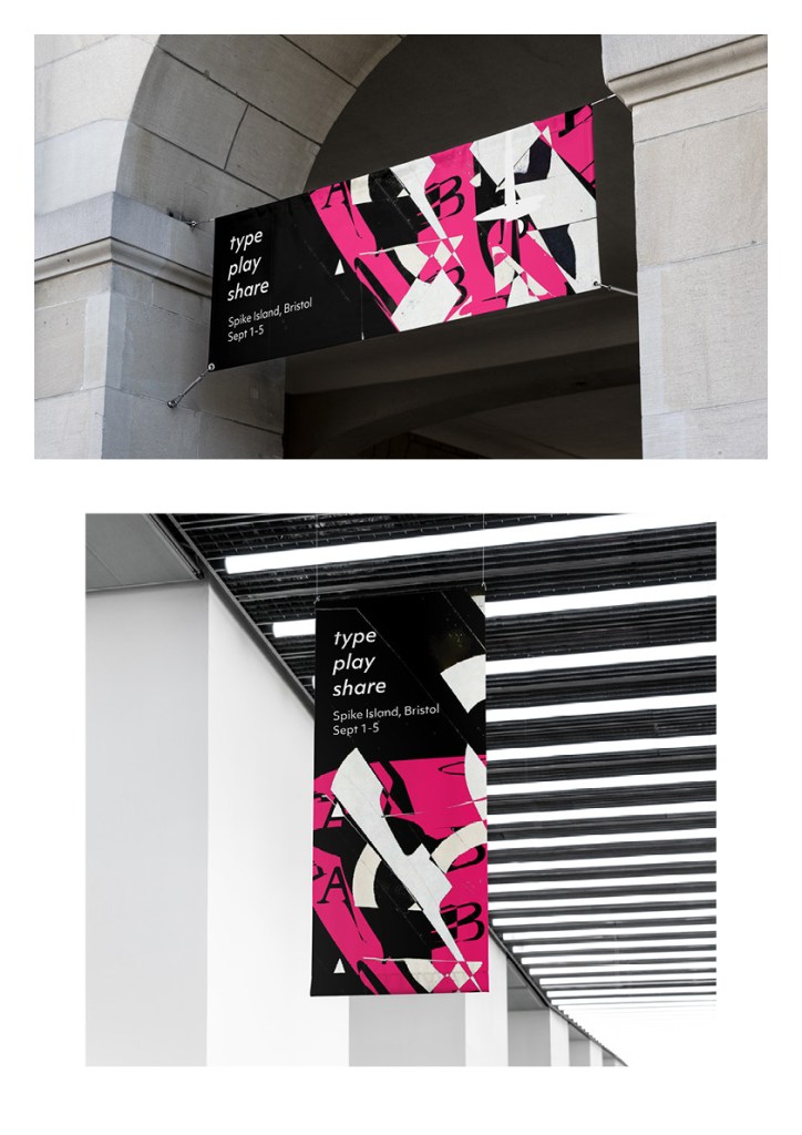
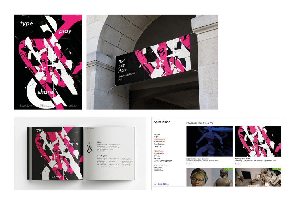
Poster experiments for the exhibition – take the process the public would take in the exhibition and applying it to the posters? These are exciting but think need to experiment in analogue first like they would in the exhibition. I want the public to be hands on and place, overlay and cut with their hands not a computer.
Could the posters be completely hand made? scanned in and become a GIF in themselves? Entrance to the exhibition.
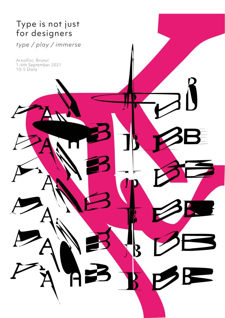
Taking a participants outcome to the simple task to use for advertising. This outcome was made by my partner who responded to the exhibition brief.
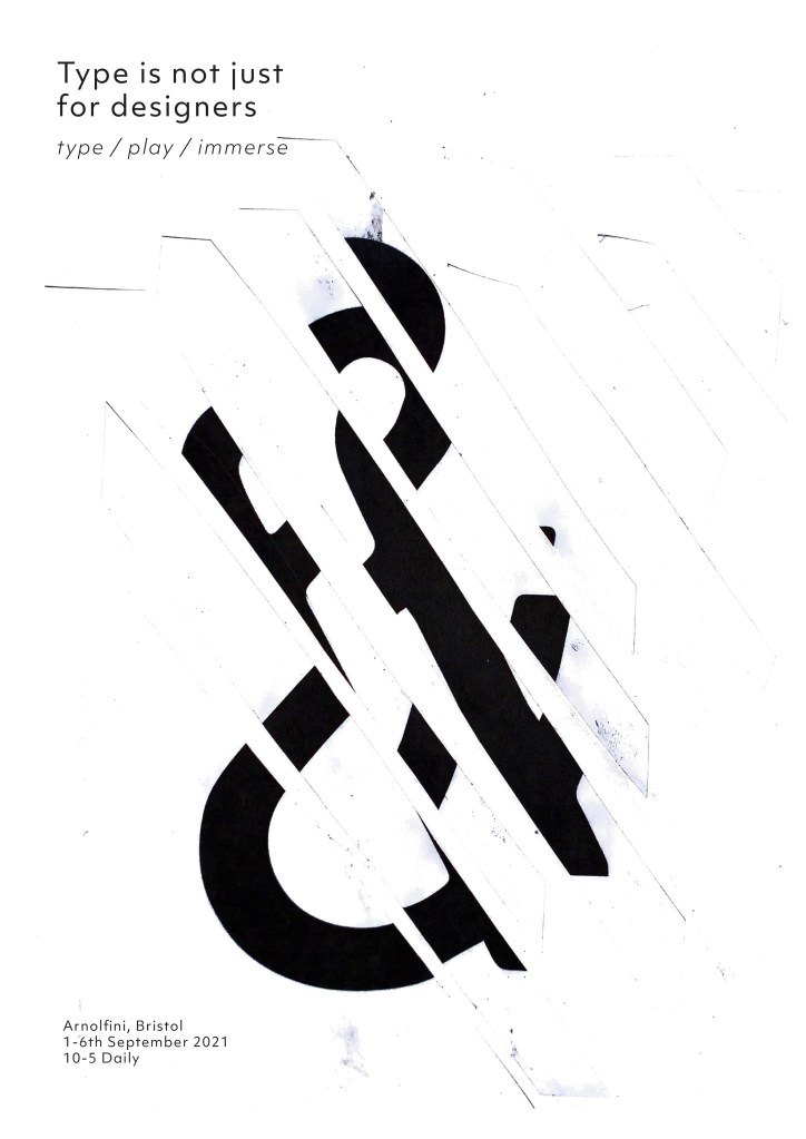
Above – Applying the design to web visuals for the exhibition. Seeing how the whole exhibition would look. The thinking here would be to use materials created from the book / from participants to create the identity. Currently working well but I think it needs further exploration and maybe more depth?
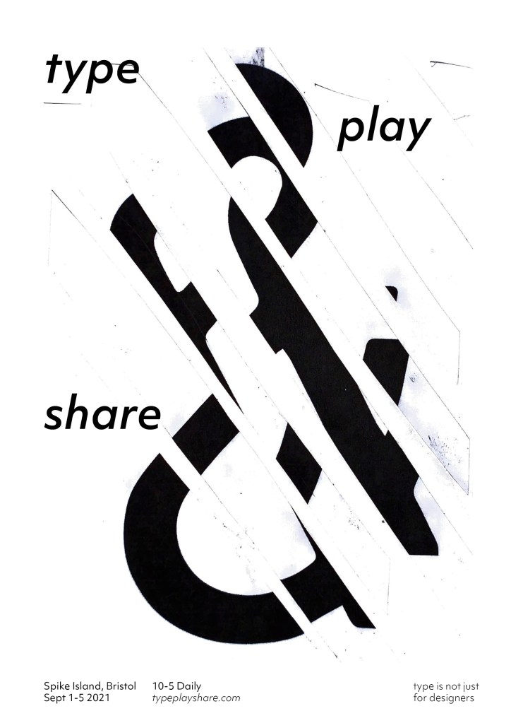
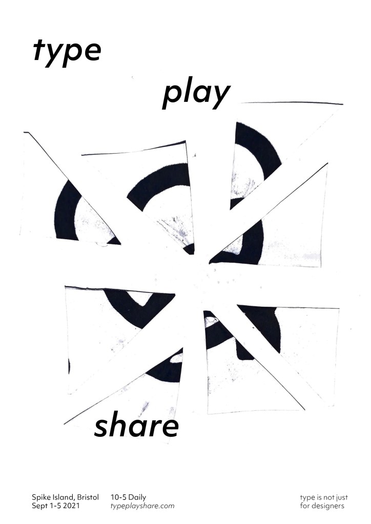
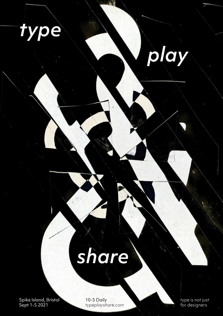
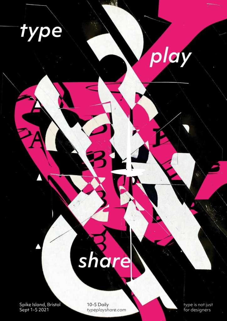
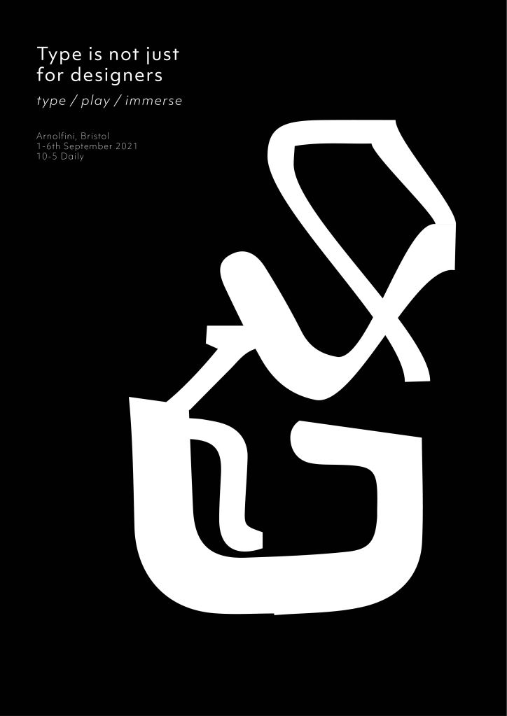
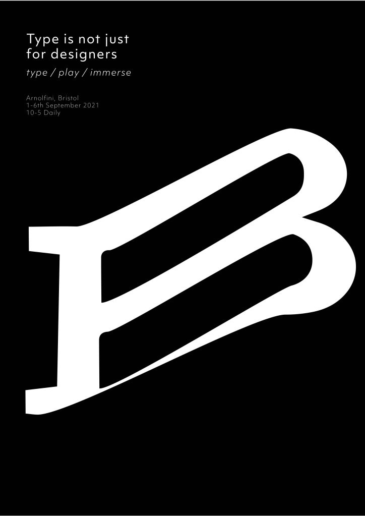
Above – Poster / identity thoughts for the exhibition design
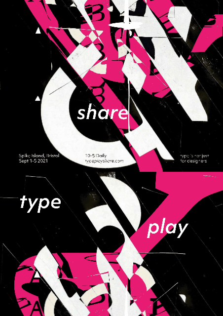
The exhibition is about playing, creating, exploring and sharing. With this in mind I got a few participants to give it a go to see the results. They were handed the type handbook and could choose any page / any letter or number from the book to play with. Within the exhibition there would need to be a laminated or digital copy of the book available.
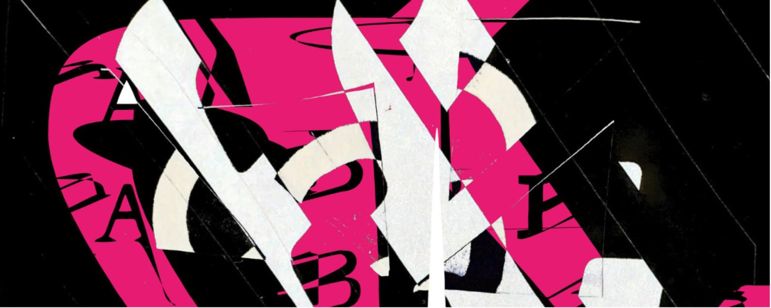
These outcomes are exciting, dynamic and eye catching. It allows the possibilities for materials to be created open. Questions I need to ask myself – How would this apply across different applications? Does the pink add anything? What if I was to invert the colours out? What if I was to try and make them into a GIF.
Exhibition – About
Ideas wall feedback
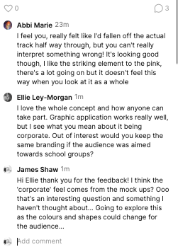
Ellie makes a point on the audience which I didn’t think about. Ellie asks would I apply the same branding if I was to aim it at school groups?
This opens up the possibility of playing with the branding in terms of colour and shape to appeal to a different audience? Something I am going to think about and explore. As the event is open to ALL I wonder if my approach in terms of design is drawing to much towards one audience? Should it be stripped back more? Should it be more clearer. What if I removed all the type and had simple wording? almost like you an entice into coming to find out what it’s all about?
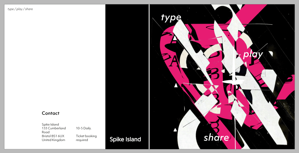
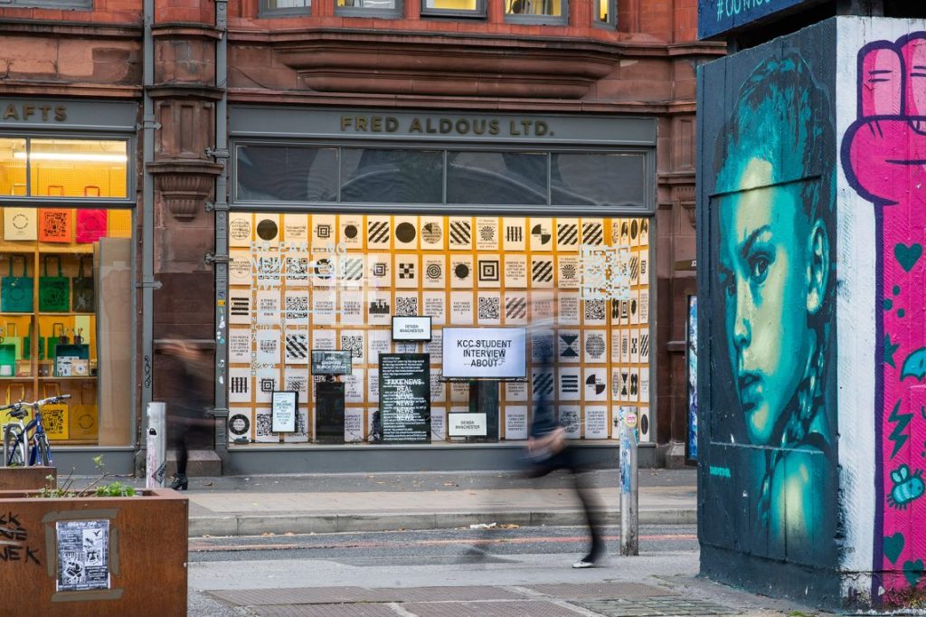
(Above) Brochure Design – How can the design be applied to a brochure design for the exhibition. When entering the event I invision the public to pick up a brochure to explain how the interactive part works. The exhibition part will be visible from all areas of the space (showcasing the type finder book)
(Below) – Web listing application to Spike Island website.
GIF test – What if the poster was digital? instead of static? what if there was supporting digital elements made from the type finder book? Distorted elements inviting you in? Turning participants work into moving images once they have completed?
Is this to far? is there to much going on in the exhibition which could overwhelm and take away from the main type finder book? Or is that a good thing that it’s so far from the original book? My thoughts are now looking at what music should accompany the moving elements?
Research (visual)
Dunne & Raby
Mark making from a machine. This is where we can use technology as a tool to create. Not knowing the outcome can produce interesting results. The machine made a series of marks which might look random but collectively feel like a set of building blocks. Ready to be assembled and worked on.
For my exhibition the outcomes from the participants would be different from each other, allowing me to work with them to produce further work. They could be structural, abstract, simple, complex. The outcomes would be unknown and compositions can start to be constructed from the outcomes. Shared via print and digital means.
Oliver Bucher
Working with static and moving images Oliver Bucher creates typographic responses. The work which first caught my eye was ‘muted memories’ Using typography, movement and sound to create an outcome. The way he has captured the typography matches so well with the movement and sounds… it gives a while different meaning to them rather than just writing them in a sentence on a piece of paper for example.
This has inspired me for this week’s challenge in how I can take a typographic print object and work with it both in analogue and digitally to add movement and potentially sound?. As someone who struggles at times with reading this makes it a more enjoyable experience in a way? Maybe not legibility wise but visually.
Studio Spass interactive typographic sculptures.
100 years of type. – https://www.designindaba.com/articles/creative-work/100-years-type
Patrick Thomas – Breaking News Exhibition
Going back to when Susanna Edwards meets Patrick Thomas and speaks to him about his breaking news exhibition. I was inspired by the input of information and format the exhibition took. It allowed the public to get involved with the results being shown on a live stream. Patrick’s work has made me thought how I can take my type finder book and work it into an exhibition. How can the book become an object that everyone can play with. How will they interact with the exhibition. Is there a core message behind it?
ON-TYPE Texts on typography – Bauhaus Archive exhibition
‘There are panels providing leaflets with example fonts and quotations that can be taken away, allowing visitors to compile their own individual catalogue.’ The exhibition has made me think how I can incorporate an element of take-away and interaction into ‘type/ play / share’
There is something enjoyable about taking away something tactile, something you can pick up and record for your own collection. Not only that but you can learn more about what you have taken away – it may inform future decisions. This also allows the exhibition to be tagged and photographed across social media.
Final Outcome
References
- Dunne & Raby. (2018). IN SEARCH OF AN IMPOSSIBLE OBJECT, . Available: http://dunneandraby.co.uk/content/projects/955/0. Last accessed 16th August 2021.https://vimeo.com/93500784
- Design Indaba. (2014). 100 years of type. Available: https://www.designindaba.com/articles/creative-work/100-years-type. Last accessed 17th August 2021.
- SEGD. (2016). Meet Abbott Miller—Design and Content. Available: https://segd.org/meet-abbott-miller%E2%80%94design-and-content. Last accessed 15th August 2021.
- Design Manchester. (2018). Breaking News 3.0. Available: https://designmcr.com/events/breaking-news-3-0. Last accessed 15th August 2021.
- http://www.typetoken.net/typeface/on%e2%80%90type-texts-on-typography-bauhaus-archive-exhibition/
Weekly Critical Reflection
What went well: The final week is over… Honestly where has the time gone over the past 12 weeks. Week 12 has caused confusion between a few of us. However I’m really proud of the work I created this week and the ambition behind it. I have always wanted to think up / design an interactive exhibition which allows participants to be at the heart of it’s outcome.
I feel I have create something which is exciting, new and worth visiting? It’s opening up design to all, allowing anyone to play. I think this is an interesting concept to see how others interpret typography. Some might come to just view the exhibition, some might take part, some might really go for it? That I think’s the beauty of it.
This week I have gone for it and really explored my thoughts, thinking how the design can be applied to multiple touchpoints. I have really asked myself could I actually make this happen? I think I could actually put this together? I think people would actually come to this and take part? It might raise questions from some but I like that.
What didn’t go well: Time wasn’t really on my side this week, I think I could have planned it better to allow for further execution. Also could the concept have been further refined. Could I have added in a floor plan / mock up of the intended space?
I wanted to also think about how sound could be incorporated into the exhibition. If time permitted I would have started to experiment with sounds in response to outcomes – something I am going to think about for the future of this project.
Overall Reflection from the last 12 weeks
What a ride the last 12 weeks have been. I have thoroughly enjoyed the course so far. It’s been a reset for me in terms of design, It has allowed me to take a step back and really engage with ideas that I want to develop. It’s allowed me to think about my design process, the journey of research and how to critically think. I am proud of what I have achieved in the last 12 weeks and have projects I really want to develop further in the future. Designs which I think have potential to go much further.
