Lecture Comments & Reflections

Reflections and thoughts on Michael Bierut – How to think like a designer
An inspiring talk which gave an insight into the world of Michael Bierut and how he works. I took away from the talk how the element of ‘play’ and ‘fun’ is important to Graphic Design. Michael was able to find small pockets of fun within projects which made them stand alone.
The work for the NY Times blew me away slightly in how they overcame the challenge of what was stopping them create. He found a solution and worked with the structure and environment. He didn’t give up and pursed with the tools available to him. Something I want to take away is really getting to understand your brief, obsessing over it, looking at the finer details and finding those elements of ‘spark’
I related to the work Michael did with the MAD in where the logo wasn’t being accepted and understood, the project was failing however he made the brace decisions to review it, look back at the core of the brief and home in simple elements. He used the location and the shapes (squares and circles) as the basis for the identity. Something so obvious yet when constructed felt inventive and playful.
Key takeaway points:
Doesn’t need to be complicated
Looking for simple elements of spark
It’s ok to review and start again
Be playful
research the location, the structures, the people
Even the smallest impacts are a success
Design Development (weekly Challenge)
Initial thoughts on briefs before detailed analysis:
International competition (LIVE) Creative Conscience:
– Real potential to have an impact on an issue which I have been through
– using real-world experiences to have impact (could be very powerful)
– Potential routes ( mental health in workplace (freelance), dealing with health issues / loss of family member.
– Hearing within the pandemic and beyond, how this effects the daily life of a family member and how they communicate, what is out there to support this? Not allot and if there is it’s not suitable for all.
Adidas D&AD Brief:
– Not immediately connecting with this brief due to it’s sport nature? (only connection here would be tennis)
– Could not knowing much about it ignite an interesting research and proposed outcome? (something new)
– Explore and area of design I want to learn more about
– The Adidas brand is playful, bold, experimental at times and known my many (advantage)
– Do I agree with what they do and what they stand for? Can I connect with the brand (if not maybe not right to force the project.
Science Museum Group:
– Immediate interest within the science museum and what can be achieved here.
– A whole new way of delivering information
– A live project
– Is this going to be to digital for me? (need to look more into prototype design)
– Opportunity to work on something new
Further Thoughts: Creative Conscience
Potential routes that stand out for me are that around hearing loss? also climate change? However I’m not sure I want to go down the same path as the past 4 weeks. Something else which stands out is the potential to look into work life balance for the self employed (what resources are available right now)
Further Thoughts: Science Museum Group (Research and Development)
Chosen Brief – Science Museum Group (Research & Development)
Further thoughts around this brief:
Look into Pokemon-Go
Idea of a ‘collection’ a collection of postcards.
Vinyl Records?
Sticker book (collection)
Digital card collection (rare / less seen objects you can collect the physical card)
Idea of ‘around the world’ – Fridge magnets you collect
Competing Projects
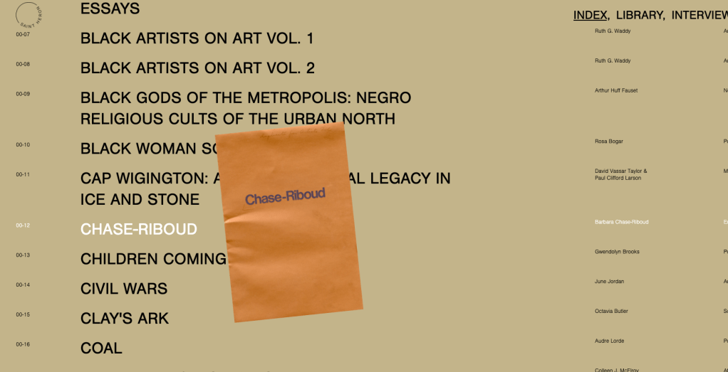
1. Saint Heron – Web Designed by – Angela A. Asemota (below)
Not so much an archive but a library, Saint Horan founded by Solange Knowles is beautifully crafted and executed in its design and navigation. What makes this accessible is the clear navigation, clear images on separate pages where they have room to breathe. The artefacts have been given the space to be showcased clearly.
When you scroll over the headline you also get a preview of the artefact which works well. I’d like to almost see the headlines in a library format? In a grid like you’re looking through a library, maybe the text pulls out with the image like you pulling out a book from the shelf. I am aware this is a ‘live’ archive and being updated constantly but I wonder if there is scope to add the full documents to the archive instead of just a preview? Maybe they are locked away until you sign up and become a member to receive the newsletter for example.


archives.design by Valery Marier.
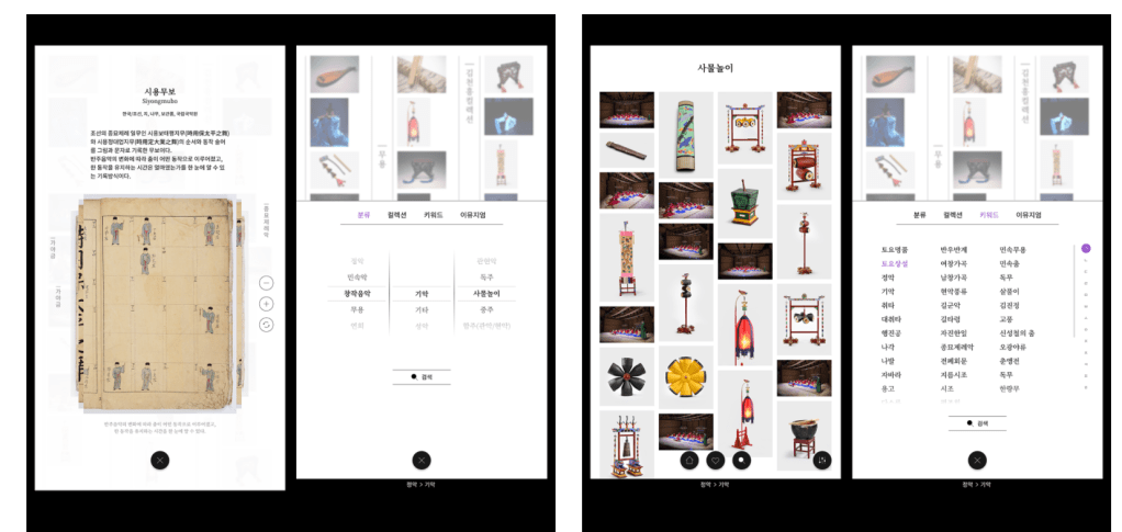
Gugak Interactive Archive by Rebel 9 (below)
Rebel 9 have captured the objects of the National Gugak Center in a new way which instantly captures your attention, even online. The interactive wall is one of the first things you see on entry to the museum, in the lobby. This location instantly captures the audience and allows the public to engage in a greater amount of the museum. One of the negatives for me (from what I can see) is the media wall isn’t accessible online? They have an online archive but this follows a similar format to many others, a navigational website with searchable key words and filters. This can be seen here. It would be great to see the format moved online so that others could experience this unique archive wall.
Further to this another element which stands out is the accessibility of the archive, the media boards allow for greater experience of the museum, allowing you to view video, hear sound and interactive with pieces. Does the digital archive give everyone a chance to experience it?

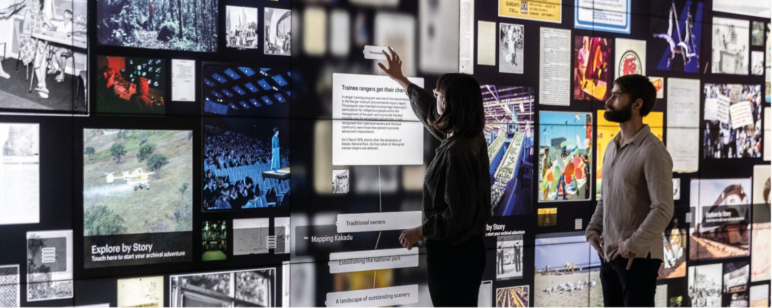
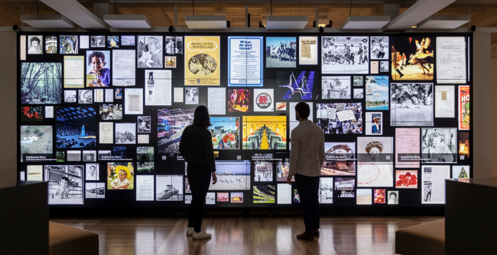
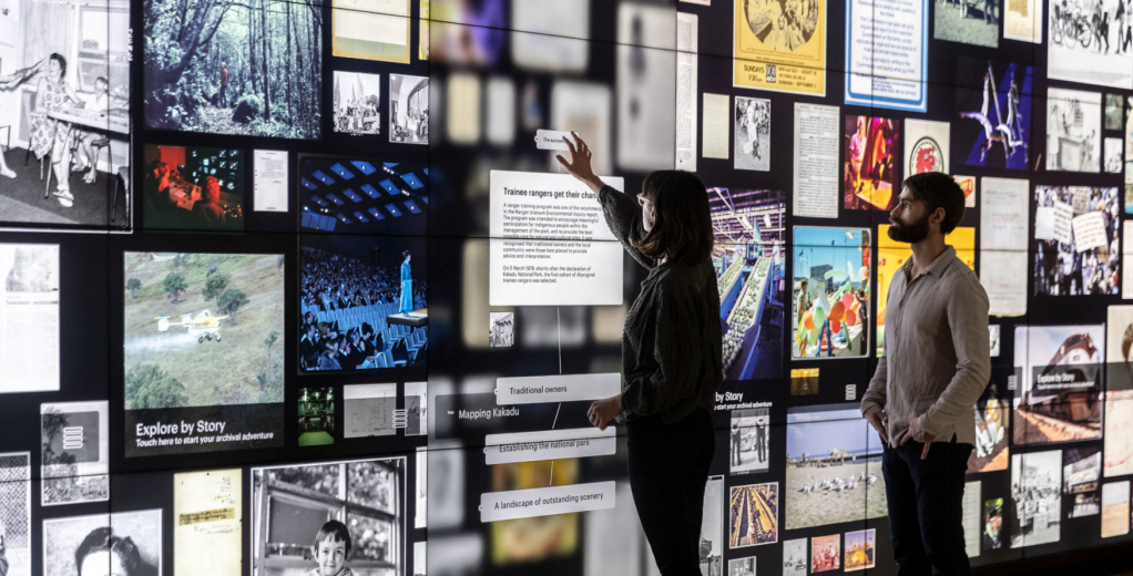
National Archives of Australia by Collider
Collider have produced an interactive wall based on the framework of traditional storage vaults at the National Archives of Australia. The first thing which strikes me is the chaotic nature the work is displayed, for me it does become overwhelming and I wouldn’t know where to start? However on the other hand I do want to get involved and see what happens? So a positive and negative in my opinion.
The wall has been designed to be interactive with visitors able to tap, expand and find surprising connections between the archived historical materials. What this system does is provide a way of showcasing an amount of information at once through this easy application. I would like to see the board change maybe in relation to current exhibitions or times of year to keep the wall refreshed, this will also entice returning visitors to discover and explore further.
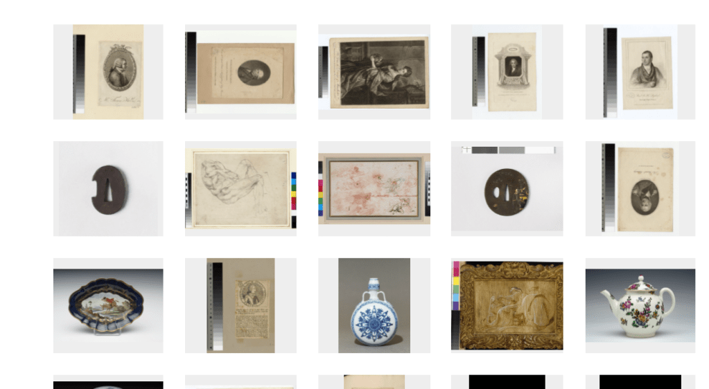
Ashmolean Museum Archive (below)
The Ashmolean Museum Archive is again a digital platform however they have pushed it slightly further to make for a more dynamic UX experience. This for me makes the overall interaction more engaging for the viewer. You are able to use the timeline to choose the decade and within that the circles contain different objects / artefacts / art to explore. I would like to see this bigger however so the archived material was able to shine.
There is an element of ‘a website’ to the it though which draws me back slightly, I feel the content needs to be showcased in a more creative way, without ruining its presentation. Maybe it’s a voice over video going through sections of the archive. OR maybe the timeline becomes experiential within the museum? What I think can be taken away from this archive and implemented within the science museum is the element of a timeline? I instantly helps those navigate a period of time and interest. It narrows down a large collection and avoid it being too overwhelming.

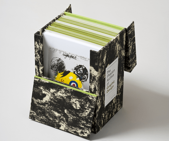
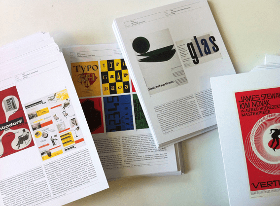
The Phaidon Archive of Graphic Design
The Phaidon printed archive stood out for me with its format. You wouldn’t expect to see an archive printed in this way. You would see archives containing printed materials in files etc however a curated printed archive is something different. Imagine this being applied to a huge archive? A full printed archive which could be accessed by the public? Both online and printed (on request?)
This printed archive
- Research and discover three creative studios, agencies or solo practitioners who have created competing projects that are in a similar field to your chosen brief. This could be an agency that regularly work in the same field or have created a one-off project, that is similar to your selected project brief.
- Post a link to the three creative practitioner websites and/or competing projects onto the Ideas Wall, for peer discussion.
- Write a 200 word synopsis (600 words in total) to evaluate the strengths and weaknesses of all three competing industry professional project examples.
- Post your three written synopses onto your blog and remember to include a selection of images that illustrate and support your evaluation
Research
Weekly Critical Reflection
What went well
This week I have aimed to get on top of this project. Starting out on a positive note and working through the week. Early on identified the brief I wanted to explore through research and have been able to push forward with further exploration. My time management this week has been good and means I can move forward into week 6 feeling positive.
Continue to work on
One thing I need to continue to work on is depth of research. My research has been much stronger at the start of this project, taking time to look at multiple resources and different angles. Through this research it’s given me a better starting block for the project. I need to continue to reflect as I go and ask myself why and what I am doing for this reason, this will help in the long run in identifying any problems I may encounter.
Prompts for next week:
Research, reflect and continue to stick to a timeplan.
