Lecture Comments & Reflections
Design Development (weekly Challenge)
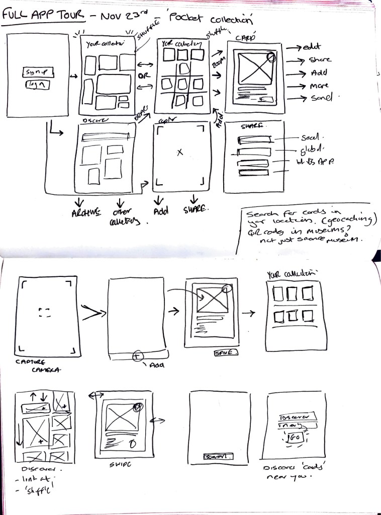
App proposed functions
Sign up / Join ‘pocket collection’
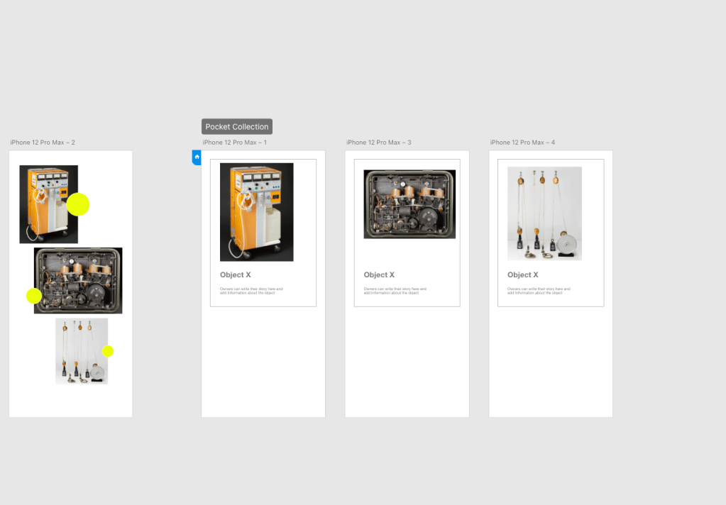
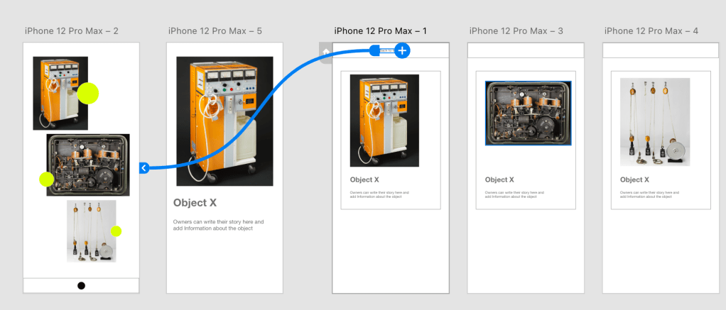
Explore your collection
Add to your collection – from main archive and photos
Categorise and edit your collection – app function creates card when information added.
Share your collection
‘pin’ to your collection
Ideas Wall Feedback on concepts:

Above:
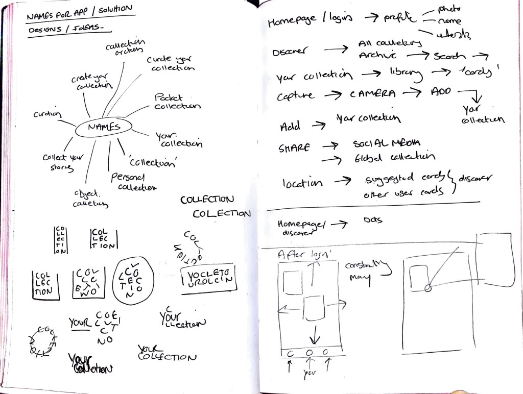
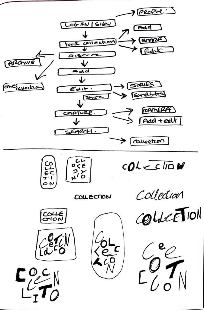
App layout and workings. I am trying to narrow down all the parts needed for the app. I want it to be an easy application to use so that users don’t feel overwhelmed. Simple navigation with clear information. I want there to be elements which allow for the information to change / move /adapt so the experience doesn’t become stale and the same. I am looking at how the discover page can constantly be shuffling the cards to keep it new. I also want to add a ‘holding page’ before log in that uses elements of the app (for example the navigation dots)
Right hand side: User journey thoughts and the options which can be taken. This still needs work and refining as there is small actions which can happen within each.
Initial logo sketches for the app name ‘Collection’ Looking at how the letterforms can create a sense of different objects, different collections, individual for every user. Idea of creating letterforms which are all unique. Maybe these change depending on the user? Could there be coding which allows the app to auto generate the letters for the user. Creating their own collection logo (instead of a profile image)
Initial Digitisation of sketches to see how the app will work in terms of navigation. Current problem is the clunkiness and lack of finesse in how you use and access the information. Need to think about navigation buttons and menus, colour, typography, categories, movement, logo.
Initial tests have been successful and I am quite pleased with trying a new app. I haven’t used Adobe XD before but it’s been quite simple to use.
Inspiration has come from apps such as Ikea and Unsplash. Keeping visuals clean and easily accessible for all. I want the cards and collection to be the key visuals throughout.
Research
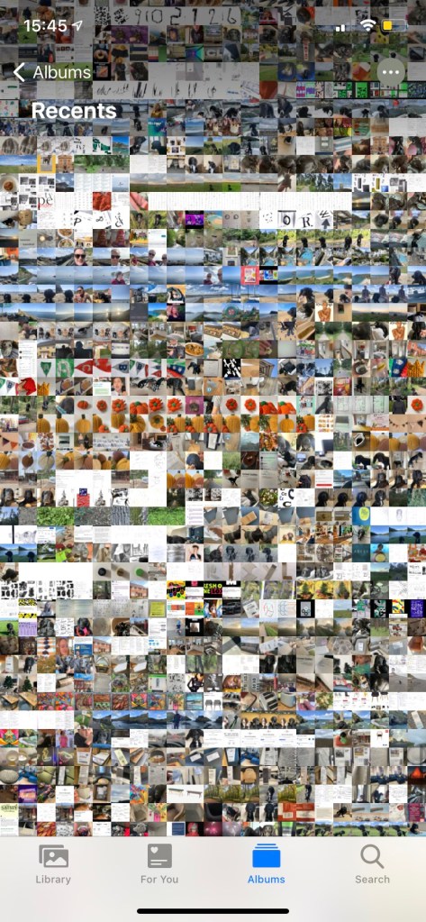
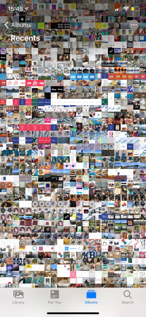
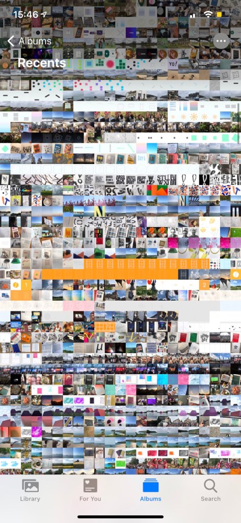
Photo album in my iphone providing a visual collection of my captures. Could this format be included within my app? What surprises me the most is the colours across the different rows. Each showing a different mood or emotion? There is consistent areas (showing time in a place for a period of time) and then areas which are more chaotic with different colours all over the place.
Could this be ‘your collection’ and how it looks? or could this be the homepage? Maybe it’s not clear, maybe the app pixelates the images to create your collection colour pallet. Which changes on the category or if other objects are added.
Pinterest
Visual imagery – click – detailed information on selected image. Here on Pinterest I like the action of clicking and image and it expanding to give further information about it , and even linking it out and adding social share. Within my app for the SMG I want to explore how this type of feature could work for the cards. I want the viewer to be able to view the card clearly.


Weekly Critical Reflection
What went well
Continue to work on
Prompts for next week:
