Lecture Comments
Initial thoughts on: How can typography help define the identity of a location?
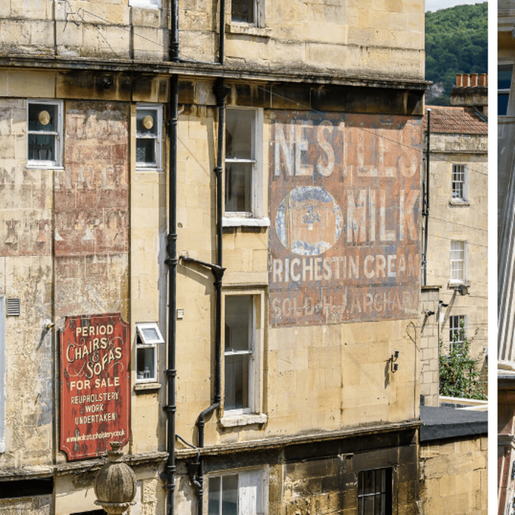
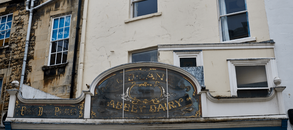
If you go into your local town / city I believe you can get a real sense of the mood / identity of the location based on the typographic use. For example I live only 9 miles away from Bath, Somerset. A town steeped in history and packed full of Georgian architecture. If you look up and close enough you start to see beautiful ornate ghost typography all around the city, some elegant in their application, some more bold and to the point. However if you start to look at existing typography within the city, somer retail shops have kept this same application? Almost keeping the history going. The modern advertising sticks out for me like a sore thumb, and I do believe the council has in place a rule about what can be displayed on the exterior of shops.

If I go down to my more immediate town, Trowbridge, Wiltshire, you get a different feel. Less in the way of ghost / historical typography? Does this start to shed a story on the past wealth of the town. I am going to explore the town further over the coming week to see what I can discover.
History revealed Lecture – Stuart Trolley – reflection notes
Places which contain multiple moving parts (people and transport) for example need to have a simple and clear visual direction. A busy place accompanied by busy graphic application causes confusion, slower journey times, no time to direct or navigate.
A considered and simplistic application (for example the London Underground application) allows for planned direction, a sense of calm even in over crowded and busy times. Navigation can be easily understood.
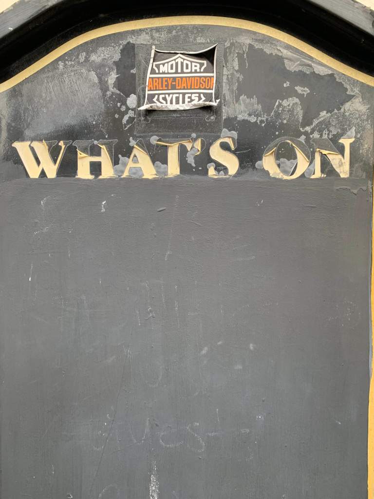
Before signs didn’t need to be made into multiple touchpoints so could be applied to buildings and be one of the main points of communication, however now mass advertising is applied everywhere and at speed… Do the more prominent / static signs show that a town is flourishing? Compared to a town which may have a degrading and crumbling advertising board.
Do we ignore the typographic applications around us? If we paid more attention would be judge a location more?

Design Development
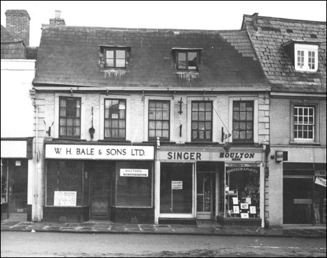
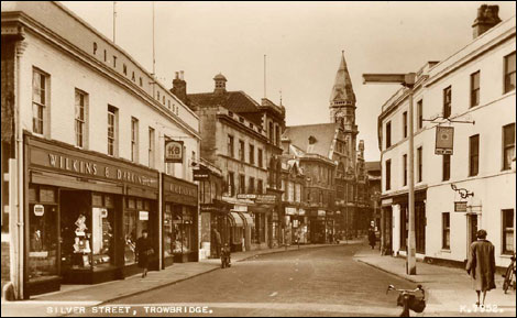
I wanted to get a response to those who had lived here longer than me. There is a local historic Facebook group which documents and shares past, present and future imagery of Trowbridge, Wiltshire. Below are a selection of the images shared. I wanted to get a sense of what the town was like before, as today it seems it’s purpose / identity has been lost? The town has some incredibly beautiful old buildings some which were mills, but you wouldn’t know this today.
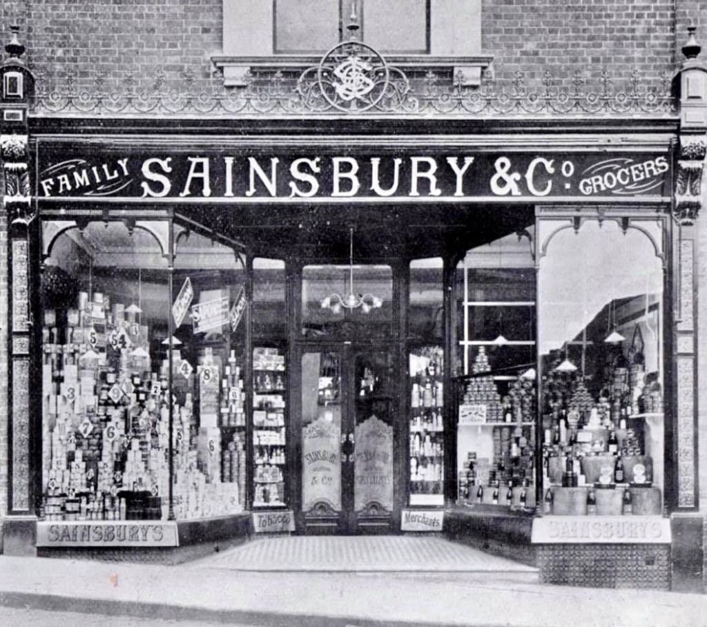
I look at the images below and everything has been erased to this day? Even down to the ironwork on the Sainsbury & Co shop front. These images show an small artisan town which is bustling and creative? Far from what is presented today. The typographic treatments however I feel bring more to light about the town.
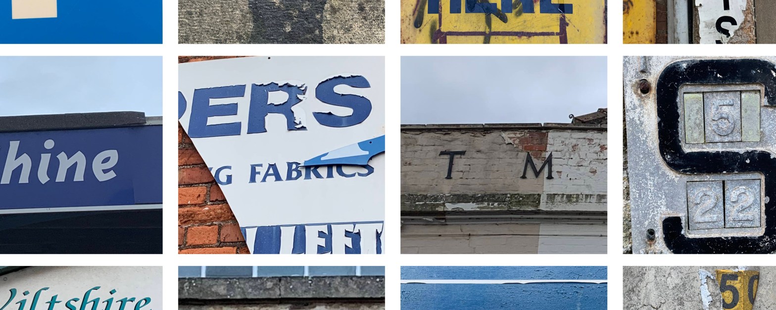
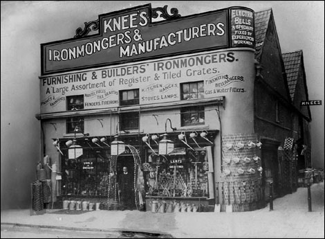
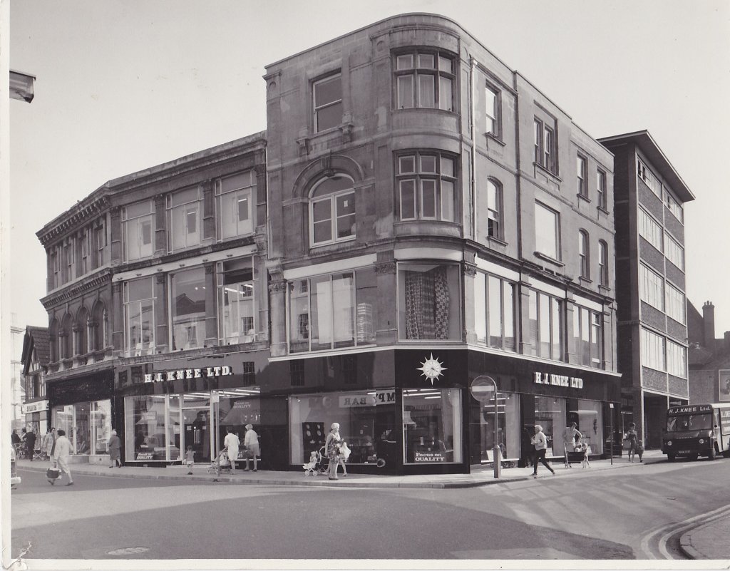
In these older photos of the town there is a real mix of typographic application? From hand painted shop fronts, elegant serif fonts to san serif 3d signs. For me it feels as though the town has always been slightly unknown? maybe undiscovered. A stand out from these photos is Knee’s, This comes up allot in photos, a staple in the town at the time? Its vibrant, energetic in its presentation from both the shop front and its accompanying printed materials (shown below) The shop which is craft based uses a serif font which shows hand crafted goods and excellence in their meticulous approach.
If you compare this to the same shop years later, they have gone for a more formal, 3D and structural based san serif font. Is this a move to wanting more trust between them and the client? Or an advertising move to be more dominant in the town?


Current typographic treatments in Trowbridge, Wiltshire. Signs of what was once there? But a degrading and deteriorating town which is trying to bring itself back. If I was to share this with someone and get feedback on what type of town / location these came from, the response I think would be a town which isn’t keeping up its appearance, a lack of money in the town? A troubled mood?
Trowbridge was known for its wollen mills but these are only now evident in the crumbling buildings, that rich creative feeling has been lost. There is an eclectic mix of typographic forms around the town, but care in the placement, upkeep and design is minimal, only on occasions is there glimmers of a rich, flourishing past.
Saying this does the mix of forms do cling on to a town which still has its creative routes but they need to be unearthed and discovered behind the walls? What if all the signs were updated and replaced? What if they all went back to being hand painted?
51.319583.-2.208181
51.319353.-2.208060
BA14 8AS

BA14 8DL
51.321815, -2.203465
BA14 8DL
51.321815, -2.203465

BA14 8BR
51.319748, -2.209355
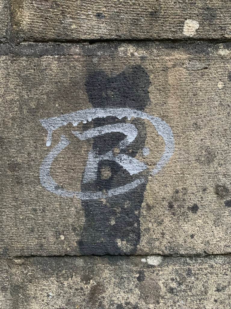
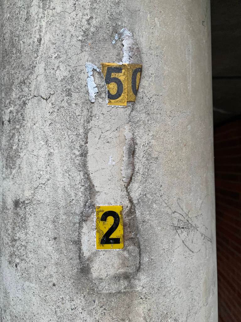
I started to explore what was happening off the main high street, this again revealed an eclectic mix of letterforms. No clear town identity? There is a mix of graffiti letterforms, signs and information graphics. All part of what most likely makes up similar towns local to the area / UK
Trowbridge
51.321921, -2.203566
Trowbridge
51.321892,-2.203460

51.321850,-2.207264


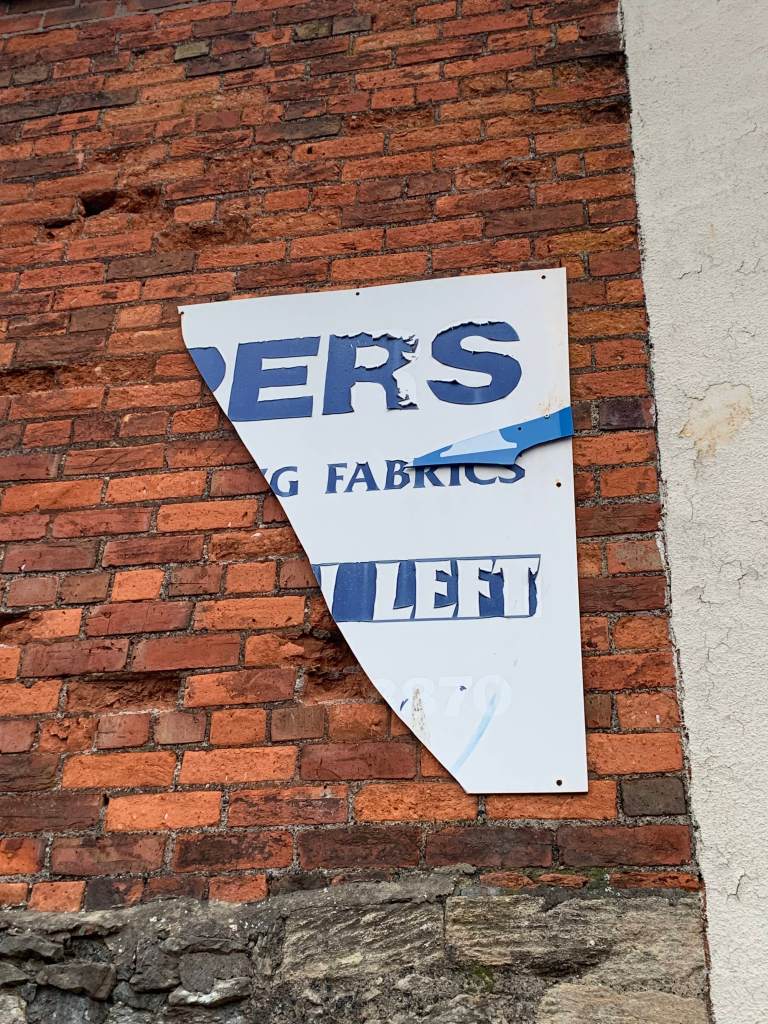
Below is a spark of history which still stands within the town? This filled me excitement? A Serif metal font standing proud on a prominent row of shops within the towns silver street. But below… damaged, corporate advertising, hanging on, ripped, with not clear thought? For me this picture really sums up what is going on within the town.
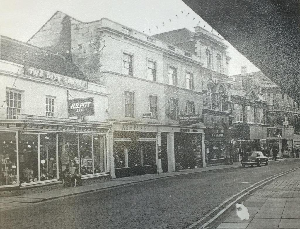
Below you can see the original 1945 Pittman House vs what it’s like today. Same typography, same building. But… The towns have two different identities. Left a vibrant full town on the right a sad looking town in need of a cash injection? Has this been town felt the huge effects of the high street collapse?
BA14 8AA
100 Word descriptors of chosen 5:
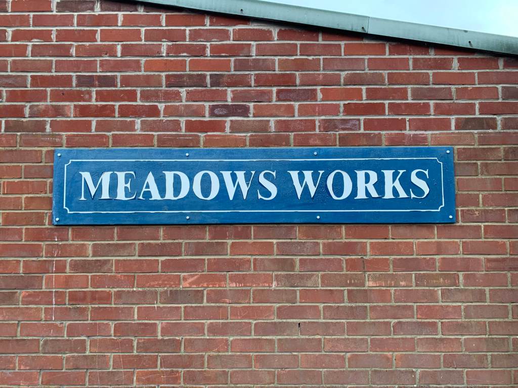
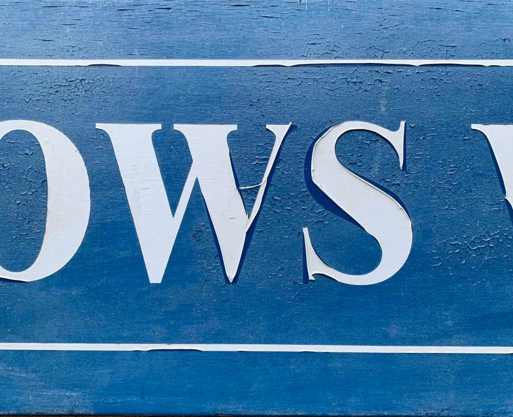
1. Meadows Works
A sign which looks authentic but is new in its application. This serif font is tucked away down a back street, called court street on what is part of the old Brick Factory (Mills) It’s main output isn’t obvious within the sign, however it’s san serif presentation could point towards a meticulous and high quality output from the mill. The sign is weathered with peeling vinyl letters, however this is coming away to reveal the original colour a dark rich blue. Its purpose is to signpost ‘meadows works’ which it clearly does in its large impact form however its deteriorating nature adds to the town’s feeling of struggle and worry?

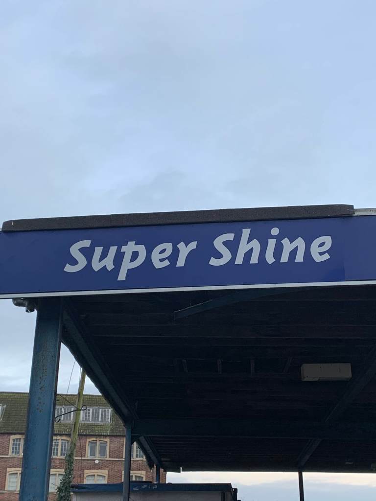
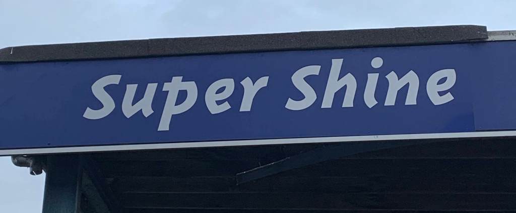
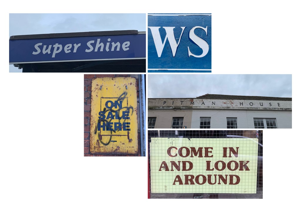
2. Super Shine
A quirky, put together serif font standing bold above the hand car wash plaza, which this sign is for. It’s white in its display but there is an element of fun to the typeface. It’s in complete contrast to other typographic applications within the town. It’s sense of playfulness leans towards an attraction, an arcade or noise? Which to an extent happens with the noise of the car wash but again, does this lean towards a confusing identity for the town?
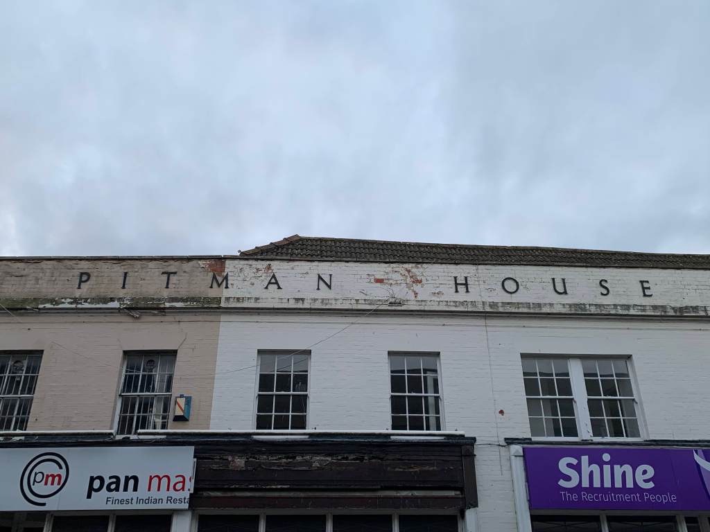
3. Pitman House (former cloth mill, owned by Pittman, invented shorthand)
The letterforms stand high above silver street, Trowbridge on the original pitman factory. The letterforms looked to be made from metal and attached individually to the building. These give us a look into the once creative, full working town. Behind the medium weighted forms however you see the crumbling paint work showing that sense that production has stopped and the weather has taken its toll. Whoever owned the factory clearly wanted to make a statement with the large lettering but at the same time keep it elegant? Could this point towards what was made within the factory.

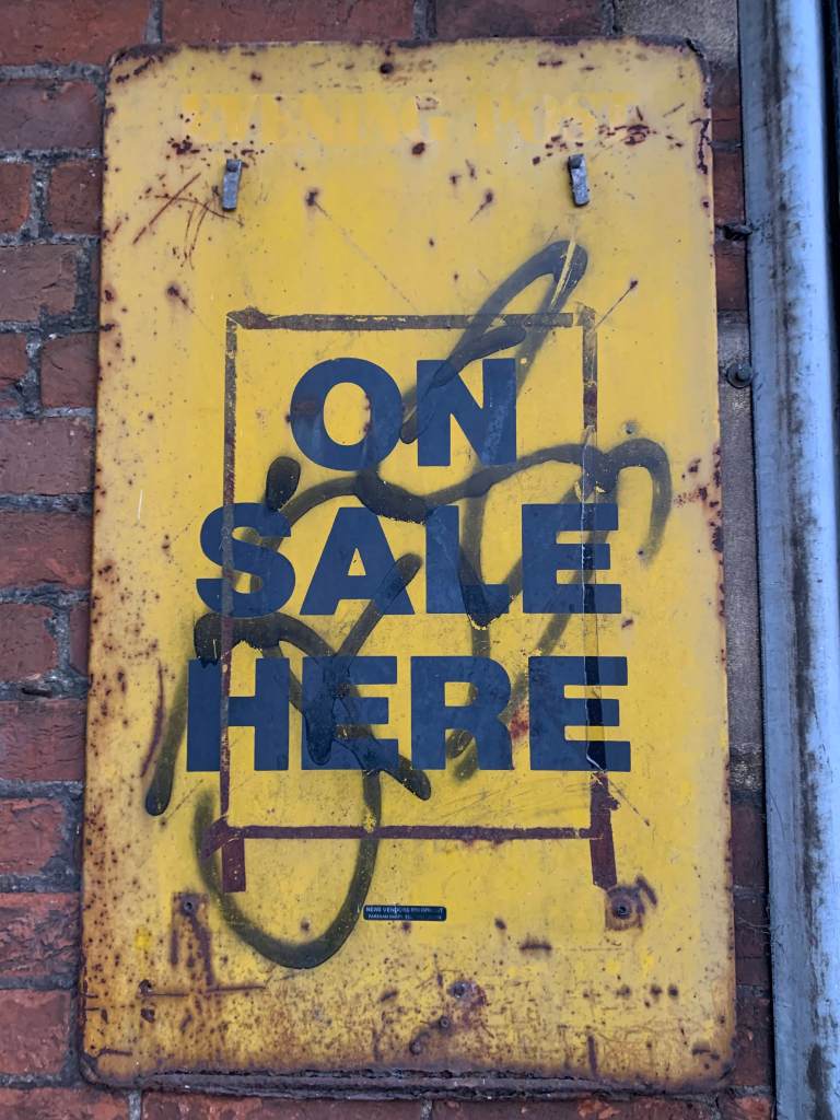
4. On Sale Here
Bold, San Serif slab font covered with graffiti upon a bright yellow metal rectangle sign, presenting the words ‘On sale here’. Above the main presentation you can just work out ghost words spelling out ‘Evening Post’ A sign which was once for the newsagents around the corner? It’s been weathered, vandalised and what looks to be tape from an old sign which was stuck on top. This for sums up the identity of the town, once open, now, stuck in a place which is struggling to show it’s true potential and once flourishing past?

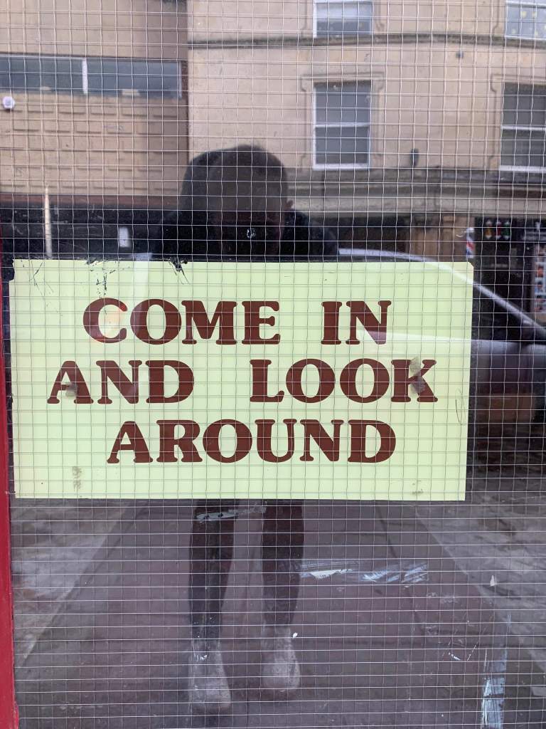
5. H.B Pitt (come in and look around) shown below
A modern rounded serif font adorning the shop door of a now closed kitchenware and gifts shop which previously was an ironmonger and before that a pub. It’s still intact with little to no wear and tear. Presented on a cream background the font gives a bubbly feeling however the colour does not, a muted brown shade. The sign wants you to come into the shop but its appearance lacks intrigue. The font also contrasts with the more ornate serif font which covers the other windows in the shop. With the shop now being closed, the sign is waiting for the next business to move in, when and who is unknown due to the town’s uneasy status.

Research
Sarah Hyndman Type Safari –
Sarah’s type safari’s open up the question of what type of letterforms are in a given location and what history (design) can we learn from them? Does it give us an insight into the creative journey that location has been on? In light on coming across “Type Safari’ I want to take myself on a few around local towns to see what moods, identity’s are discovered?
However how far should we read into typographic choices?
Final Outcome
Weekly Reflection
References
Fig. 1 – https://www.wiltshiretimes.co.uk/news/14681606.looking-back-on-hb-pitts-115-year-history/
Fig. 2 – https://www.bbc.co.uk/wiltshire/content/image_galleries/historic_trowbridge_photos_gallery1.shtml?38
