Lecture Comments
Design Development
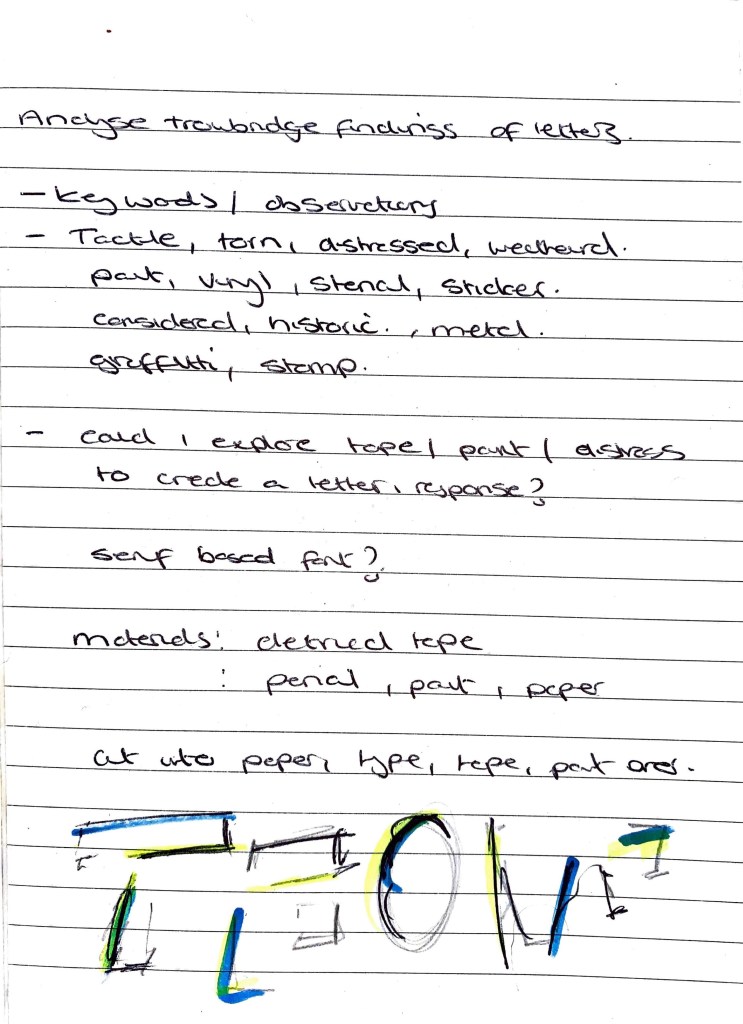
Initial thoughts from analysing letterforms found in location. Considering key words, materials and application. Through observations I have started to think this will be an experimental but evolving font? Distressed in areas to show the town’s current known status and visual appeal but also areas of structure / material to highlight the towns silk / woolen history.
Could I start to explore how fabric / tactile materials could play a part in the construction of the title typography.
First workings from seeing location type
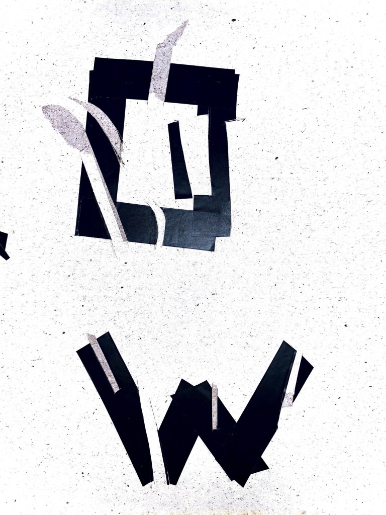
I wanted to capture that element of deterioration and weathered mood here. But not that I wanted to almost use a similar vinyl material. Here I have used electrical tape to start constructing the letterforms. This then led me to start cutting into the letters at different points, to distress, at the moment though I think it feels too forced, it needs to be more natural?
What I want to start next is bring in other layers and textures, to really emphasis the past and present status of the town. How can I get these letters to work together to produce a title? At moment they are being treated individually? Is there a way of connecting them which links to the town’s identity?


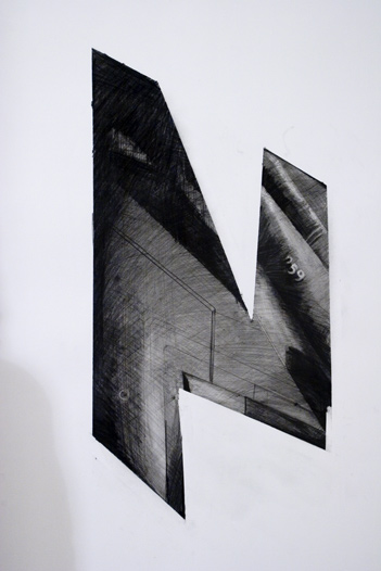
Layering, deconstructing, adding light – Following on from my initial experiments I want to try a slightly different route using more formed letters (below) The process of getting here was quite laboured however I think the outcome is starting to give a sense of the town. A confused and broken look.
I’ve taken direct visual references from the visuals I collected but also artist Daniel H Cantwell. Daniel merges and connects his typography forms together to present abstract outcomes, almost showing a journey.
What I think is failing here is potentially the font choice? I need to be more explorative with the existing font potentially? This may add further layering. Or does the towns identity require a few different variants? Something to explore further in the coming week
A few questions on these:
Could I add colour into these experiments?
What if I mixed both san serif and serif fonts together? Would this be to confusing
How legible does it need to be? Am I holding back slightly to make sure the legibility is there
Next stages of the experiments:
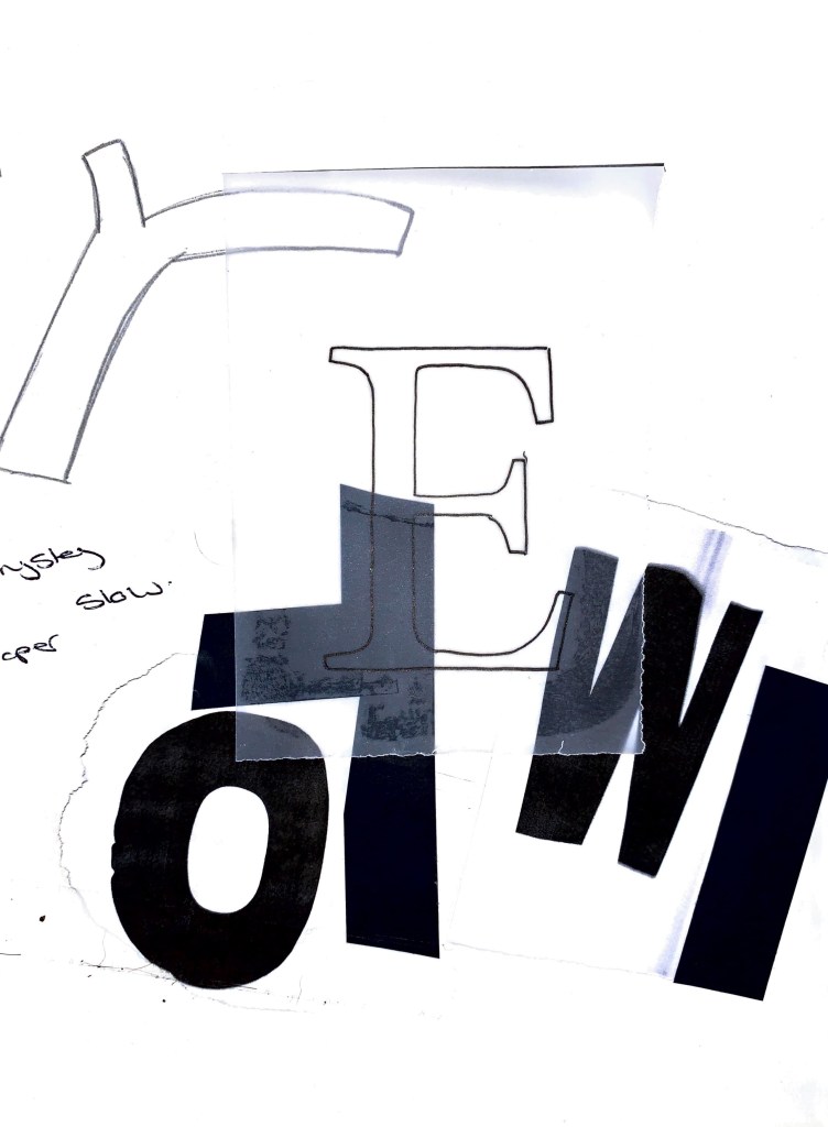
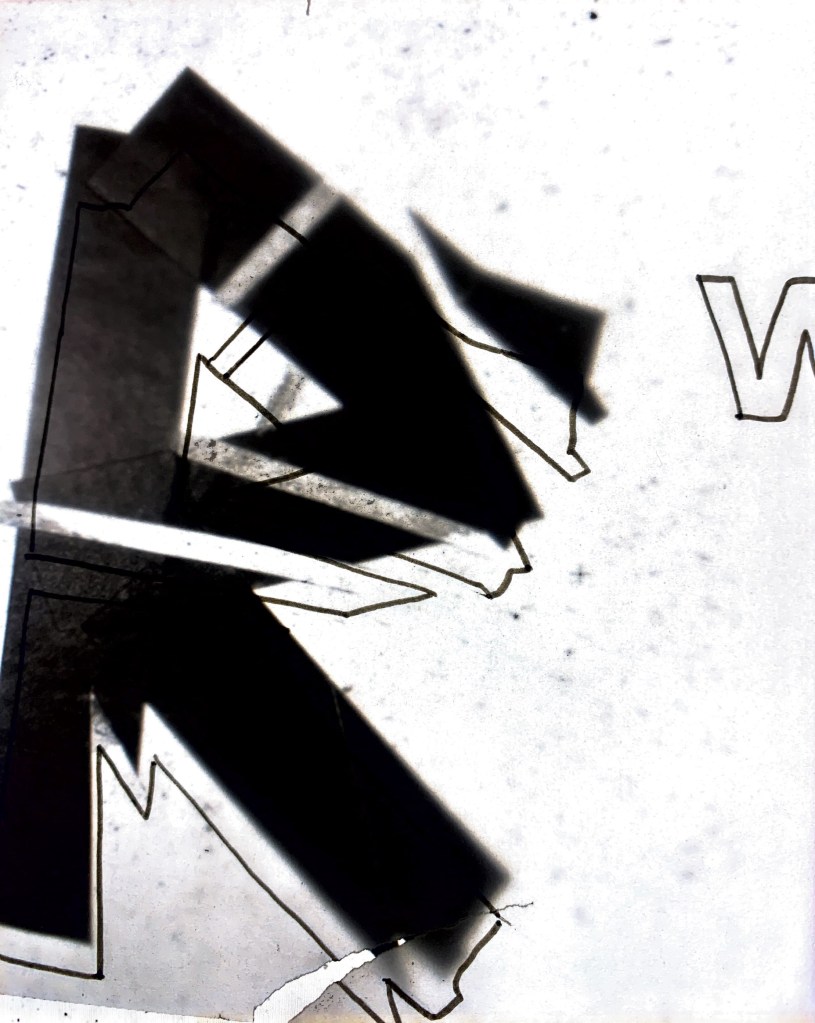
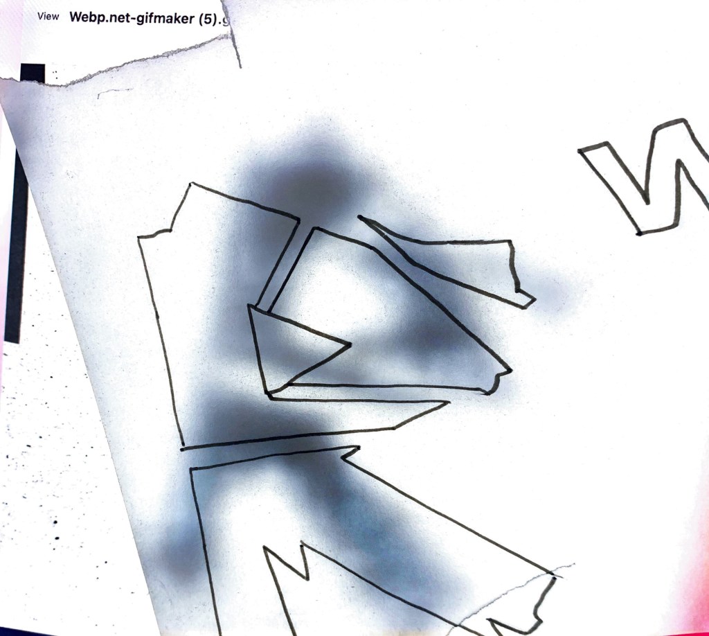
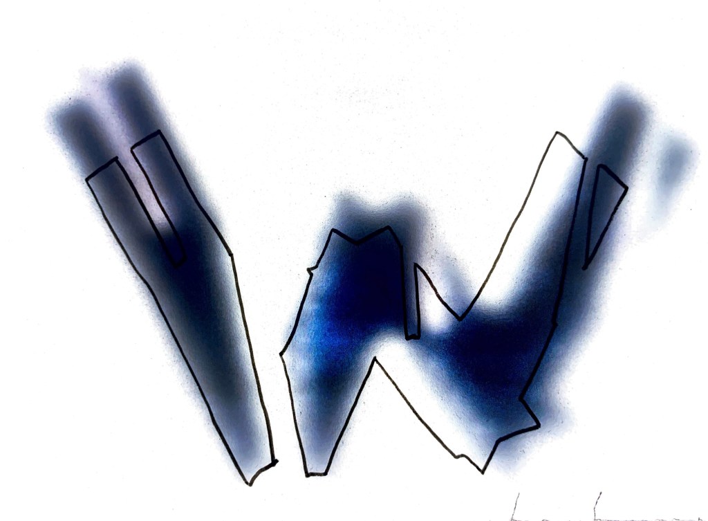
I reverted back to my first initial card and tape designs, these had an element of tactility and emotion which I wanted to carry through. I started to introduce the screen and tracing paper to give that sense of hiding / unknown / past is being hidden. These were then layered with an additional line observation. The line observation however might be to much?
At this stage I am not sure what the line is adding? It adds clarity to the tracing paper photo but part of what I want to show is that sense of illegibility / disrupted down. How can I use the elements I am creating to get across the right sense of emotion?
Should the lines within the letters be there? Is it to much? If this was a full alphabet how would those lines be consistent?
What I do think is working really well however is that opaque/ mottled window later – this could also give nod to the amount of closed shops on the high street of Trowbridge, Wiltshire. What once went on behind the closed shop windows.
Pushing forward idea to create title typography
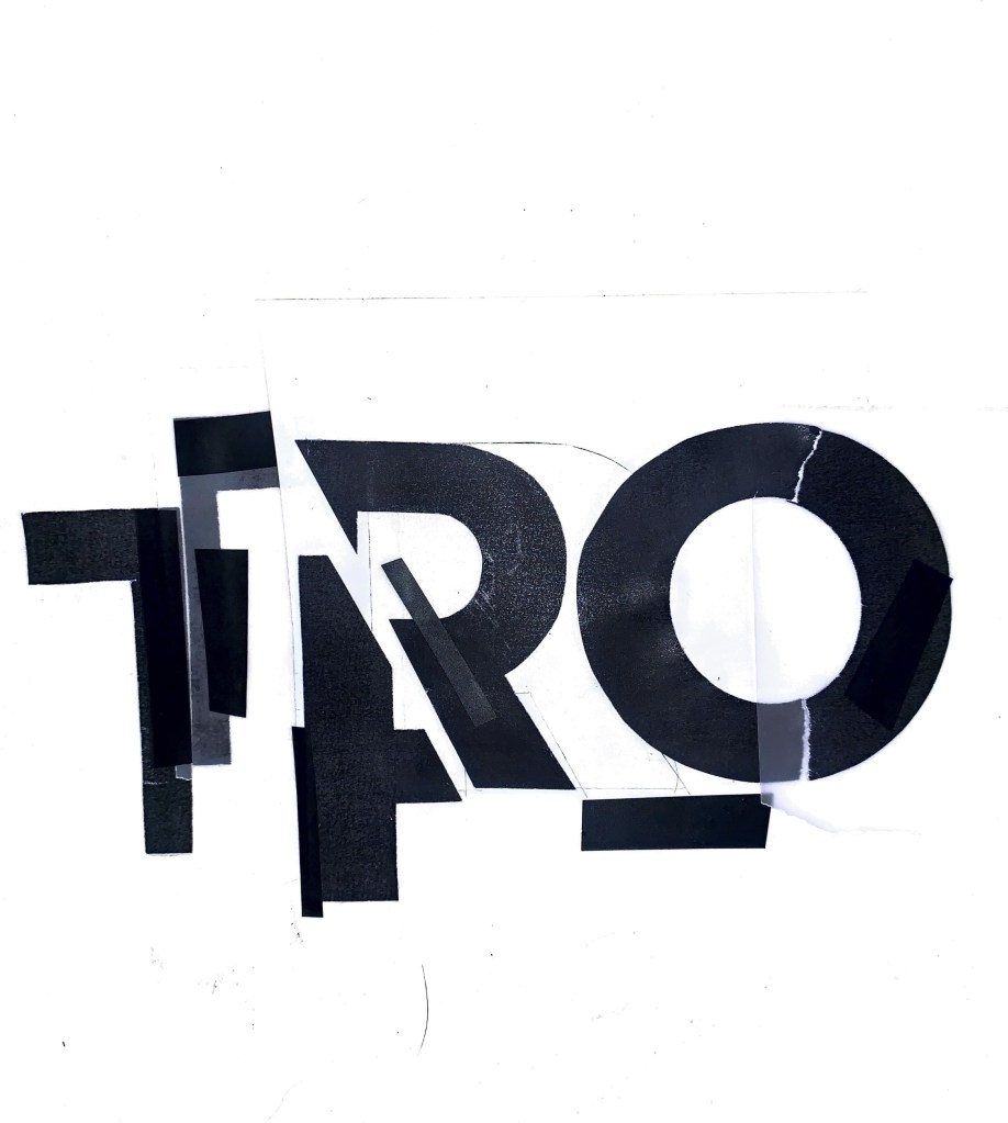
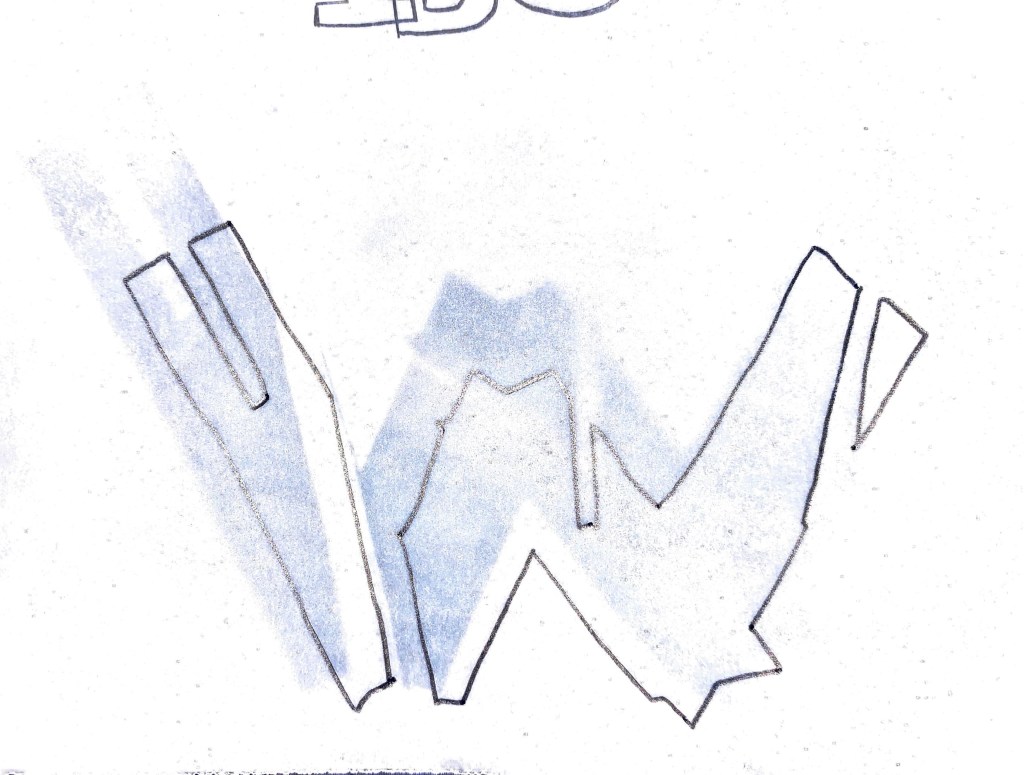
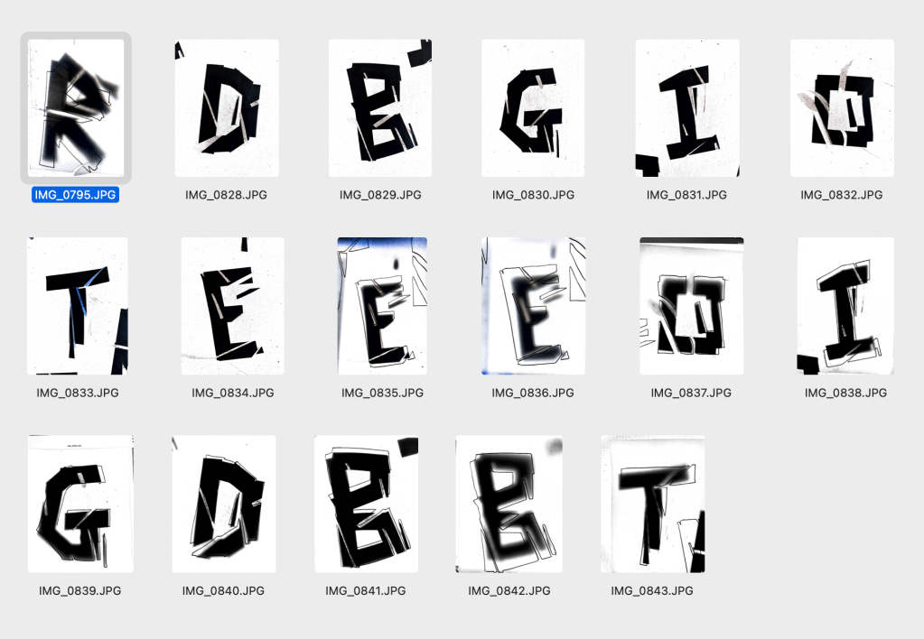
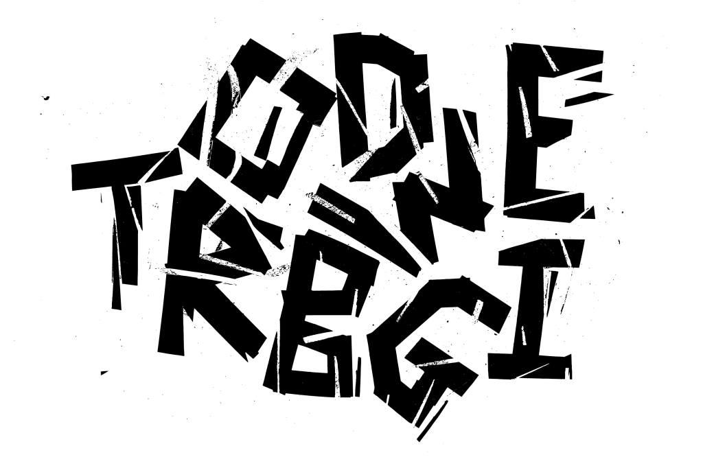
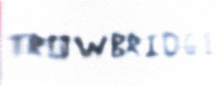
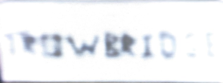
Following on from positive experiments with the typographic I applied this working to the rest of the letters within my location. Both without tracing paper and with to see which was working better.
Strengths here: I feel as it has successfully taken elements from the typographic vernacular collected from around my location. This has been supported by a viewers take on the town.
Once constructed and presented as a whole title, it’s bold, but has an element of fragility showing the location is struggling in areas but has had a creative past, which can be seen in areas around the town (opaque letters)
What I want to do from here is consider different variants of the title? Could it be stripped back? Could there be colour added to add further emotive signals? Or will colour turn this into a title for a different location? I need to consider sizing and placement further.

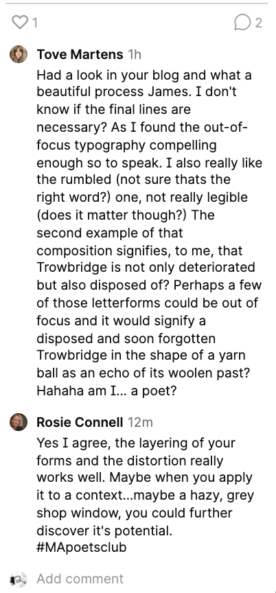
On the ideas wall, Tove made a comment on the addition of the ‘lines’ that maybe they’re not necessary? I want to explore this to see what feeling that gives to the title.
Tove also comments in a below experiment where I have stripped the opaque application away to give a more chaotic and illegible representation, what I like here is the shape and layout of the letters? Instead of it being in a straight line could the structure of the letters help signify the emotion and identity?
Rosie comments on the context side of the title, saying once applied to a surface could this enhance the identity and overall feeling? I am going to explore a set of juxtapositions of the title typography on location within the town.
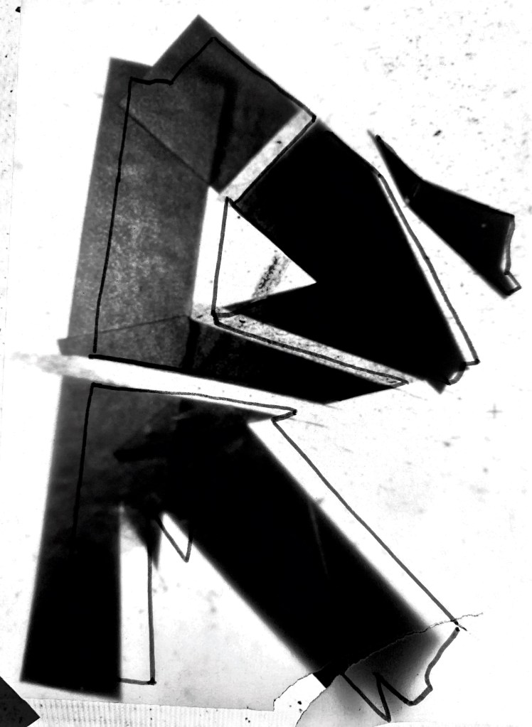
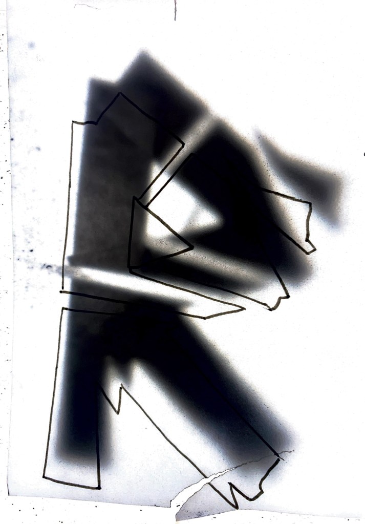
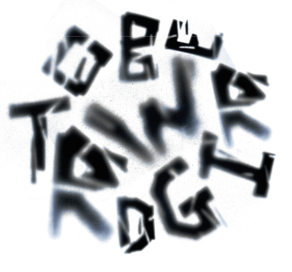
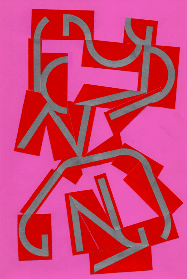
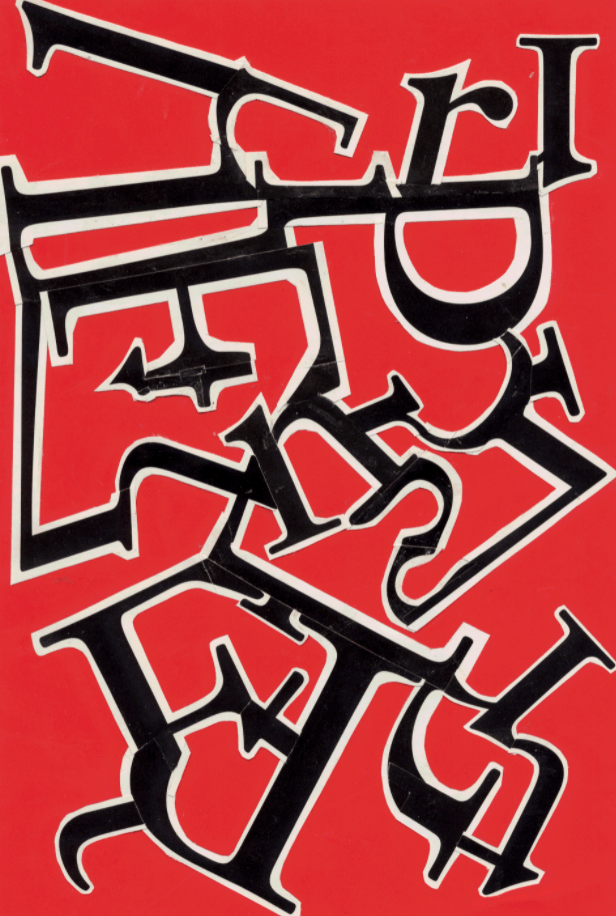
The original designs below have started to be constructed into a form (shape) to add to that ongoing unknown? Is the fact it’s illegible as a title ok? Maybe The lines here are again to much? This way of working has been informed by the work of both Cecil Touchon and Daniel H Cantwell. Deconstructing the letterforms, overlaying, mashing to create more of a design rather than a piece of typography.
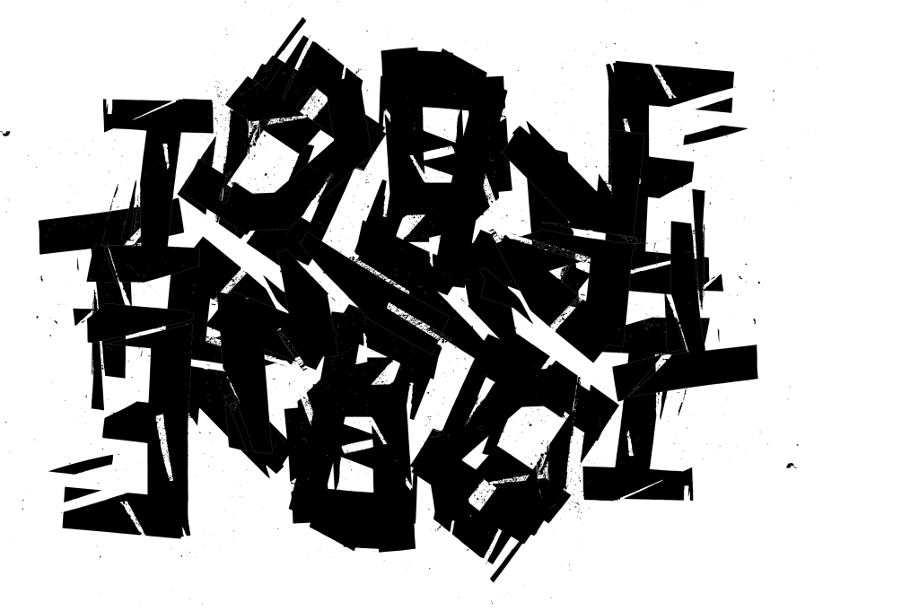
Below I have taken the approach to remove the overlay line. This gives a more paired back look to the title and less fussy? This I love! It feels like it’s eroded by the weather, a shop sign that’s been bleached by the sun. But can I go further? Is it still to legible?
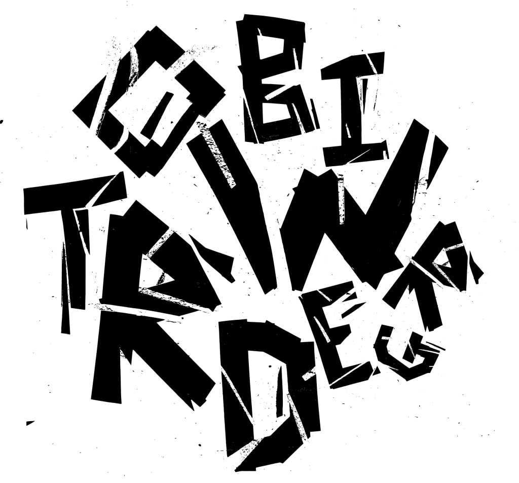
Maybe the horizontal layout is looking too formal? Here I took some inspiration from Tove who mentioned mixing the letters up to almost look like a ball of wool (this relating to old mills that once dominated the town)
Illegible and also starting to look like a mark? Is this starting to look to much like an icon/logo? It’s chaotic layout does work with the identity of the town so I want to explore further in how this can be displayed.
Below I start to degrade the title typography by repeating a process of tracing paper and screen capturing. This leaving hard to see letters which become hidden in the background. What’s working here is that some of the letters are standing out more than others, this going with the identity of the town. Some parts of the town are still flourishing but others have faded (the historical, creative parts) these being the more faded illegible letters.

Research
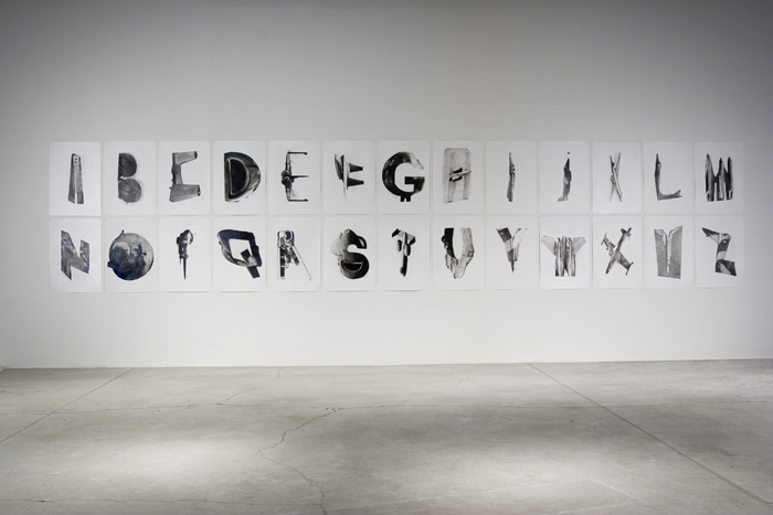
Fiona Banner, The Bastard Word
Taking influence from objects, place, material and form to present a unique family of letterforms. What I love here is how Fiona is breaking the rules of typography. When viewed as a set it works, it communicates a vision which has been documented from looking, seeing and researching. While we look and observe letterforms in our town I wonder how much of the surrounding structure of the town influences / influenced that decision? For me the placement and areas the typography I have found also plays a vital part in how I view that letterform and the overall identity of the town.
Lance Wyman – Olympic Logo 1968 – Mexico


Daniel H Cantwell
Final Outcome
Weekly Reflection
References
1. http://www.fionabanner.com/works/bastardword/index.htm?i44
2. http://lancewyman.com/brand-project/mexico-68-olympic-games/
3. https://www.behance.net/gallery/4166431/Graphic-Deconstruction-3
