Lecture Comments
Design Development
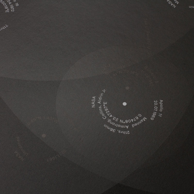
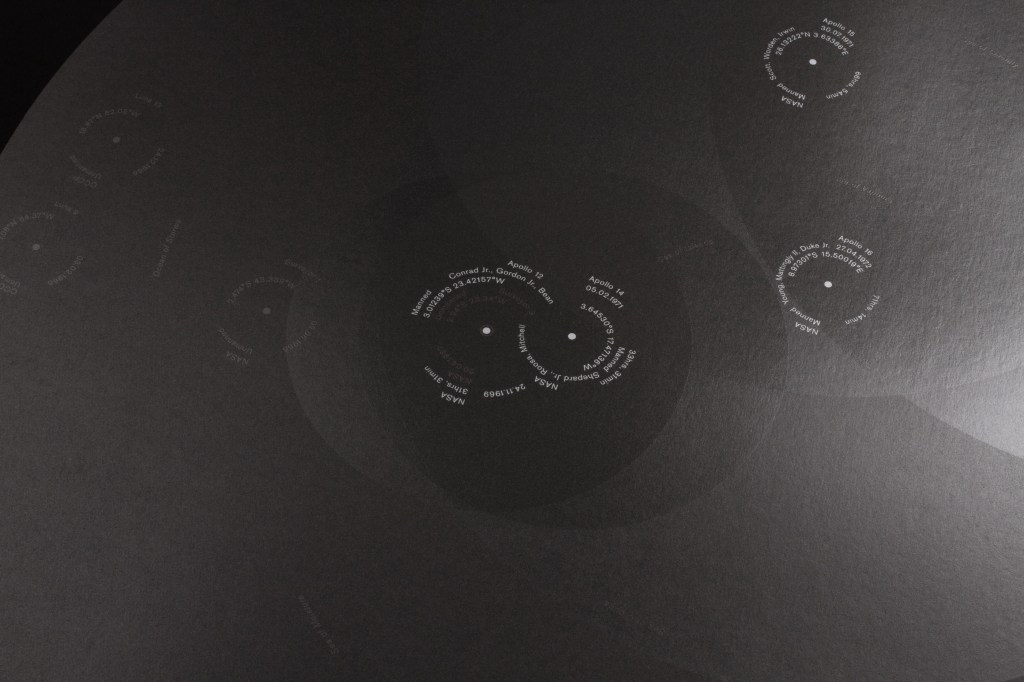
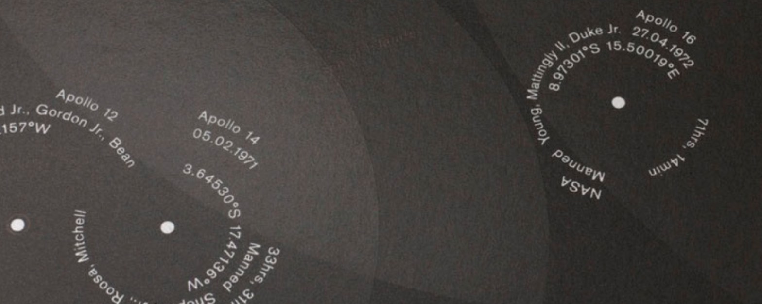
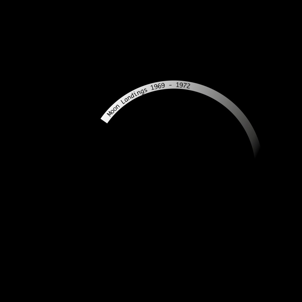
Chosen infographic: Moon Landings Accept and Proceed
Initial Thoughts on infographic:
Visual representation on first view is clear however when zoomed in does it loose it’s context and become unknown?
Clearly labelled on each ‘landing’ which is vital information
Without the overview would you know this is linked to the moon? Could there be more visual representation of the spacecraft’s, textures, and NASA involved somehow? Even if small.
Simplicity around the shapes depicting the moon, the black and white give a sense of the feeling of being on the moon/in space. Quiet, alone and empty.
I find the infographic quite personal to those involved / those who supported the mission? It acts as a memorial in a way?
Animation element – This I feel is fluid and soft? Again could it be more representative of the mission to the moon? The angle the spacecraft goes in?
Stories Discovered:
The stories of those missions has been captured within this graphic, making it a personal and emotive piece. Documents the journeys taken and those involved. How little we have been to the moon recently? With technology advancing why have we not been to the moon more?
Use of shape
use of circles? Relating to the shape of the moon and the earth? a connection of how we got there. Designer made a clear decision to only use circles.
Circle – a round plane figure whose boundary (the circumference) consists of points equidistant from a fixed point (the centre).
Colour
Black and white to relate to the original landings? B+W TV? colour of the moon? Dust. Colours are wavelengths reflected by objects to the human eye. White is pure light and black is the absence of light.
Relation to other space infographics:
While looking into other ‘space’ infographics many were brightly coloured and included icons and imagery to show the subject area (for example, stars)
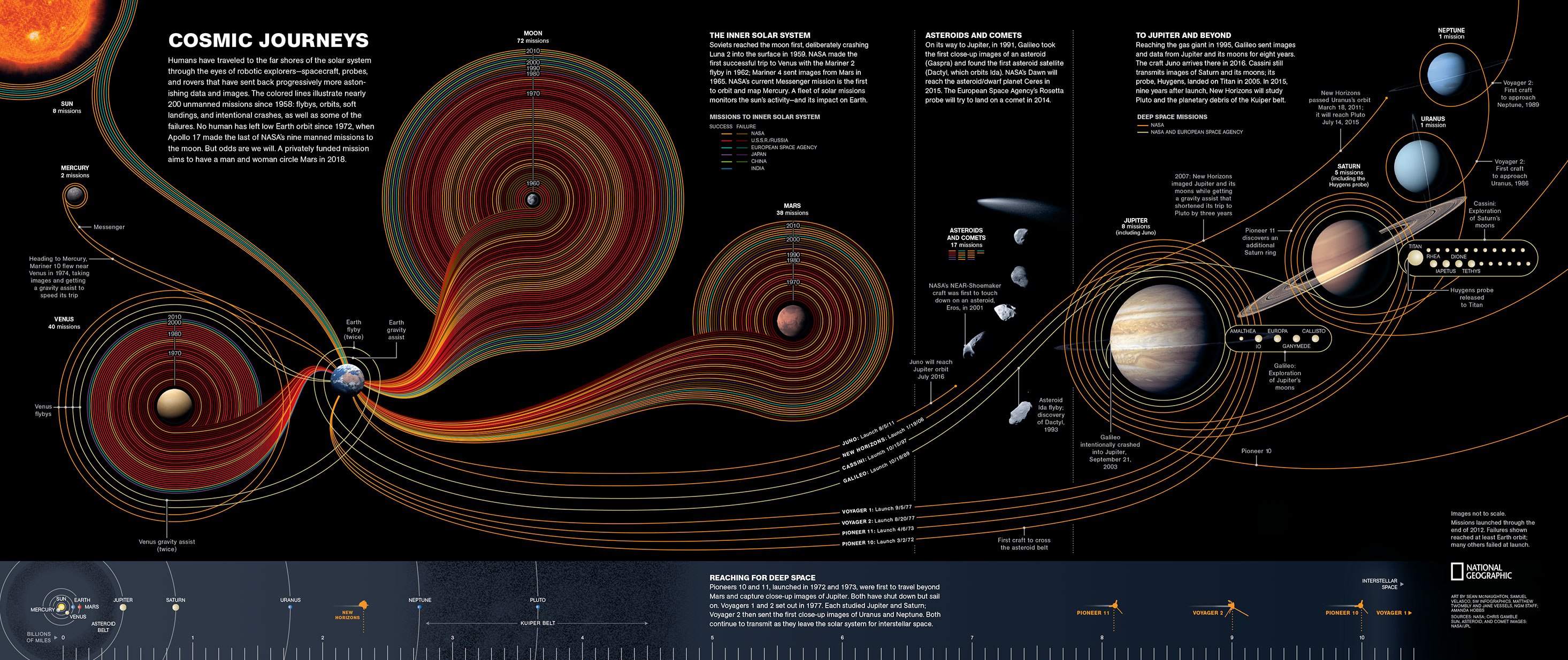
Below is an example of this. A beautifully presented infographic documenting 54 years of space exploration. Lines showing the journeys taken to each planet, this clearly shows areas we have been to most and those yet to be discovered more. Each colour line is a different country. The fluid and smooth lines show movement bu also start to build an architecture of our time in space. Are the way the lines placed to show the entry and exit points to earth?

Editorial Design
Visual references for text layout within editorial, looking at the launch trajectory to the moon. Could this act as a grid for elements of the typographic within the editorial.
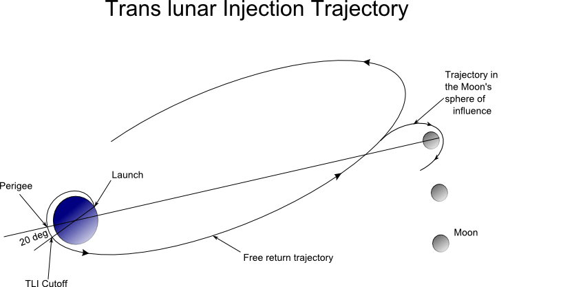

Initial sketches / thoughts for editorial design. Looking at how this can be multiple pages exploring the use of type and space. Could I carve out certain areas where the type shows through, a nod to the original infographic. Also looking at how the trajectory of the launches can play a part in the design.
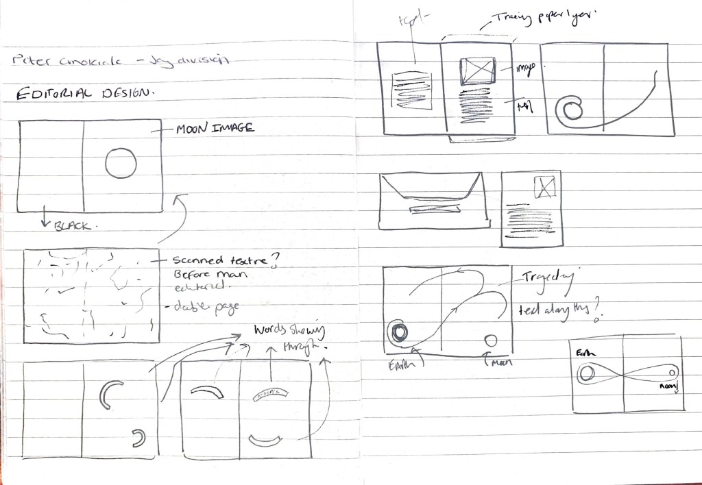
Second Draft of editorial, incorporating another page with the ‘earth’ and ‘moon’ to balance out the pages which are separating the text.
500 Word Analysis
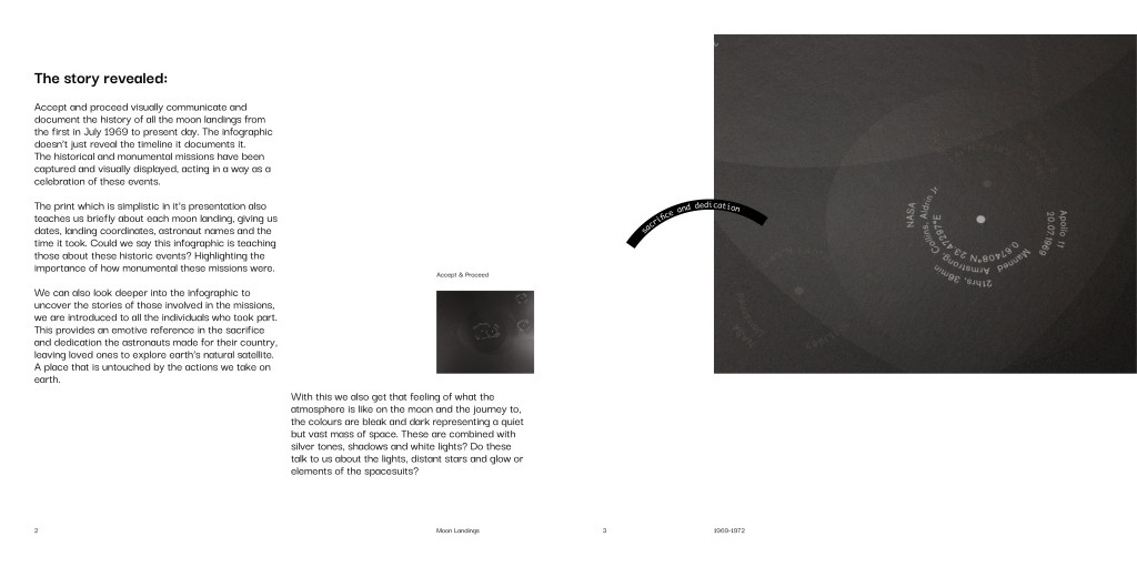
The story revealed:
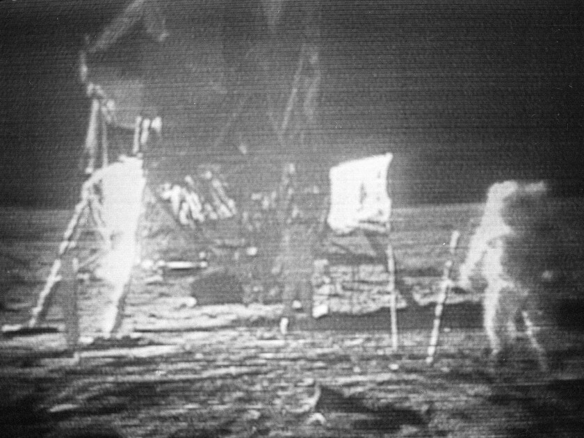
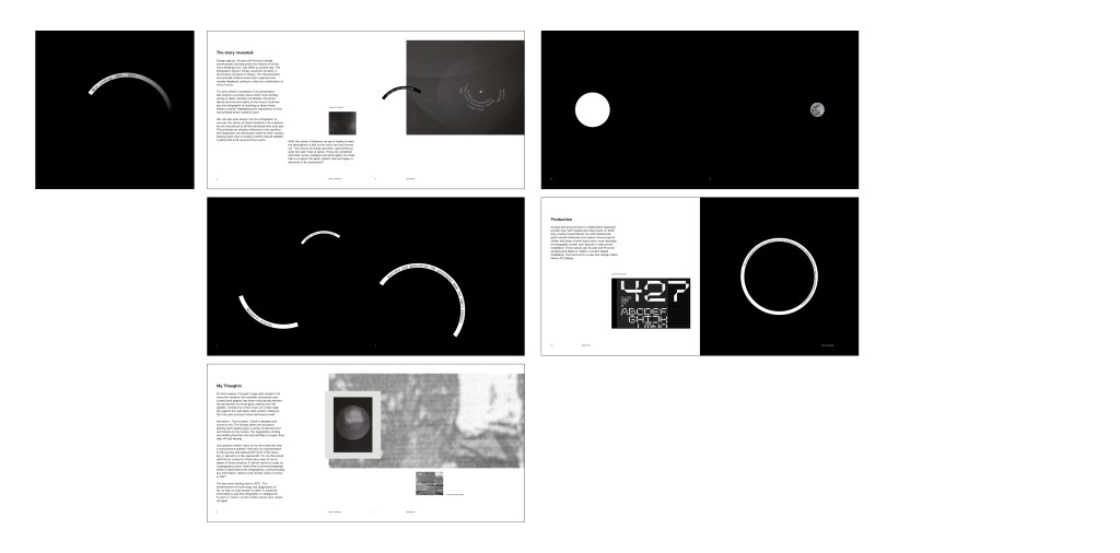
What is being told within the graphic? Design agency, Accept and Proceed visually communicate and document the history of all the moon landings from July 1969 to present day. The infographic doesn’t simply reveal the timeline, it documents moments in history. The historical and monumental missions have been captured and visually displayed, acting in a way as a celebration of these events.
The print which is simplistic in its presentation also teaches us briefly about each moon landing, giving us dates, landing coordinates, astronaut names and the time spent on the moon. Could we say this infographic is teaching us about these historic events? Highlighting the importance of how monumental these missions were.
We can also look deeper into the infographic to uncover the stories of those involved in the missions, we are introduced to all the individuals who took part. This provides an emotive reference in the sacrifice and dedication the astronauts made for their country, leaving loved ones to explore earth’s natural satellite. A place that is far removed from earth.
With this sense of distance we get a feeling of what the atmosphere is like on the moon and the journey too. The colours are bleak and dark, representing a quiet but vast mass of space. These are combined with silver tones, shadows and white lights. Do these talk to us about the lights, distant stars and glow or elements of the spacesuits?
My thoughts on the graphics
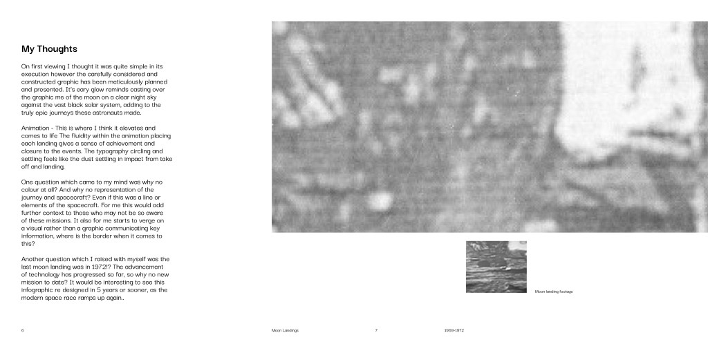
On first viewing I thought it was quite simple in its execution however the carefully considered and constructed graphic has been meticulously planned and presented. Its eerie glow, casting over the graphic, reminds me of the moon on a clear night sky against the vast black solar system, adding to the truly epic journeys these astronauts made.
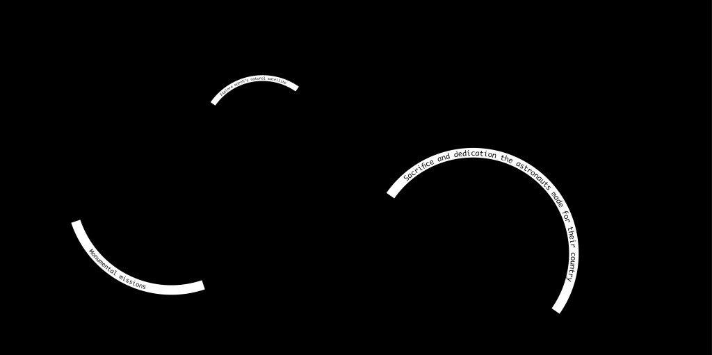
Animation – This is where I think it elevates and comes to life. The fluidity within the animation placing each landing gives a sense of achievement and closure to the events. The typography circling and settling feels like the dust settling on impact from take off and landing
One question which came to my mind was why only a monochrome palette? And why no representation of the journey and spacecraft? Even if this was a line or elements of the spacecraft. For me this would add further context to those who may not be so aware of these missions. It almost starts to verge on a typographic piece rather than a universal language which is associated with infographics, communicating key information. Where is the border when it comes to this?
The last moon landing was in 1972… The advancement of technology has progressed so far, so why no new mission to date? It would be interesting to see this infographic re-designed in 5 years or sooner, as the modern space race ramps up again.
Production
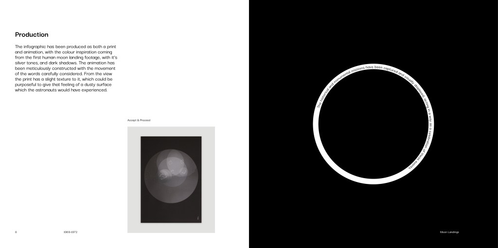
Accept and proceed have a collaborative approach to both their self initiated and client work. In 2019 they created ‘Explorations’ the self initiated site which would showcase and explore these projects. Within this body of work there were ‘moon landings’, an infographic poster and ‘Spectra’ a data driven installation. These pieces got Accept and Proceed working with Nasa on ‘Grace’ a screen based installation. This work led to a new font design called Grace-FO Display.
Research
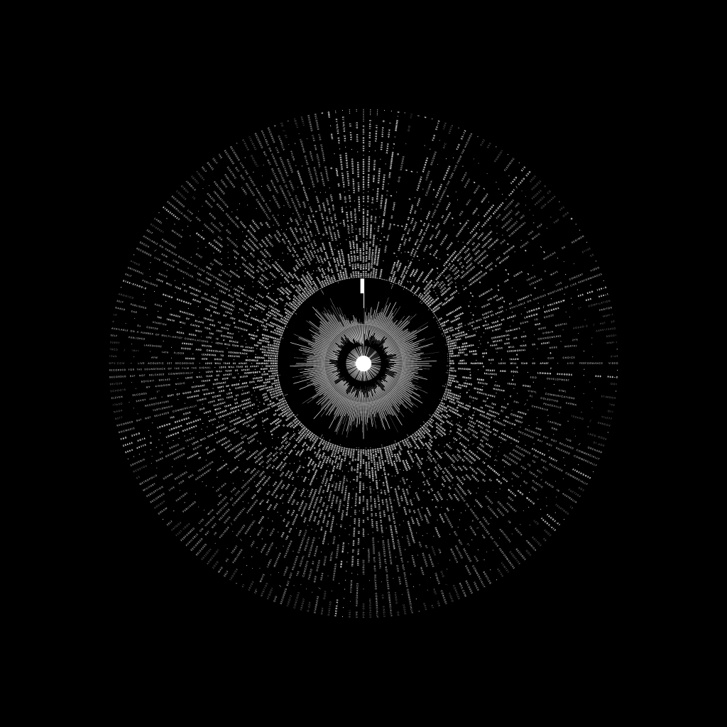
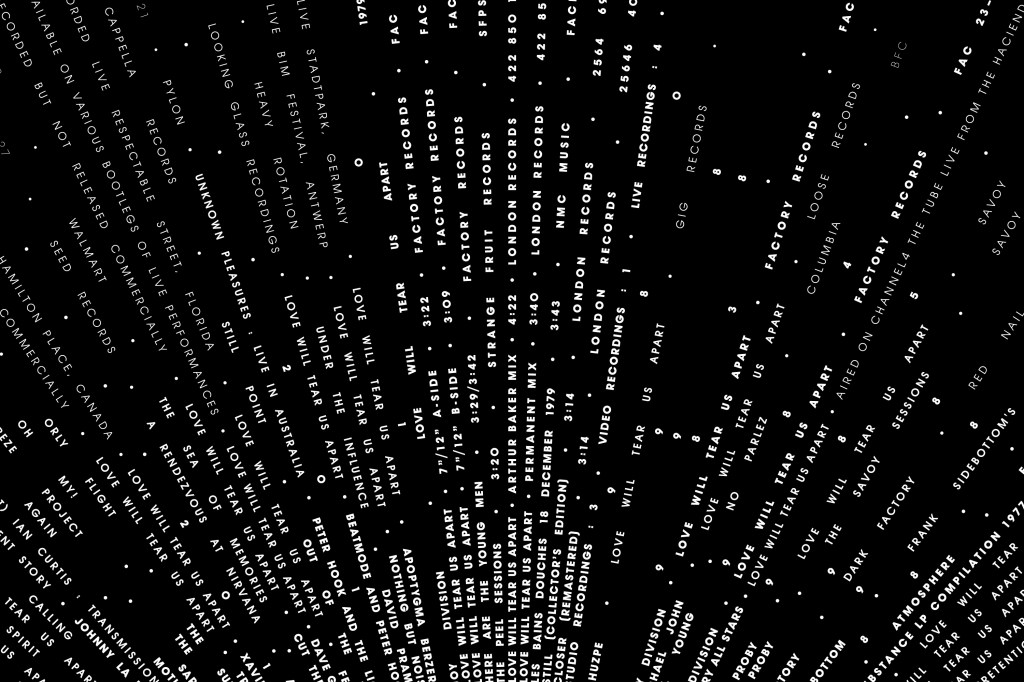
Peter Crnokrak – Love will tear us apart again – Joy Division
Pure simplicity and beauty within this infographic created by Peter Crnokrak. Documenting all the covers of the Joy Division song ‘Love will tear us apart again’ originally recorded in 1979 till present day (2021) It’s visual presentation is effortless however I think many viewers may find the information overwhelming and hard to digest. The infographic has a clear key documented.
What makes this stand out is that it goes beyond 1 type of information. The central circle depicts the comparative waveform analysis of the three studio versions.
Though not mentioned the shape of the final graphic looks to be a vinyl record? I could almost see this being the sleeve.
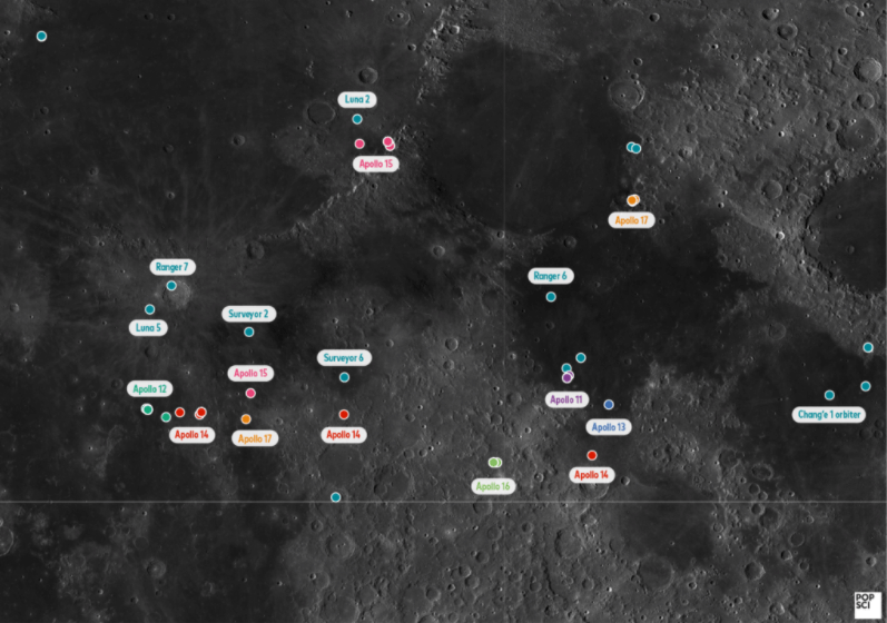
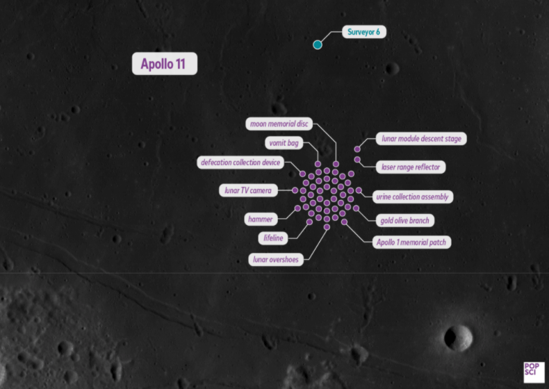
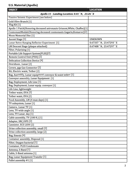
Sara Chodosh – Items we’ve left on the moon.
Mundane information made interesting. This infographic explores the items left on the moon from the missions which landed there. They go into great detail on location and what object was there. These have been documented by NASA in the Manmade materials left on the moon catalogue
What works here is the photograph (real location photo) simple dots and text boxes. This graphic makes it so clear and easy to read and see the location. What I think would elevate this is if we could see the whole moon and where these sit? This would show the scale of the moon and the scale of the objects. Here the objects look massive on the moon’s surface.
Final Outcome
Weekly Reflection
References
1.https://www.petercrnokrak.com/love-will-tear-us-apart-again/
2. https://anatomyof.ai/
3. https://www.petercrnokrak.com/
4. http://cosmicdiary.org/fmarchis/2014/05/19/54_years_of_exploration/
5. http://www.5wgraphics.com/img/newsletter/50-years-of-exploration.jpg
6. https://history.nasa.gov/FINAL%20Catalogue%20of%20Manmade%20Material%20on%20the%20Moon.pdf
7. https://history.nasa.gov/afj/launchwindow/lw1.html
8. https://www.itsnicethat.com/articles/nicer-tuesdays-2019-accept-and-proceed-graphic-design-140619
9.https://www.acceptandproceed.com/explorations
