Lecture Comments
Design Development
Potential Routes to discover:
1. Weather data – Could I look at one area of weather data in a certain location? All weather data would be too overwhelming and hard to narrow down and communicate within a short period of time. For example I could look at ‘river flow’
UK:
Sunlight hours?
Rainfall Amounts?
Snowfall Amounts?
Cloudy days?
Highest Wind gusts?
UK Flooding
UK weather trend (tempreture)
– Monthly, seasonal and annual number of days in the month with precipitation amount >= 1mm for England
Chosen route to discover: Rainfall amount in England from the past 10 years. Looking at monthly rainfall amount, seasonal rainfall amount and annual rainfall amount.
Initial Sketching of infographic ideas.
Thinking about how the presentation can be complex but simple in its legibility. Can simple shapes (circles, squares) be used to show the data across a long period of time. Once overlapped and layered they become a visual within themselves. This visual showing the rainfall amount across England within a period of time.
Could different colours represent different years? Or could colours show different amounts of rain for example over 100ml or below 50ml? Viewers need to be able to understand whats on show. Does the information being shown communicate anything?
Right hand page page I’m starting to look at a grid based system which can be filled in relation to the data available from the Met Office. Going off a structure of a bar graph in terms of axis.
What if each year / month had it’s own infographic and these come together to create one full infographic?
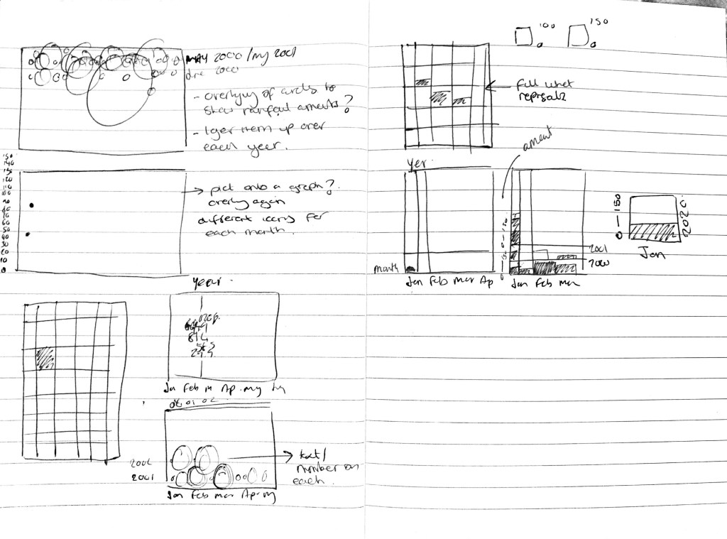

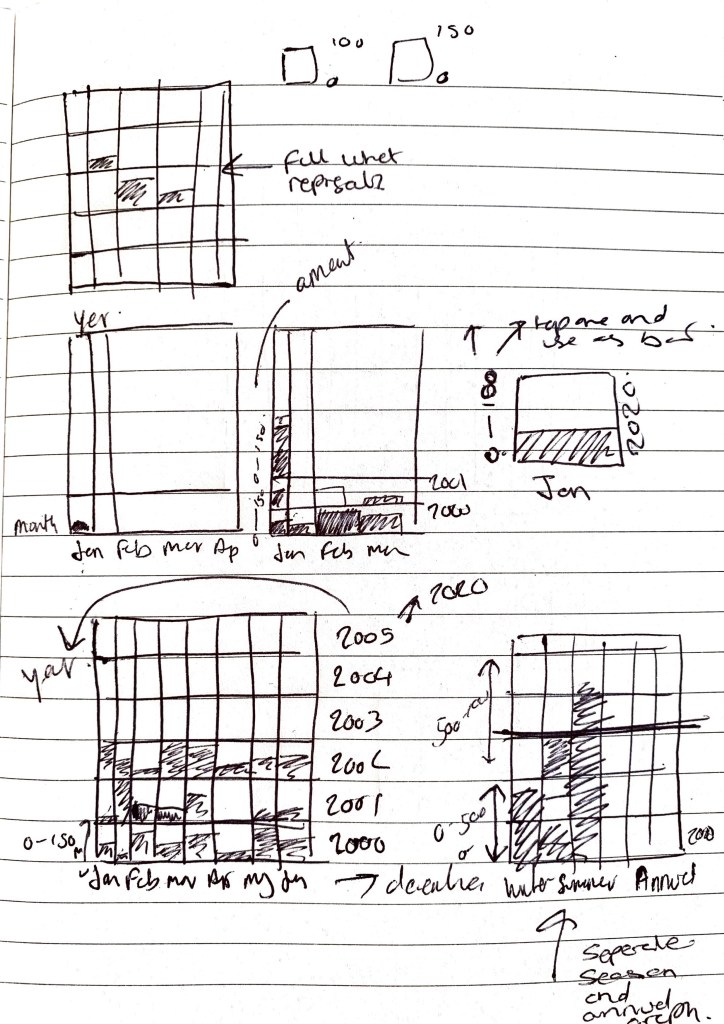
Thinking visually how the information is going to work, is it going to work vertically or horizontally? I don’t want it to be to ‘graph’ based. There needs to be an element of ‘interactivity’ and ‘interest’ within the graphic.
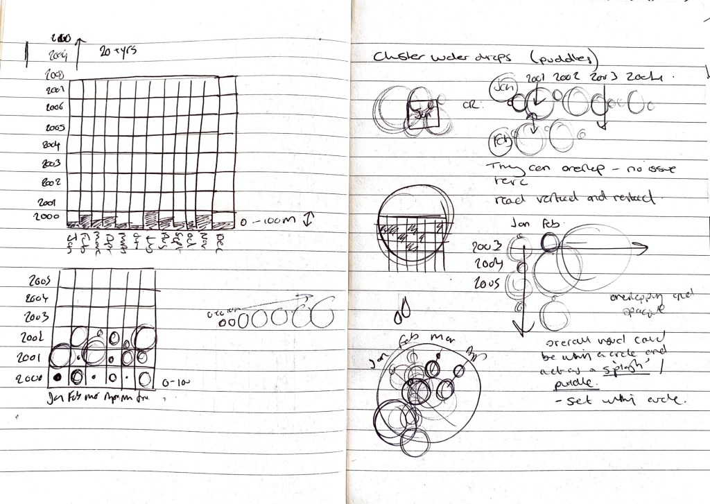
Below I am starting to consider the idea of using puddles / rain drops as the main design device? I need to be careful here that I don’t make it a confusing graphic however I want there to be an element of complexity in it’s visual appearance.
Can each month of rainfall have its own mini infographic which then joins with all these others to create a larger visual?
Original data provided. Experimented with visual presentation. Not an infographic more of a visual / mash up of data. Almost trying to create that sense of rainfall, at mass.
When I start to plot all of my data I have this vision that it may be complex in it’s visual appearance but easy to read and understand. Should an infographic be completely legible from the off set? or does a clear key / typography help once analysed.
Initial Digital take on sketches
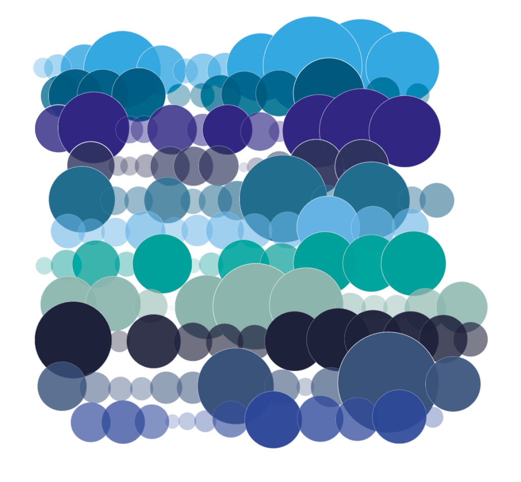
Here I have taken data from 2000 – 2010 in terms of rainfall over each month in England alone and plotted it horizontally (this showing the higher rainfall months within that year) These are clearly outlined also by the darker opacity of the circle.
Opacity is set to the amount of rainfall with anything over 100ml being 100% opacity. On the right hand side I have complied all of the years and started to present them more visually over each other – this started me thinking about ‘puddles’ ‘flooding’ ‘water effects’
Even though at this stage there is no details added in terms of keys / information/ totals something is coming through?
I need to think clearly about the presentation and layout so that it is legible for the viewer? Or could there be a supporting infographic to help visualise the ‘puddle’

Extracting the information from the ‘puddle’
From the visuals I created above I wanted to extract all of the raindrops to make a clear presentation of the information I was trying to display and highlight. Below was influenced by Ryoji Ikeda in the way he presented multiple devices in linear and grid form. I could see this being on mass and large scale with interactions of the ‘drops’ pulsing/moving. Coupled with more data this could become a powerful visual.
What is clear here is the drier months but also the drier years, you can then go away and research those years and see if there was a drought / heavy rain / flooding that month / year in relation to the size of the circle.
Here I want to apply this to a grid and get it lined up perfectly, plus add another 9 years of data. This enhancing it’s impact. Could I also highlight on here the years / months which had flooding? major weather events which may have impacted the rainfall? (eg heatwave, storms)
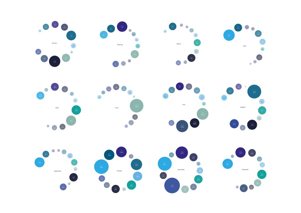
Can each month be its own mini infographic and be brought together to create one? Below I have made each month into its own graphic, which look like drops in water from above, here you can clearly see the difference between drier and wetter months (wetter being over winter most of the time)
Can they be layered on top of each other? Or can the amount of rain be highlighted with typography? My worry with adding in text is it may start to look to ‘infographic like’
What if these were in horizontal one after each other? Could they move? What if there was music added to the infographic? sound of rainfall over the top with the month rotating?

Horizontal Infographic
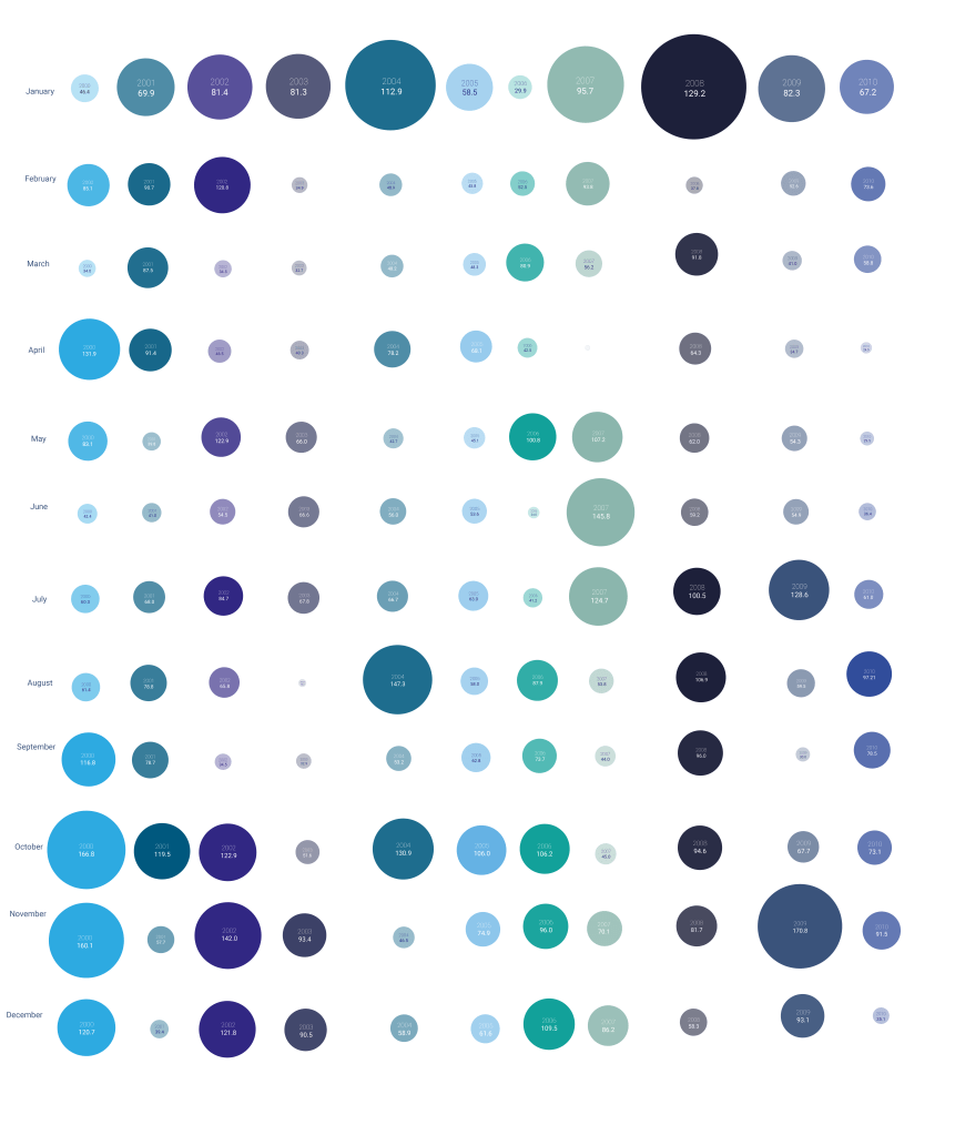
Updated graphic to include overall 10 year monthly totals.
Here I wanted to include the totals of each month over the period from 2000-2010. This again outlines those months which are wetter, which we can relate to flood events.
Progress? I still want to update this further with the previous 10 years (2010-2021) plus consider how music can be added (water/rain sounds) to add another element to this infographic. Could it turn? Could it zoom in? Could like addressed above parts pop out and highlight those historic flood events?
Could there be another circle in the centre? outlining the winter/spring/summer/autumn totals which have been provided by the met office? This making it a full infographic of those years?
I could see these being create for the different weather types (sun, snow, wind, storms) and this becoming a full infographic suite.
Research
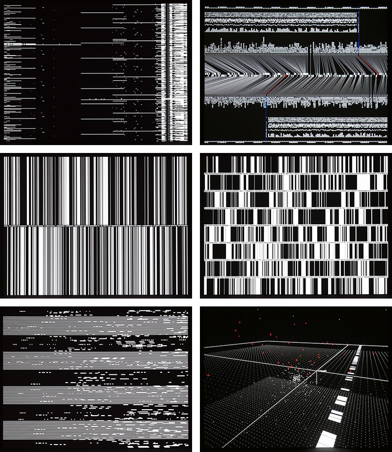
Ryoji Ikeda
Broken connections? TV static? These highly detailed infographics go beyond what we normally see from an infographic. They have movement, they can be viewed from all different angles. They are playful, how can I take elements of Ryoji work into my infographics?
What is notable is the use of just black and white, which makes it very impactful but also a feeling of captured and documented? A moment which has already happened and isn’t live anymore?
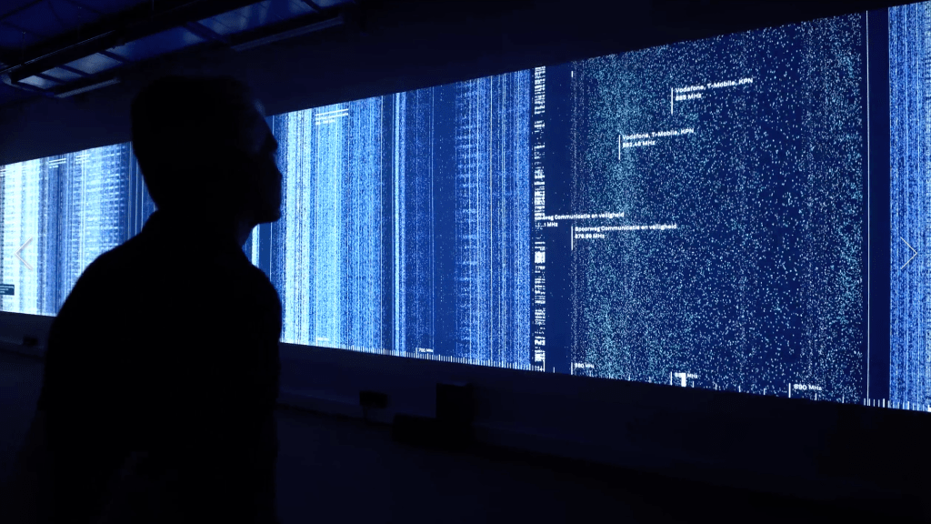
Richard Vijgen – Hertzian Landscapes
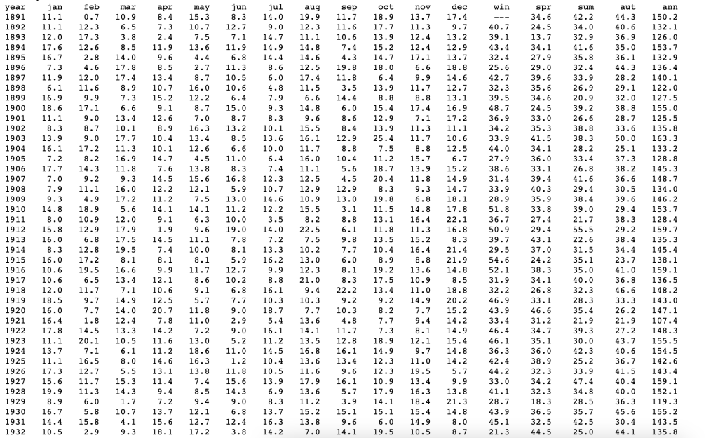
Met Office Data
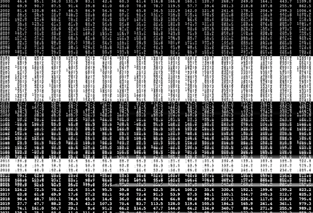
This is the raw data from the Met Office below, showing the rainfall totals across the UK, instantly this is a an interesting visual to me. Not only because it’s typographic but from a distance the numbers almost merge / become more of a pattern. It’s not until you zoom in you get the detail. How can this approach be applied to my infographic?
The data here is complex and is hard to read and understand unless you study it in detail. For me it works in a similar way as Richard Vijgen work above, being complex in it’s appearance. We can view this as a visual rather than just a numbers.

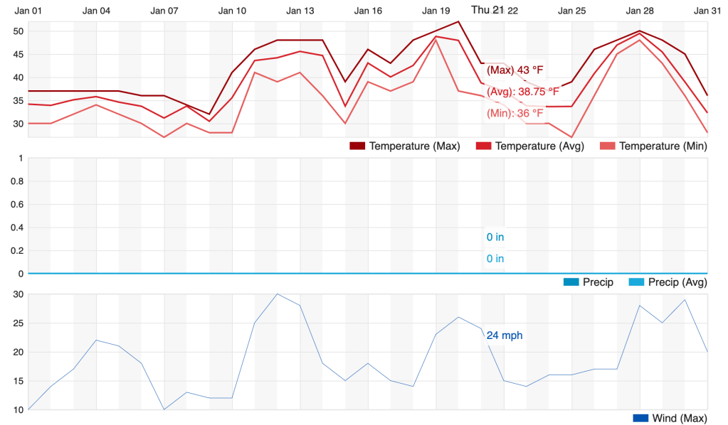
Weather Underground
Interactive weather graphics, allowing you to hover over the graph and get instant information about temperature.
References
1.https://www.metoffice.gov.uk/research/climate/maps-and-data/uk-and-regional-series
2. https://www.wunderground.com/history/monthly/gb/bristol/EGGD/date/2021-1
3. https://www.wimbledon.com/en_GB/scores/extrastats/index.html
4. https://richardvijgen.nl/#about
5. https://www.ryojiikeda.com/project/datamatics/#datamatics
