Lecture Comments

Design Development
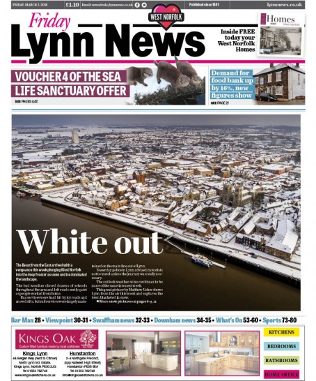
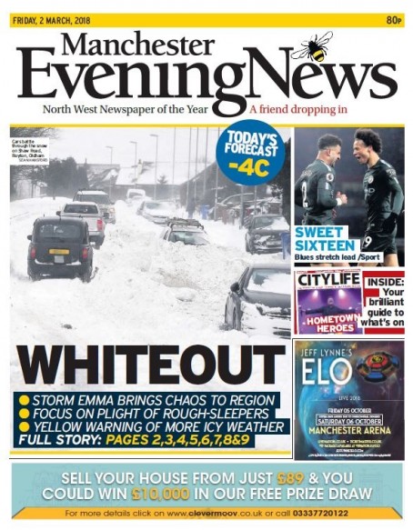
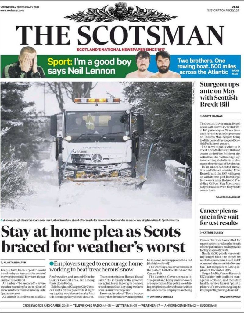
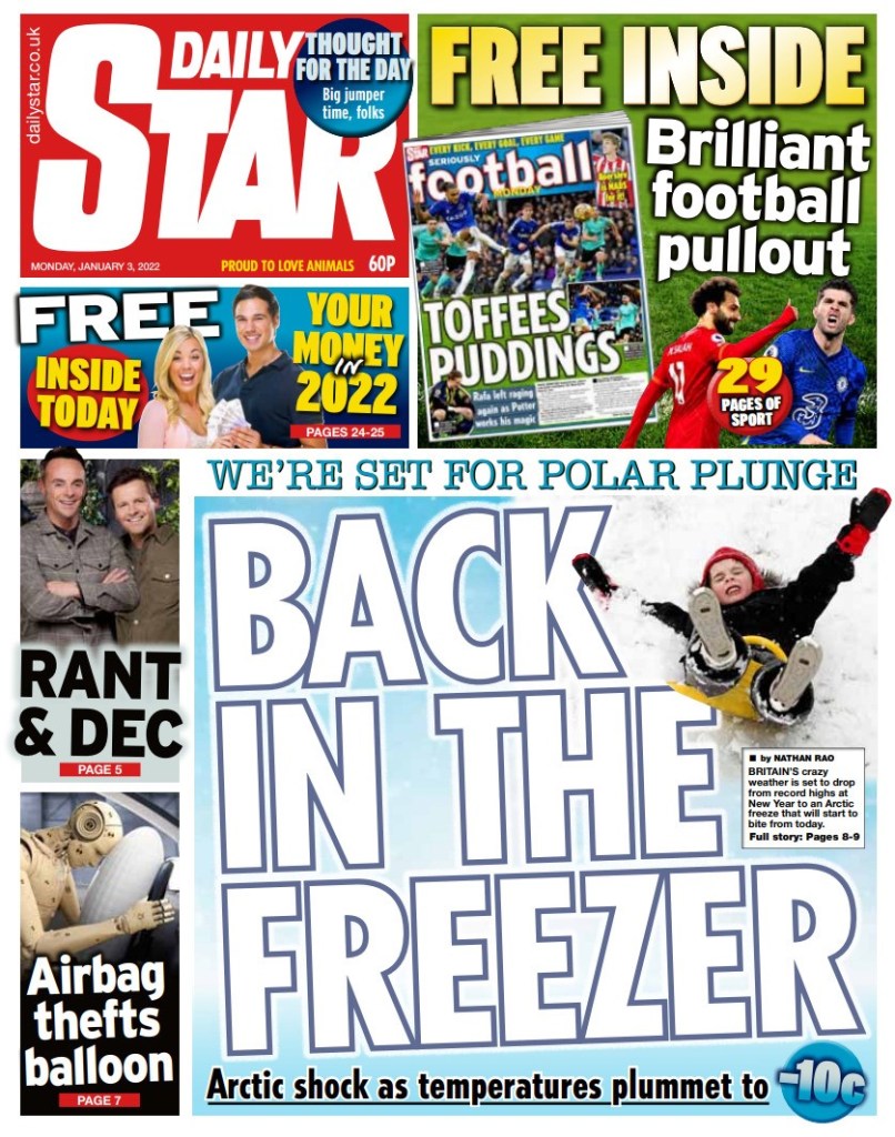
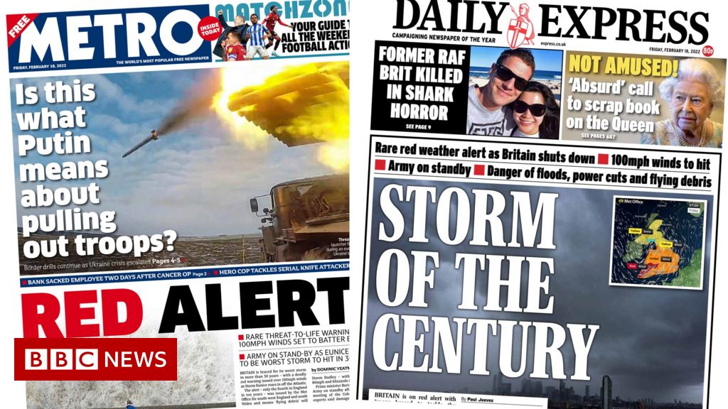
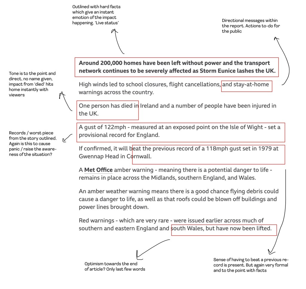
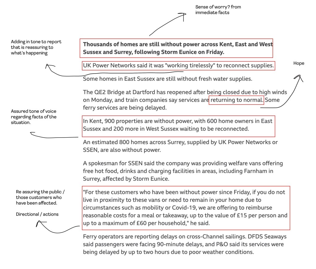
Language / Tone of voice on the front of newspapers in relation to weather stories

Initial 400 word tone of voice piece
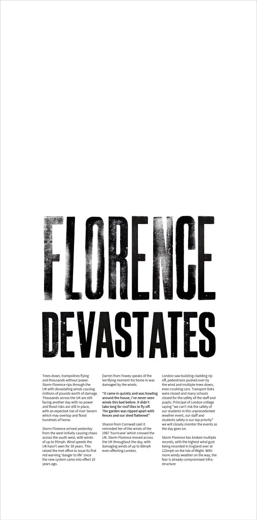
Headline of the report / news story
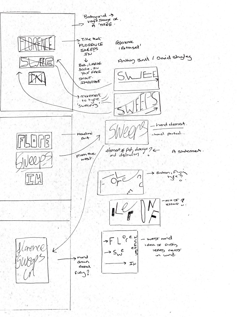
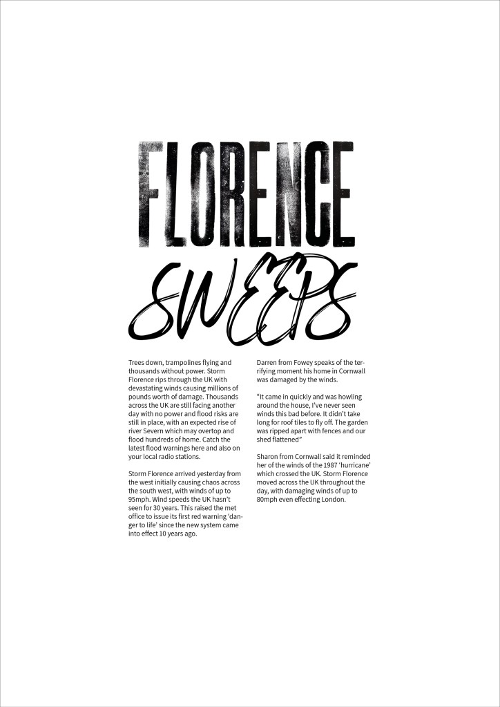
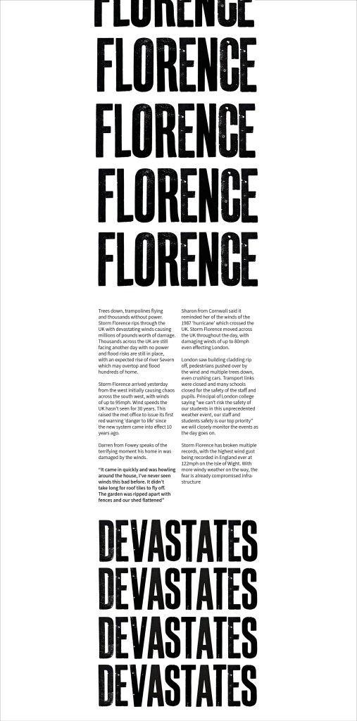
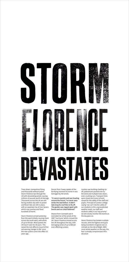
Florence
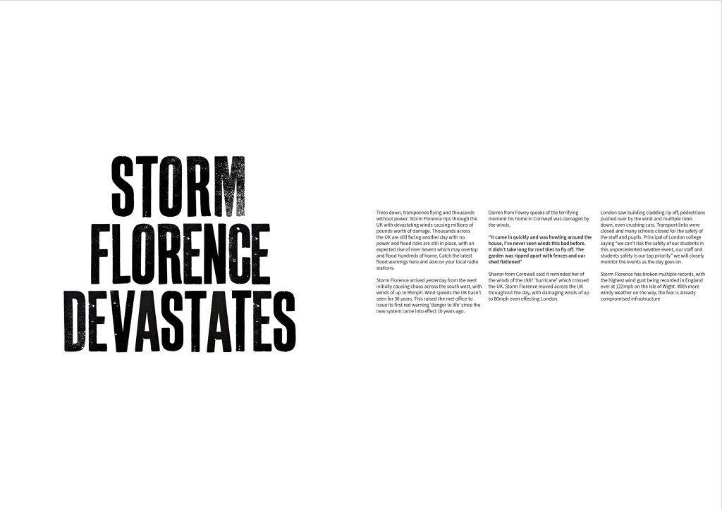
Trees down, trampolines flying and thousands without power. Storm Florence rips through the UK with devastating winds causing millions of pounds worth of damage. Thousands across the UK are still facing another day with no power and flood risks are still in place, with an expected rise of river Severn which may overtop and flood hundreds of home. Catch the latest flood warnings here and also on your local radio stations.
Storm Florence arrived yesterday from the west initially causing chaos across the south west, with winds of up to 95mph. Wind speeds the UK hasn’t seen for 30 years. This raised the met office to issue its first red warning ‘danger to life’ since the new system came into effect 10 years ago.
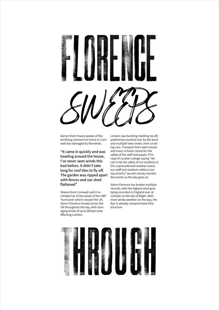
Darren from Fowey speaks of the terrifying moment his home in Cornwall was damaged by the winds.
“It came in quickly and was howling around the house, I’ve never seen winds this bad before. It didn’t take long for roof tiles to fly off. The garden was ripped apart with fences and our shed flattened”
Sharon from Cornwall said it reminded her of the winds of the 1987 ‘hurricane’ which crossed the UK. Storm Florence moved across the UK throughout the day, with damaging winds of up to 80mph even effecting London.
London saw building cladding rip off, pedestrians pushed over by the wind and multiple trees down, even crushing cars. Transport links were closed and many schools closed for the safety of the staff and pupils. Principal of London college saying “we can’t risk the safety of our students in this unprecedented weather event, our staff and students safety is our top priority” we will closely monitor the events as the day goes on.
Storm Florence has broken multiple records, with the highest wind gust being recorded in England ever at 122mph on the Isle of Wight. With more windy weather on the way, the fear is already compromised infrastructure
Design Development of typeset article (news)
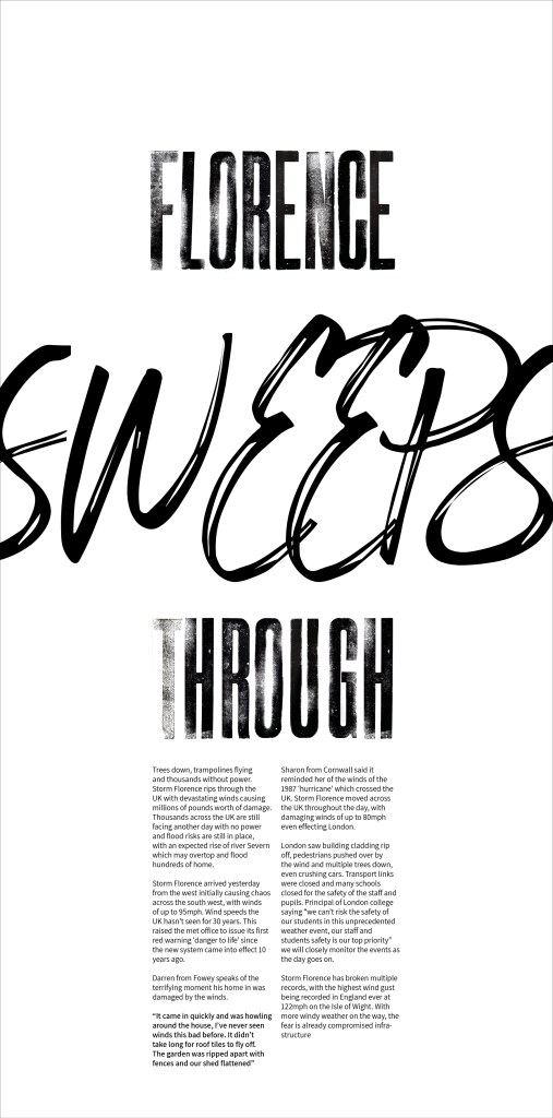
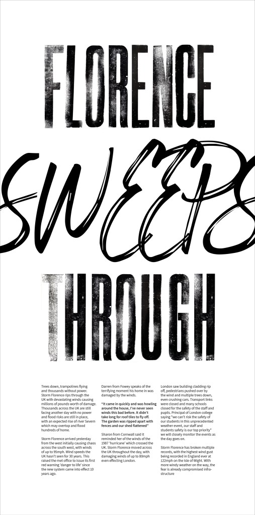
I want the news article to have impact and a sense of dramatic movement. News articles especially those printed within newspapers around weather in the UK are always over the top and in the face of the viewer. Below I have started to sketch out ideas around the main typographic element this being the article title ‘florence sweeps in’
Thinking about how elements of the typography can show the dramatic nature of the event. Type being stretched and hand drawn to give that element of wind / movement to peoples lives.
Smaller side studies on the right look into broken and deconstructed typography – referencing debris and damage from the storm. I wonder here though if this would become illegible and confusing to a viewer of this story? Or would the element of confusion add something? Need to explore this further.
Next steps
Think about how I can apply a similar thinking to the body of text inside the article. newspaper use columns and imagery to get across their stories. For example online the BBC start with a headline image then they have the story (typeset the same in most stories) followed by a series of photos (usually from those who have experience the event)
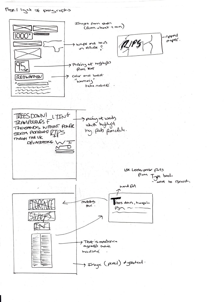
Article Layout / sketches (Below)
Considering how the layout and body copy are going to work in relation to the article story. I want to take inspiration from newspaper layouts (colum format) but add elements which highlight certain words / facts . This ramping up the emphasis on the story, making it dramatic. In the UK we love a weather story so this needs to highlight that.
Started to think about if I could rip into the design / hand drawn into the design? Could the whole article focus on bold / large format text
Exploring existing elements – Primary Research
I printed these letters a few years back and think there stature and impact could work well for the ‘headline’ I’m going to explore how they sit together alongside the article text.


Development
Trialling typography headlines against set column text. Something working with the impact text but the ‘sweeps’ isn’t working for me? I think it’s too soft in the language? Need to think of some other words which can summarise the destruction. Could parts of the text also start to be playful like mentioned above.


Research
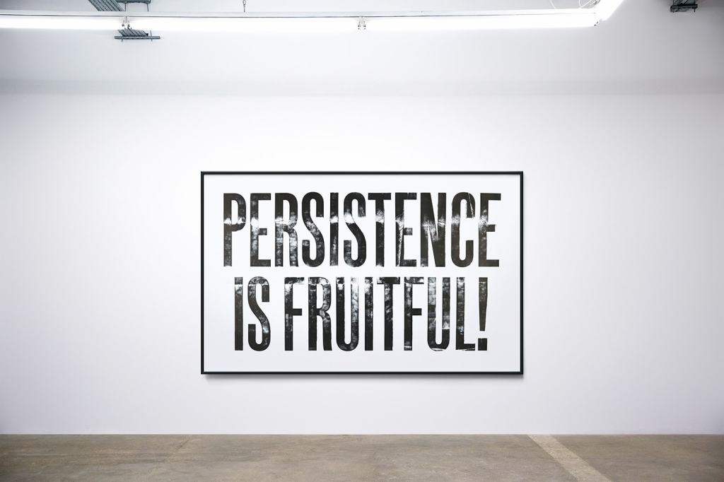
Anthony Burill – Letterpress Prints
I’ve referenced Anthony Burill a few times however I think here for what I am looking at it gives me a good reference on showcasing words with impact. Anthony Burill is well known for his letterpress work which is bold, simple and provided instant impact through clear messages. The use of textural letterforms on clean backgrounds lets the message / words speak.
For my article I want to add in that element of impact. 1 because its a news story and 2. the nature of the subject I am covering. Anthony’s work has provided that space for me to not go over the top with fussy typography. The application of a hand printed letter / hand drawn letter may add another element to the story and tone of voice? Could the use of black and white also add the feeling of this happened and there is not good of it?
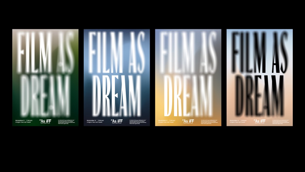
A.A. Trabucco-Campos
I came across the work of Andrea’s work when exploring typographic applications in relation to tone of voice. Andrea work ‘Film as Dream’ captured me on its visual look. It has this dystopian / unknown unless you explore further feel. When you stand back and focus you can see the words but there faded out, giving that feeling of hazy brain.
What inspired me here and something I want to consider and experiment with if that use of masking areas of type? Could adding in elements (such as opacity for example) give the reader that sense of what was and what is now? This in relation to the destruction the storm has caused? OR would this application draw away from the impact and destructive tone of the article?


Weekly reflection
Fell behind on week 5 and had to re visit it towards the end of the module due to time constraints with work commitments. However I think this worked in my favour as I was able to look at the week with fresh eyes. My outcome, although not complete is going in the right direction. I have taken the experience of the following weeks to draw upon this element of tactility to bring the outcome closer to the tone of voice. Texture, boldness and sweeping lines help tell the story.
I think this week can go further in exploring the layout and font choice of the main body text and how it comes across to the audience. I really enjoy the letterpress font which highlights the title and think this could be explored further in the body text? Could I think about introducing colour?
This week I think I was lacking confidence to play and explore further with typography? To rigid in my approach to let go. Going forward I need to not be afraid to explore materials and sketch before going onto the screen.
References
1.https://extraset.ch/
2. https://anthonyburrill.com/archive/ditchling-steam-print/
3. https://trabuc.co/As-iFF-Fall-18-Season
4. https://www.sfmoma.org/artist/Jack_W._Stauffacher/?sa
