Lectures / Feedback
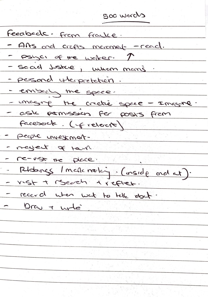
1-1 with Frauke – Feedback on ideas / Next steps
Highlights to take away:
Arts and craft movement – Look at this.
Personal interpretation of the life of a worker within the mills, my feeling and stories which are captured within the buildings.
Capture the space – write in the space, take rubbings and artefacts. Re visit the place multiple times. photos from all angles. Speak to people.
What could it be now? What is it giving off now for the town? the town is in neglect but these creative spaces are still there.
Embody the space (The Mill) capture live thoughts.
Imagine / Tell my story and share that
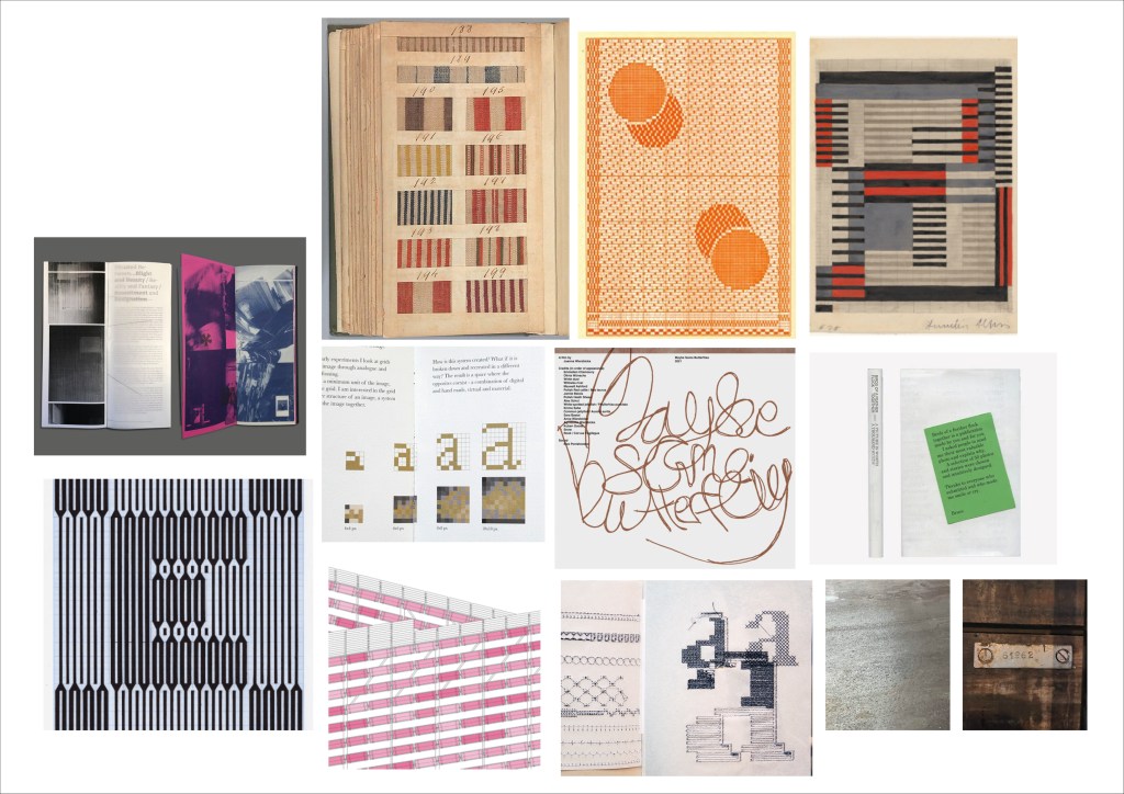
Design Development
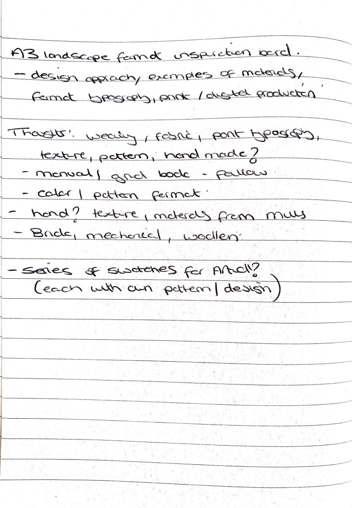
Moodboard thoughts / related words
A3 Mood board for Design Direction
Tactility, texture, personal.
Within the publication design I want it to feel personal, a story from the imagination. I want texture, fabric and tactility to play a big part in how the design takes shape, using grids from the buildings structure to construct typographic responses to support the article. But also adding in elements of hand drawn notes / handwriting to capture those moments within the mill (it can’t be forced / digitised straight away. This would take away from the story.
Inspiration has looked into designers such as Anni Albers (grid weaving) and Sean Steed’s hand drawn, grid led typography.
Research
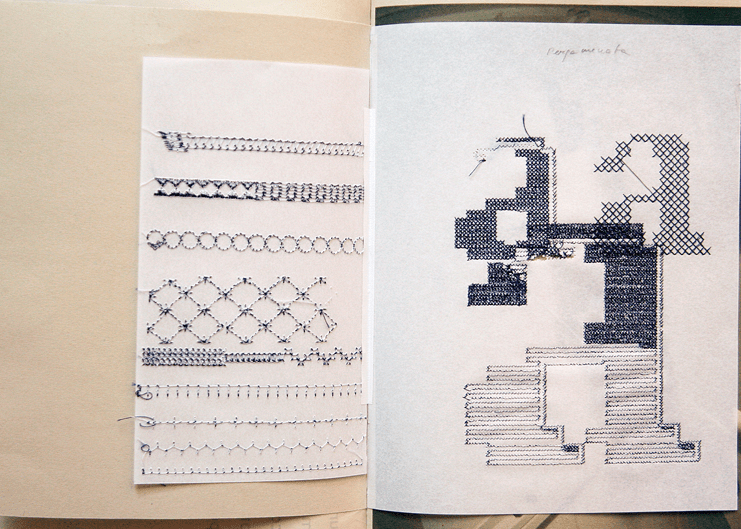
Evelin Kasikov
Designer Evelin explores the craft side of design to produce typography and editorial design. Evelin uses craft to her benefit and creates intricate, detailed typographic observations and compositions. The tactility personal nature to these drew me to find out more.
Not only does it capture a material, its diverse application can be explored in multiple formats. Within the work I am constructing I saw an instant connection to Evelin’s work. I’m looking at how I can use grids within the environment of my subject area to create typographic responses.
What I think work’s in the below response is the freedom? There is a sense of continuation and flow to the woven typographic letters. A response directly from something she viewed / saw /captured. Very structural in its appearance but delicate in it’s material use.
References
- https://www.itsnicethat.com/news/yorgo-and-co-google-atap-jacquard-publication-digital-090721
- https://www.itsnicethat.com/news/pentagram-giorgia-lupi-moleskine-art-101121\
- https://www.instagram.com/pointedpress/
- https://www.situatedbetween.com/process
- http://evelinkasikov.com/following/evelinkasikov.com/Woven-Text
- https://www.artsthread.com/portfolios/typographic-drawings/
- https://www.seansteed.com/xtypedrawings.html
- https://www.moma.org/collection/works/3735
- https://www.vam.ac.uk/articles/arts-and-crafts-an-introduction
