Lectures / Feedback
Darren Wall
Design Development
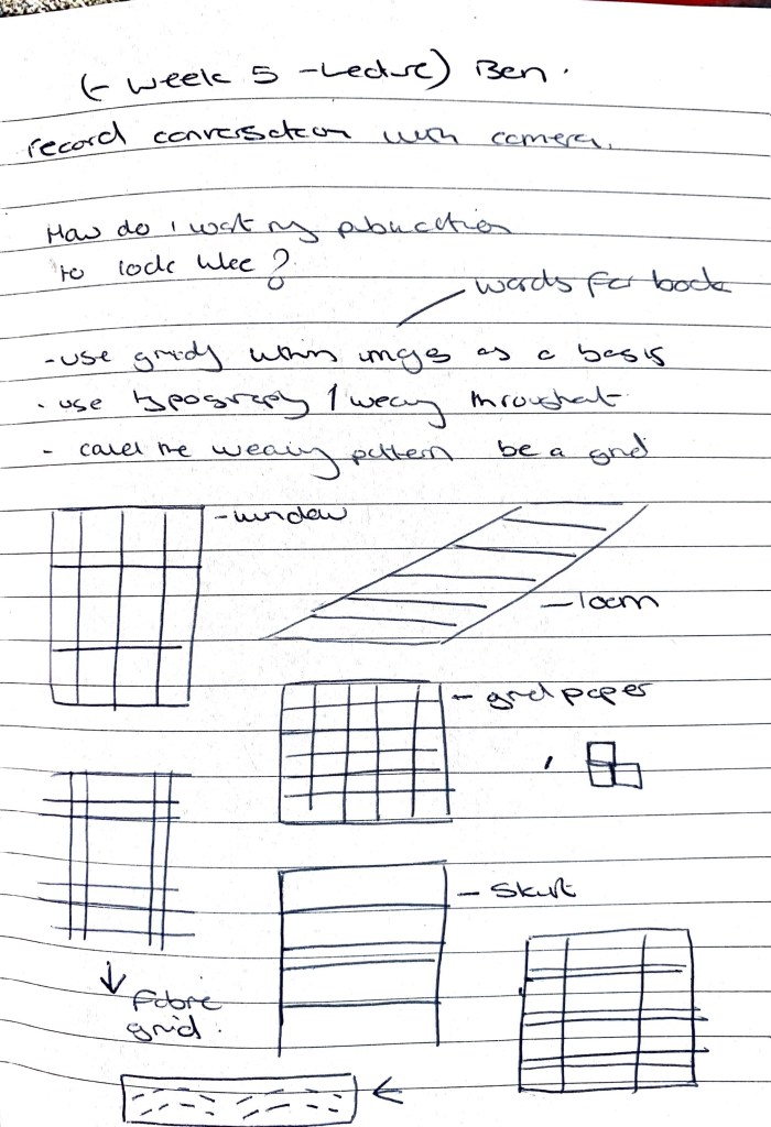
Initial / early thoughts on design features / grids for design of article

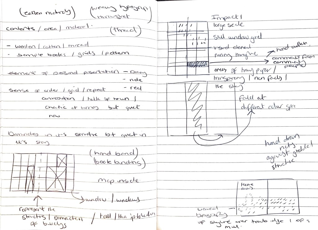
Thoughts on design ideas and decisions
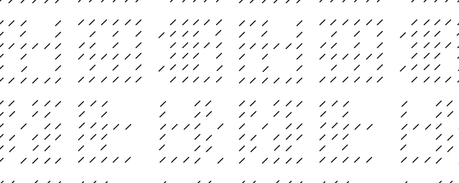
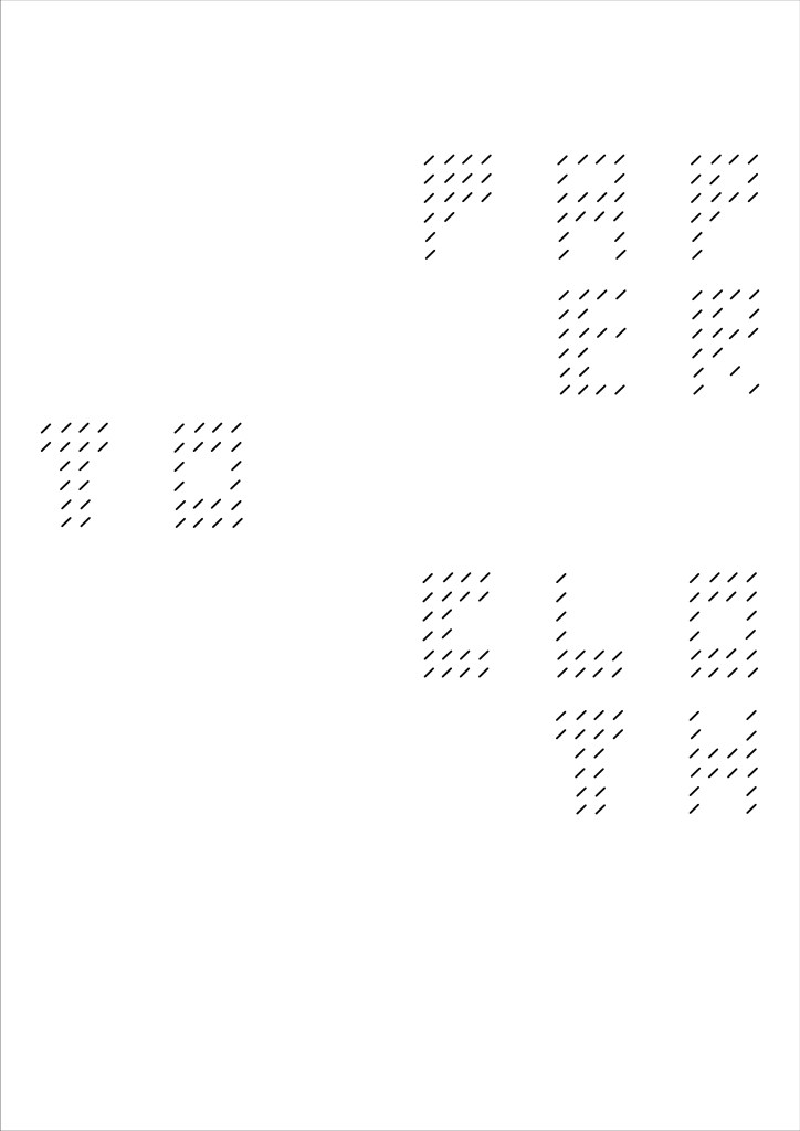
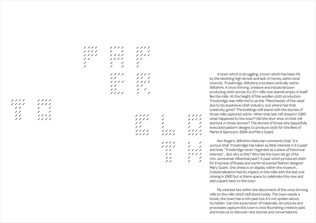
I want the publication to be clean but have an element of tactility and personal ownership. Almost like a diary in areas (hand drawn notes, comments, like an ongoing thought/ journal) I also want to introduce my own typographic play with the weaving letterforms I have been creating.
What if these form were stitched on the final design? (this could support a stitched book as well) to add tactility? Or will this take away?
Grid will be based on the structures of the internal objects I saw at Home Mills (windows, spinning Jenny, floor) This also looking at the existing windows of the mill still standing across the town. Could there be space for a visual to represent the mills? maybe the structure of the typographic / images could show a dominating skyline? Something to explore to enhance the design
If this was printed I also think the weaving marks could be raised? (almost like brail?)
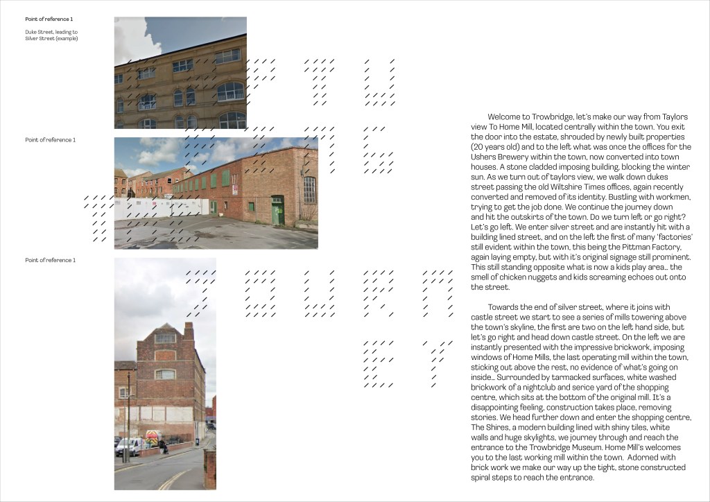
Above – Initial digital drafts, pulling together research, initial imagery and words. Placing them within the grid. Here I have also started to break the grid and add the typographic treatment which I think is working really well, it breaks up the content and gives a dynamism to the page. Is this going to become overwhelming throughout the whole publication? Should I be selective with where it is placed.
look further add publication design / article design to see how type / image can work together in a playful but legible way.
I want to now start thinking about how layers, comments and hand drawn elements will start to interact with the grid / image and text. Could these be smaller pages within the publication which sit on top of content? (almost like pull outs?) could they be on tracing paper to enhance that message of was there, is still there but masked / hidden within the walls of the mills?
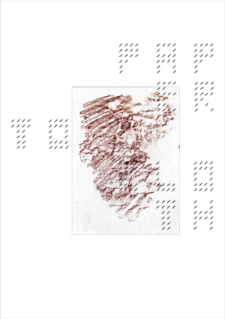
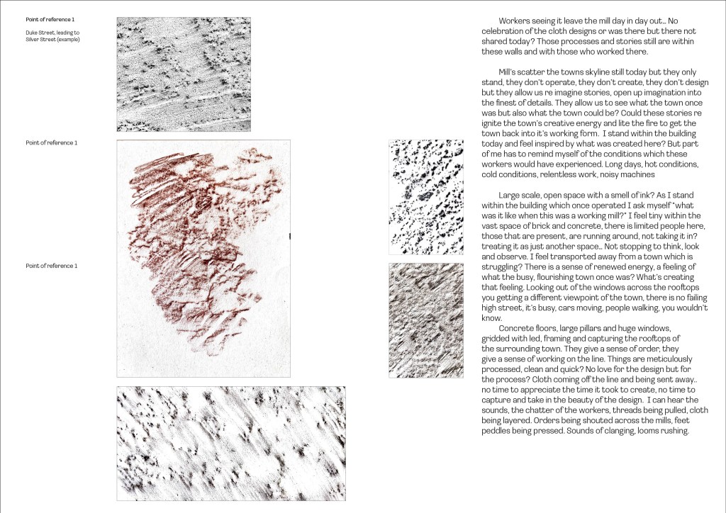
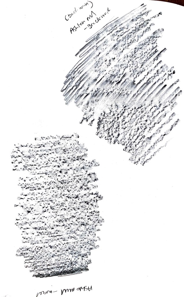
Rubbings from Home Mill (site location)
While visiting the mill on the 21st march i sat in the space for a period of time and collected a range of materials from photos, sketches, audio recordings and pencil rubbings (from the original structure)
The rubbings were this idea of connecting people to the mill more directly, these surfaces were the original ones which workers / milling machinery would have been on. Felt these marks captured those stories in an abstract sense. Allowing the viewer further insight into the stories.
Some of the rubbings reveal patterns, raised areas and different forms. This helped me further capture and re imagine the workings of these mills. Something quite raw about them?
Could they be digitised and curated to create elements for the publication? Could they make up the identity of the publication? Inform the typeface

Captured Sketches from Home Mills visit
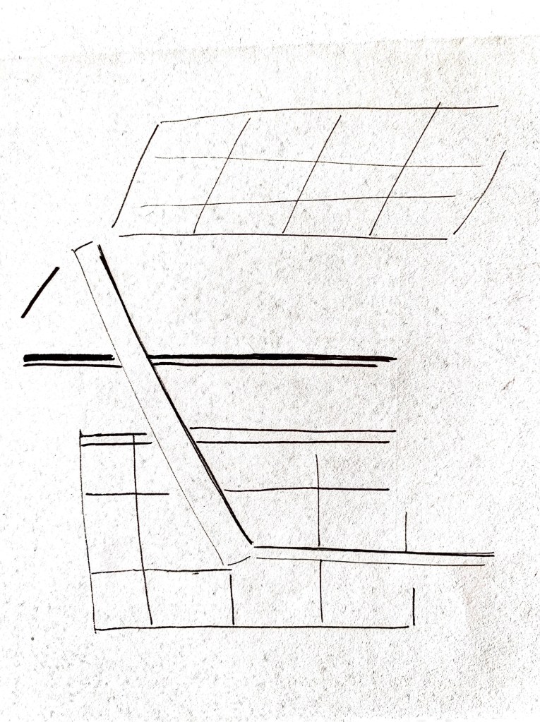
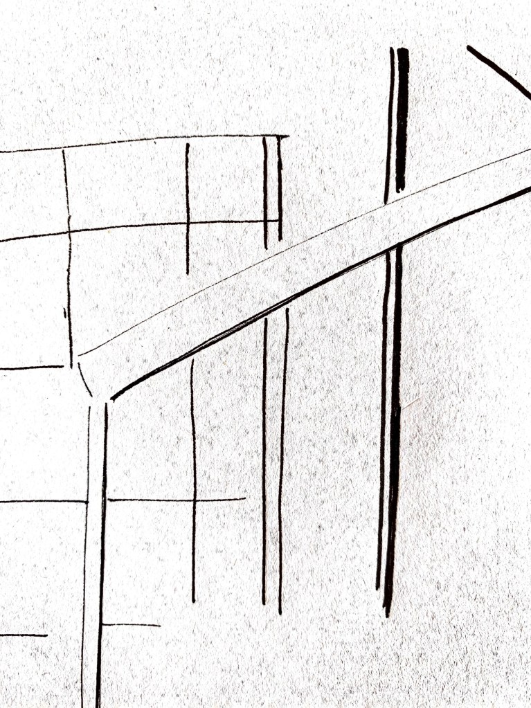
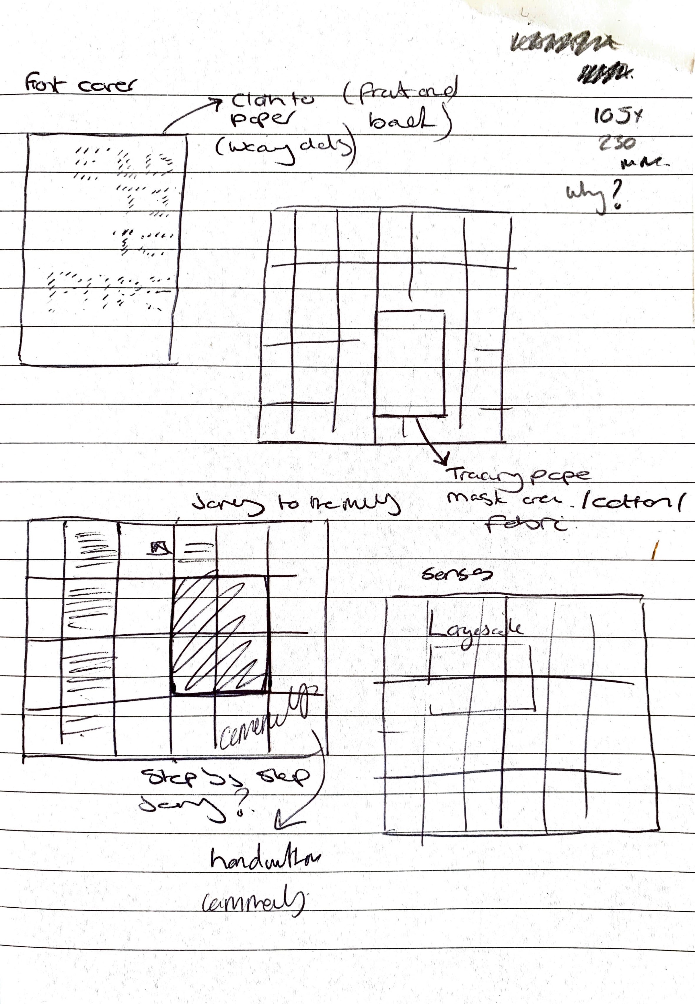
Next Design Draft
Brining in elements of tactility from found resources.

How I might Fund, Promote, launch.
Initial thoughts:
Fund – Kickstarter?
Promote – Through social media and also through local community connections (contact creative blogs) Creative Boom, Its nice that, feature on instagram pages (Counterprint, slanted for example)
Launch – Once printed I see this being held within one of the mills itself as an immersive launch. Launch would have an introduction talk (from me, and others) Following this an immersive experience of sound, image and tactility will continue for viewers to engage with, encouraged to share.
With the publication being about a local area I feel I need to look beyond that area to promote it’s launch. The intended audience would be more of a curious kind rather than someone wanted to find out about the historical timeline of the mills within the town. This is a publication which hopes to put you in the place and give you a sensory feeling of be present within the spaces.
With this in mind I feel the launch could potentially be in a few places (but also once an initial launch takes place, it could travel to other areas)
1. Location – Home Mill, Trowbridge Museum
2. One of the multiple mills still standing today
Locations will be set up for a ‘talk’ style launch however there will be an element of immersive interaction so viewers can experience the thoughts of the publisher / writer.
(with this all in mind cost, time and availability will come into account) I have contacts within the town which I could potentially reach out to to allow for this launch to take place in the above locations.
Design promotion – Graphics / words can be extracted from the publication to create posters / social media graphics to promote the event. (Set of limited edition posters could be provided at the launch / on purchase of a (for example £3 ticket)
Distributor –
Copies / amount –
Cost – (sales from first / previous one would fund the next? ) promote it and sell it myself (directly get the profits)?
It wouldn’t be a subscription service, see it being more of different narratives that you can collect
Further mill rubbings to add context to text. Further observations of brick, rock and structures of the buildings.

Draft publication containing 3000 word article.
From feedback I decided to remove elements of the design and words from the article. Photographs captured didn’t really add anything further to the design and story and if anything detracted from the ethnographic research I had undertaken in detail. This I wanted to be at the forefront of the design with the viewer making up there minds when viewing it.
Alongside this the content changed. I removed text about walking to locations and instead looked at having conversations with the mills themselves. This creating fictional dialogue and capturing the feeling and movements of the buildings then and now.
Reflection on direction so far
Written element – I have struggled to write the 3000 words and it has taken me along time to get to where I am with it currently, which I think still needs allot of work. The approach I have taken is quite conversational and observational which I like for what I wanted to approach. I think I could have spent more time trying to connect with local residents about the mills within the town, this may have led to new conversations for the article (something I want to pursue going forward)
The Design – The direction and design for the article has been driven by my ethnographic research which has opened up a new way of thinking for me. The research in this format unlocked new avenues for discovery. The rubbings, sketches and photos I captured all contributed to the structure and grid layout all linking back to the research. In terms of next steps and development I would like to expand on the ethnographic research to make more of a focus on this (further rubbings, captures, photos, mark making) This could be extended to other areas within the town or further afield.
Research
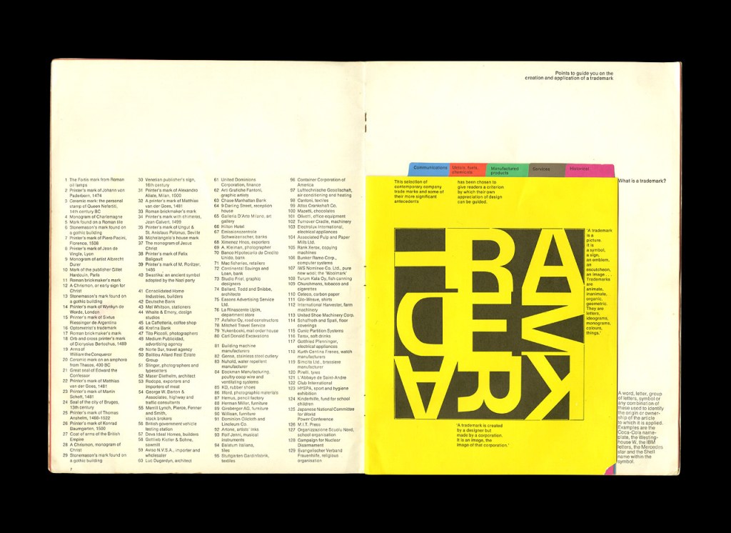
Man and His Mark (1970)
Taken inspiration from the layout and use of smaller internal pages, to add interest and intrique for the viewer. I also feel this will enhance the tactility for the viewer and make it more interactive. What id working well here as well is the use of bold colours against a simple and paired back black and white page (with simply set text in colums) This is allowing the extra pages to sing and be more free within the design.
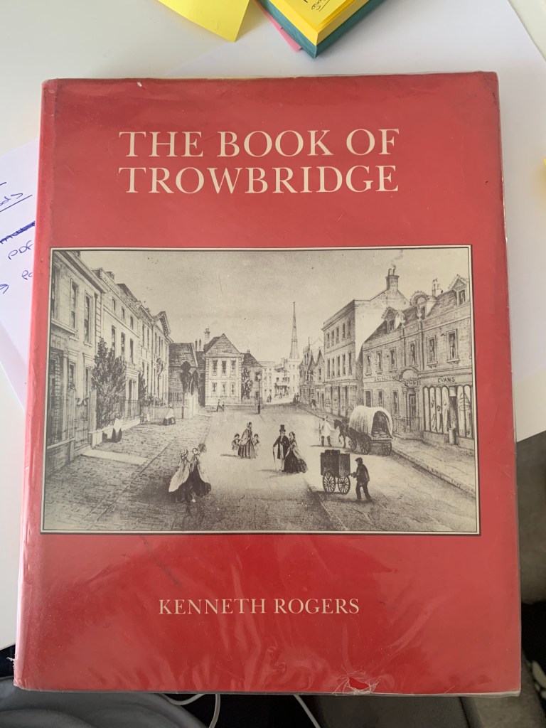
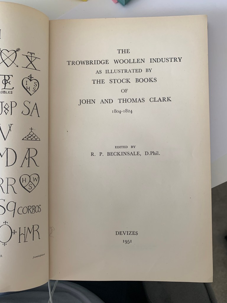
Trowbridge Library references
Exploring existing resources within my local library around the history of Trowbrodge in particular the woollen industry. Kenneth Rogers was a key writer in the history of Trowbridge. Both books here supported the back story to what the town was like before the industrial revolution and opened up stories around the mills within the town.
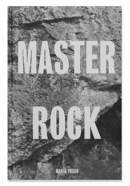
Master Rock – Publication