Lecture Comments
Tokyo Olympics Logo vs Theatre De Liege
From first impact they’re very similar in their execution, especially the ‘T’ and accompanying graphic ‘O’ embedded within the design. However could this have been a case of the elements being found and put together without seeing the Theatre’s logo? There is going to be times when designers will have similarities, it’s when we identify these what can be done? With the olympics being such a high profile event seen by the world, this is where I see it having a damming impact on the theatre logo and brand?
The Tokyo logo ended up not being used for the Olympics due to such a high profile reaction online. Would this have been the same if we didn’t rely so heavily on social media for reaction? Could this similarly have been less of a problem if social media wasn’t present?
Design Development (workshop challenge)
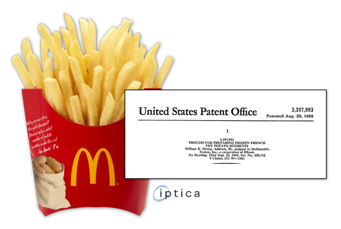
Selected object ideas. I wanted to initially look at how food products in huge brands are copyrighted for example McDonalds fries, which do have a patent on them (the making of them)
“Dehydrate, fry, freeze and re‐fry the potato slices.”
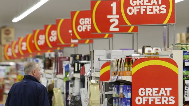
Instead I’ve gone into looking at how graphic symbols under brands for example the blue circle within Lidl’s logo. Recently they have taken Tesco to court over the use of a blue circle. Such a simple device which has most likely been widely used? Is it it’s use and impact it’s having on tesco that Lidl don’t want? Profits?
Lidl say -” “seeking deliberately to ride on the coattails of Lidl’s reputation as a discounter” Pointing towards more on the use of the icons which are used for discounts / offers.
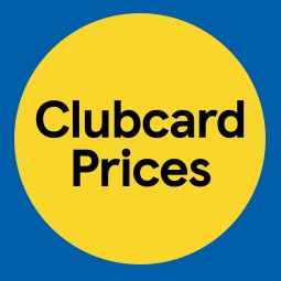
Supermarket Sainburys use a very similar design, if anything this is closer to Lidl’s design with the yellow circle used across offers in stores?
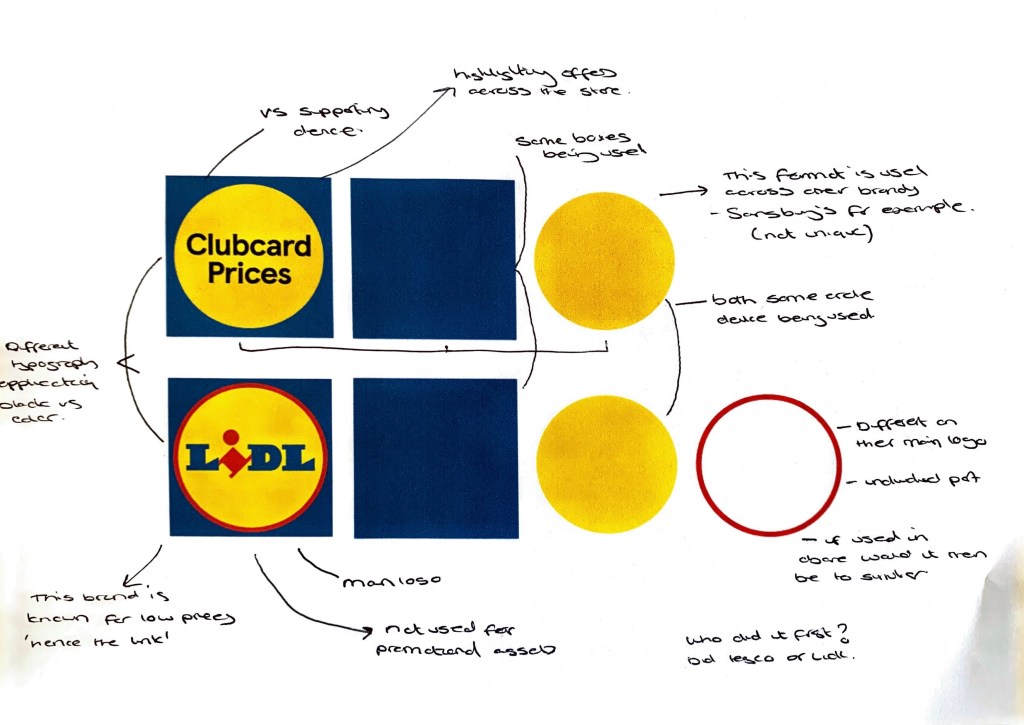
Deconstructing the icon to its core components.
When you take apart the components they are made up of very simple shapes, square and circle. An Article refers to this case as ‘wordless logo’ a device which has been adopted by the pubic in relation to a certain action, in this case a promotion on low price products. Article can be found here
This comes at a time when the UK faces a huge crisis within living costs. Retailers doing all they can to support customers and keep their shops busy. I can see in a way why Lidl are looking into this case.
Once you remove the ‘Lidl’ logo you can then see the similarities between both ‘icon devices’
Within the trademarks act it states that –
“A person infringes a registered trade mark if he uses in the course of trade, in relation to goods and services, a sign which
(a) is identical with or similar to the trade mark,
where the trade mark has a reputation in the United Kingdom and the use of the sign, being without due cause, takes unfair advantage of, or is detrimental to, the distinctive character or the repute of the trade mark”.
Lidl don’t actually use the mark (circle and square) on it’s own and haven’t done within the UK, whereas Tesco have consistently used the mark in their stores in relation to the ‘Clubcard prices’ promotion.
Weekly Challenge: Logo Evaluation (Volley Design) Own Business logo and name
Research
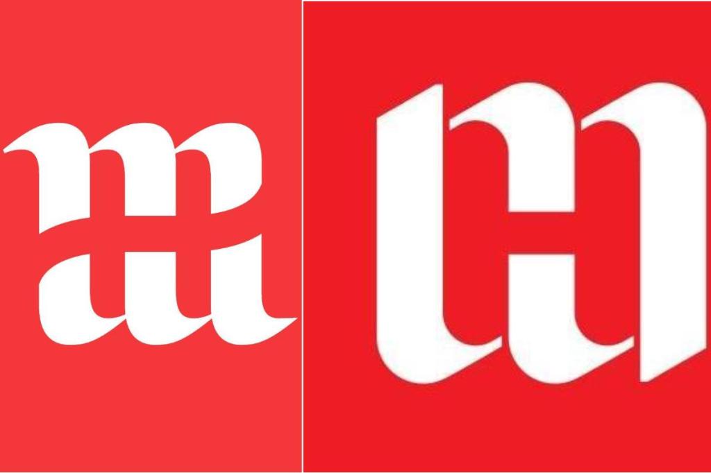
“a pure, unlucky coincidence”
The agency behind the new Hertiage Malta logo said they continued with the publish of the new logo and said “”a pure, unlucky coincidence” that it was similar to Hunter Museum of American Arts.
My question here is as an agency, if you saw the similarities (and here they are very clearly similar) Even down to the colour? Would you not want to go back to see how you can revise and make it unique to that company? The agency spoke of the process and decisions that went into the design process. It was a rigid research and analysation process to get to this point.
Is there space for similar logos? If they’re in two different sectors? Or for the audience does this cause confusion and remove that brands uniqueness? Potentially harming their brand awareness and build of public reputation.
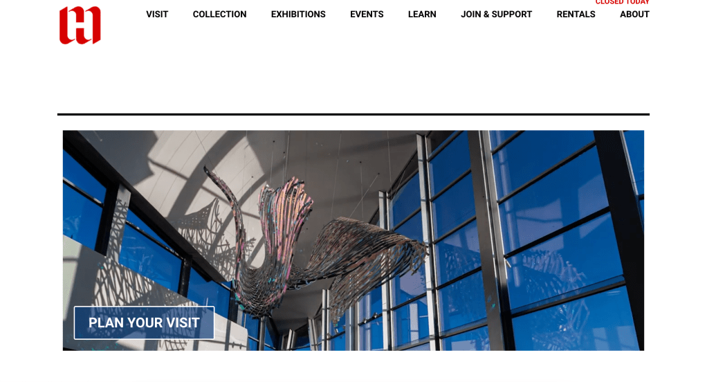
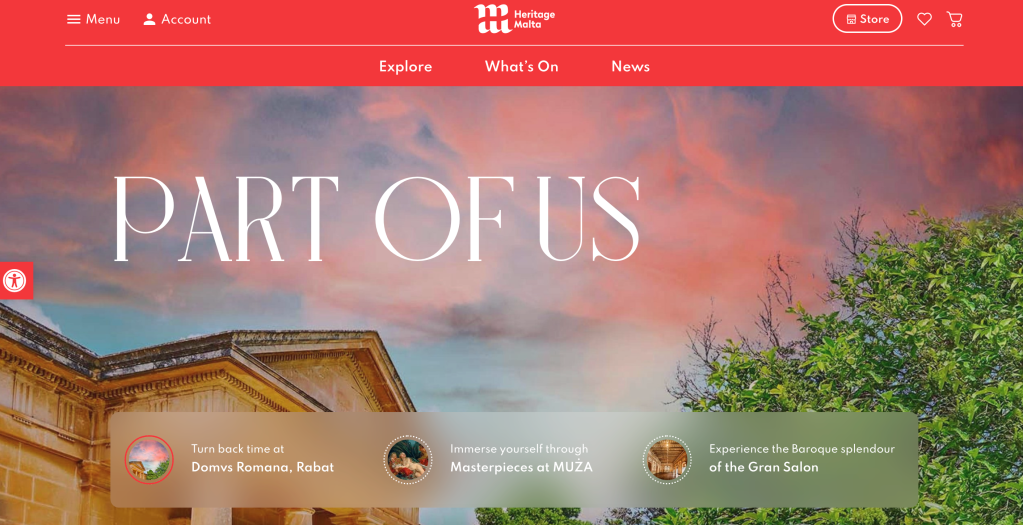
Website application of logo across both institutions
When seen in situ again very similar approach?
6 things designers should know about copywright – Design Week
You as a designer decide who gets to copy the work, and under the conditions which you set. The design you create is yours.
Designs are protected but not the style for example the colour. For example above Tesco can use the colour ways Lidl have but not the physical design of the logo ‘Lidl’.
The copyright doesn’t automatically go over to the client when handing work over unless this is agreed in writing. I have had experience here where I have not got this in writing and my work has been used in different ways across different platforms outside of the intended scope / use of the work. Permission is needed for this to take place. There needs to be permission granted to adjust work.
With copyright, as many can play a part for example type designers, illustrators (on larger projects) you should bill to the client the copyright if you’re considering given them copyright to parts.
Weekly Reflections
This week really has opened my eyes up to how I currently run my design practice and how certain things may need to be put in place to protect the work I’m creating. I think partly this comes from the relationship with my clients. (however I should still be cautious) I don’t currently have an up to date contract which sits between me and clients (new work) which states about copyright around work and how it’s used.
I do however make sure that when using clients brand guidelines and creating work under their guidelines all checks are made around publishing work online.
I’m going to look over my current practice and see how I can implement a more rigorous approach here to protect the work I create. As part of looking at the change of my practice this is going to need to be in place.
One question which has come to mind this week is how the rise of social media, and us being present online and becoming more digitally alliterate how designs , creation of assets may become easier to copy and quicker. Especially on these quick fire creation platforms such as Fiverr and Upwork…
