
Design Development
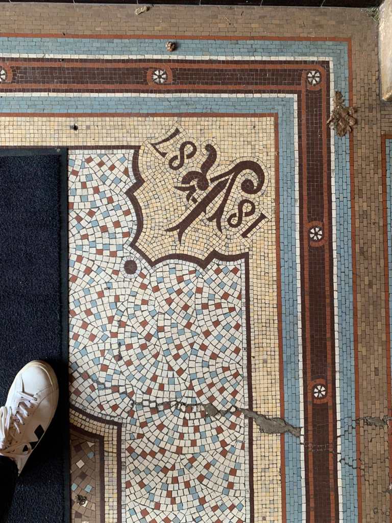
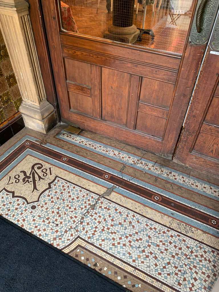
What is linking these places? – The Location – They all sit within the location of Trowbridge. Where I used to live and walk past these places most days.
Tutorial with Dan continued:
From the conversations we had around typography I have reviewed my work so far and many of the elements explored so far have been within a typographic sense or elements which could be worked towards this. I have found it interesting that the narratives and objects I’ve been working on could work together to become a typeface which is supported by narrative?
A short book which has a series of informed typefaces (these informed by the environments and experiences of those who have been to these spaces) Could these letterforms be constructed from observations? Could they be directing informed by the materials the buildings have been made from? Could the stories and narratives help inform their construction?
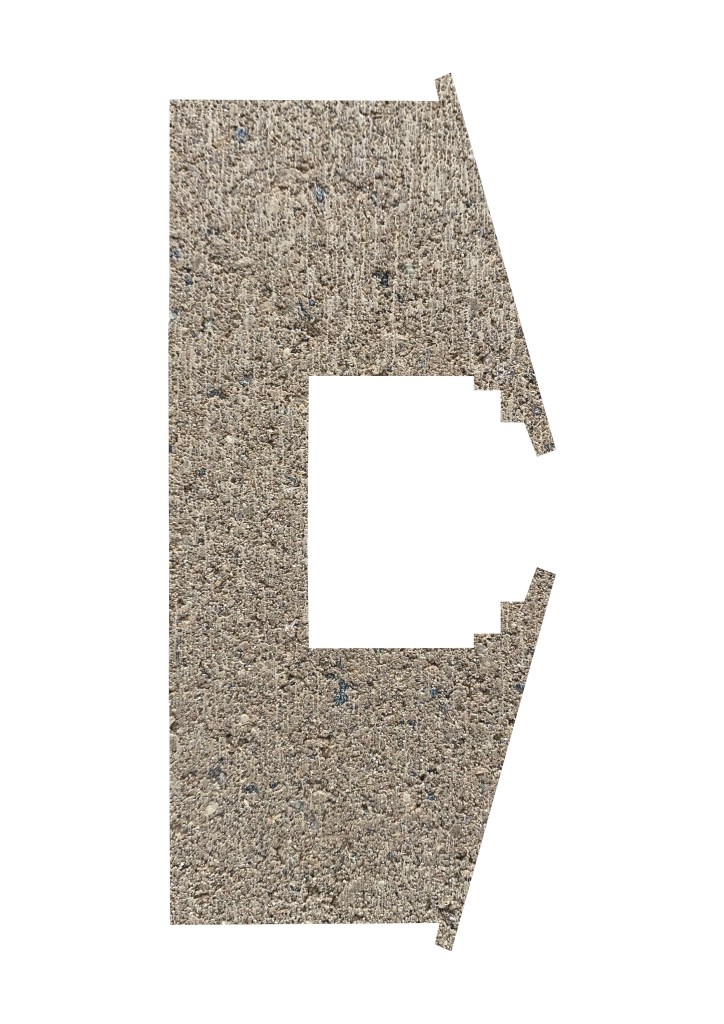
Town Hall further photos captured on entrance (reference of initial type tests and extraction)

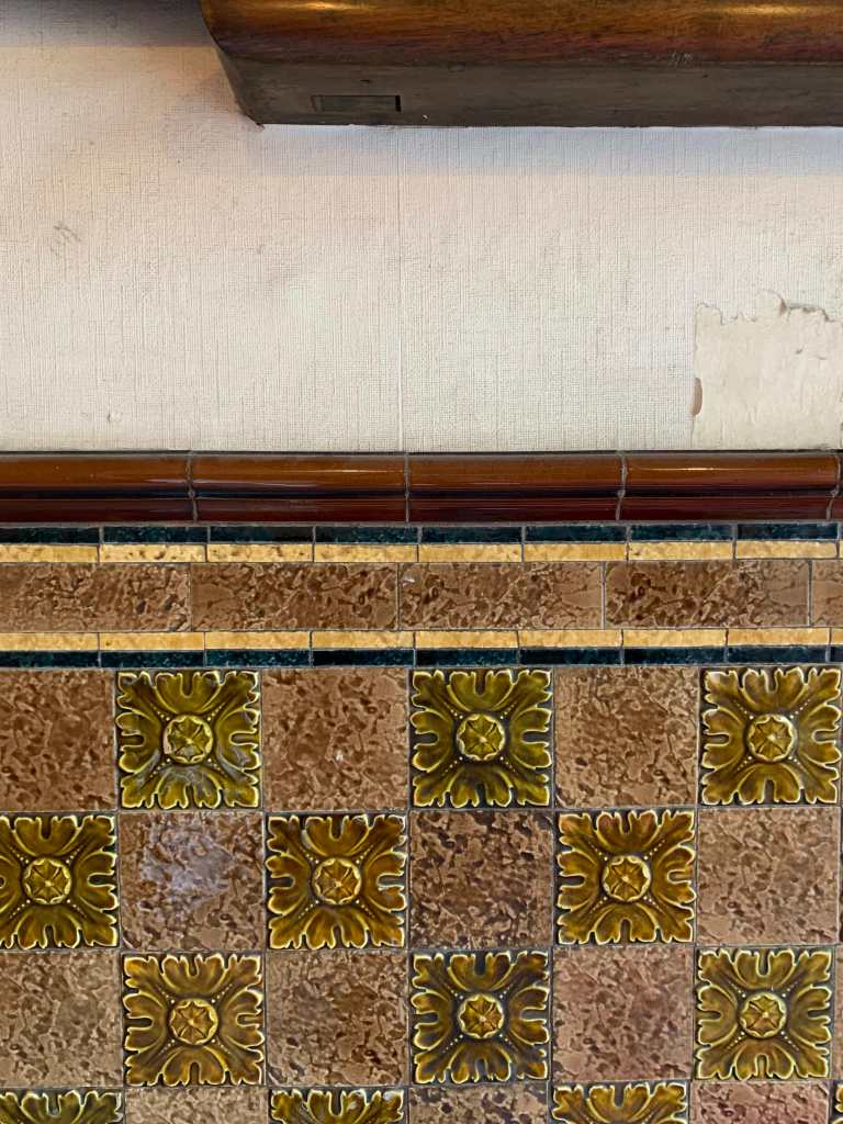
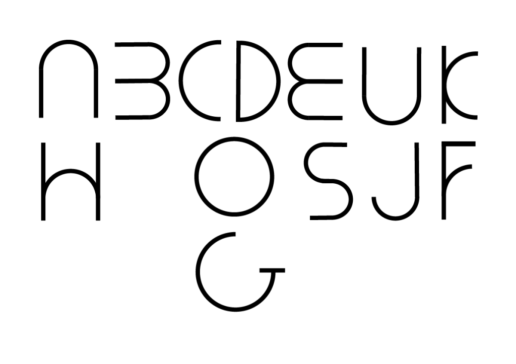
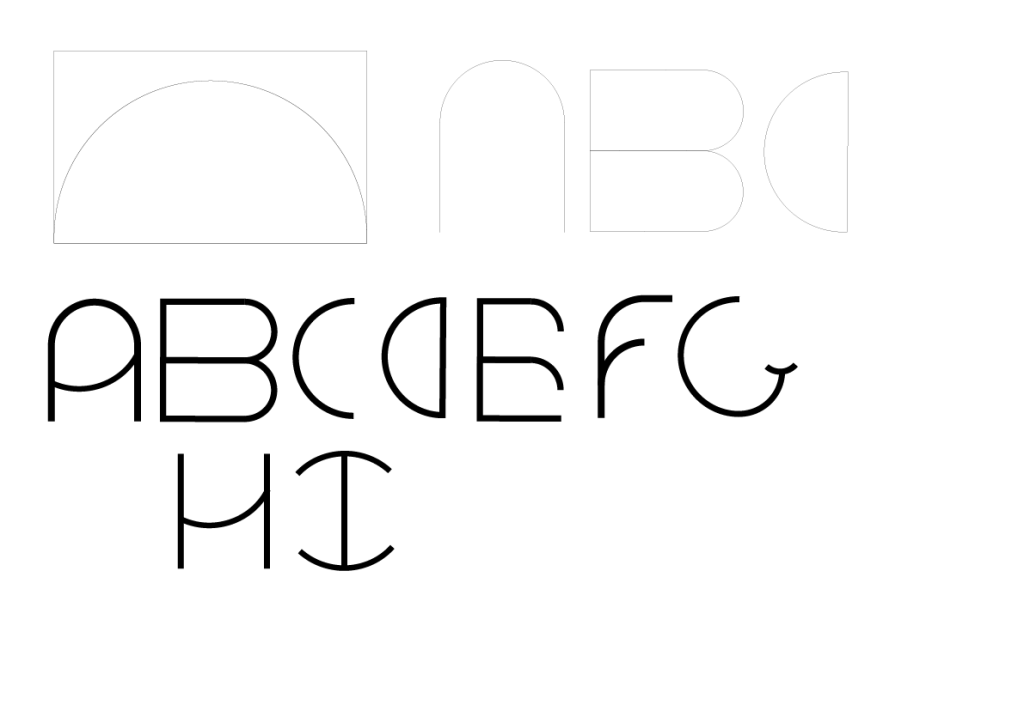
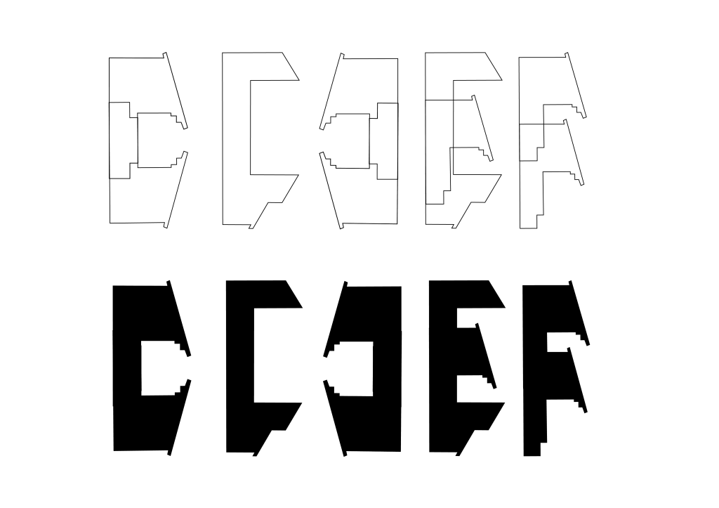
Extracting forms from Town Hall (place 1.)
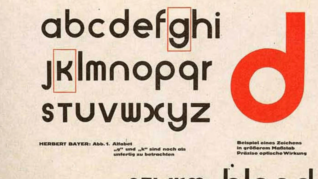
Considering key shapes which can be used to create a typeface? In reference to how Herbert Bayer created the Universal Typeface using just a bar and circle. Can it be this simple or do other parts need to be used to tell the story / show the identity of the place?
This won’t stand alone the typeface will be accompanied by narrative and materials to support the construction of narrative. These materials will be textures, findings and recordings.
Could this typeface allow users create their own story?
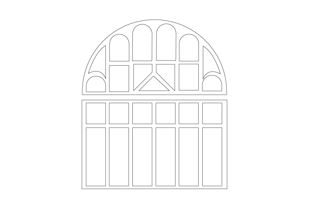
Next steps – Look at the main facade of the building as its grid form could support the development of a typeface? Trace out and extract form from a prominent area.

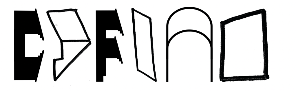
Exploring Type extracted from building form
On first impressions is this too modern? Does it give a different identity to the building than it should? Is it too structured…. With the building being central to the town and a history and future of movement (music, dance) is this so formal? Or is it the case it needs to sit with other materials / words to work in harmony.
The initial forms I think are organic and reference elements of the building but maybe to smooth? Should they be more ‘constructed’? Parts which make up letters.
I think I can be bolder here? Is there
Questions to ask:
1. Am I being too safe with my approach when extracting elements?
2. Are the current letterforms too formal? Should I explore forms made up of pieces?
3. How can I move forward from where I am currently

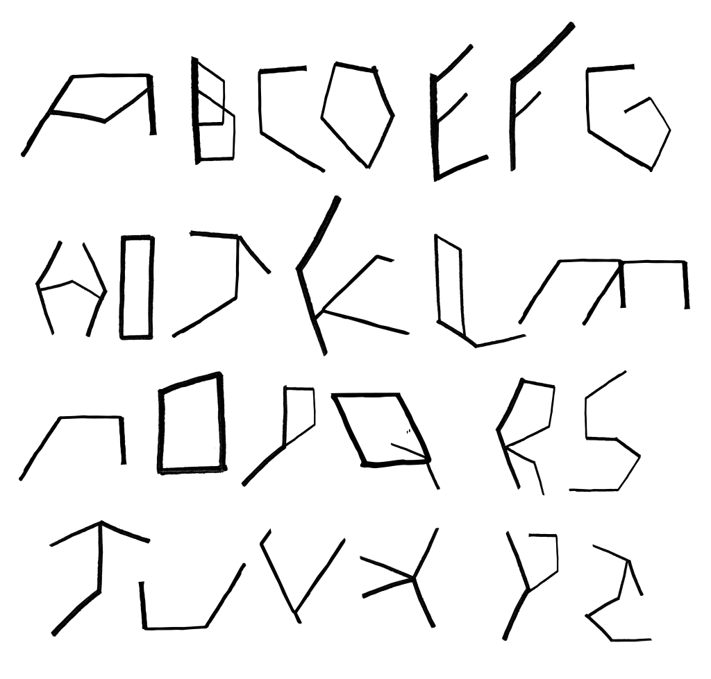
Civic Centre Observations and Extractions.
Using the building as a grid format to extract forms digitally. Can this be used as the basis to the observed forms? I want to explore adding the drawn forms onto this grid.
Can letterforms be created from these observations?
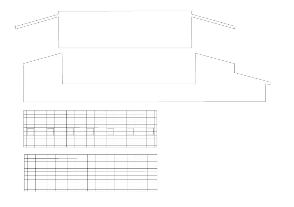
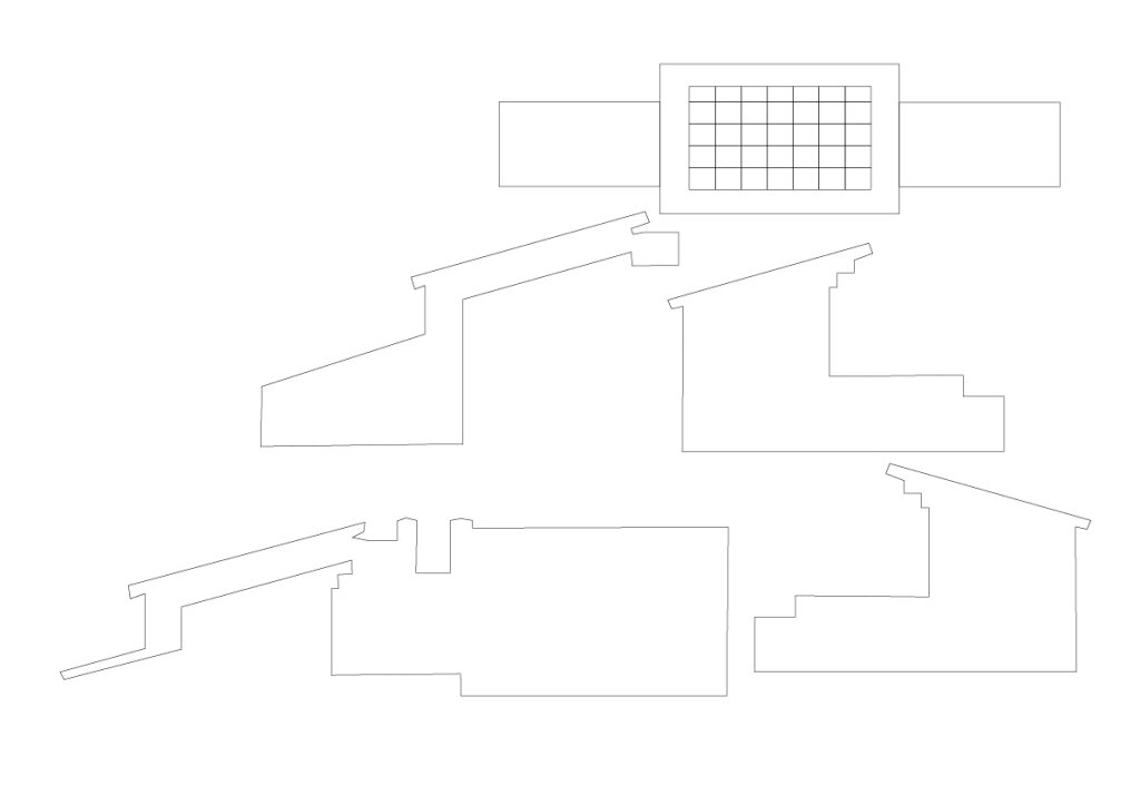
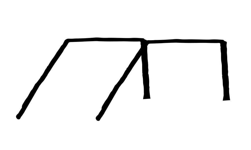
Forms onto grid. Forms from The Town Hall and Civic Centre (digital Extractions)


Structure to type sketches – observations from digital. How can the different places when observed and presented give share the narrative.
To do:
1. Start to play with found forms and objects to create letterforms
2. Be informed by the materials and structures of the places I’ve chosen (does this inform the type of design)
3. Draw upon the immediate narratives being constructed from observation
4. Take materials and textures from sites to – to inform application
5. Place raw letterforms onto structured grids which have come from observations. These need to come from painted observations and keep their raw from (maybe mixed with a digital response?)
6. Capture narrative stories (my personal experience)
Reflection so far:
What’s working well:
So far exploration and design has been going well all abit slow at times. The project has evolved gradually with a clearer outcome now in sight. I think with work commitments take president this has had an impact on development. The design work has started to develop however with experiments happening across typography. Typography has been evident in the project from the beginning but I think I kept pushing away from it. Forms and shapes have been observed alongside movements and these are now playing a part in developing a typeface potentially? Or word marks. These still to be accompanied by narrative and other materials.
One of my goals over the next few weeks is to really develop the design development to start to see ideas come to life more. I need to make a few visits to locations to gather some further resources but I also need to be confident to play (peer feedback talked of allowing myself to play with the raw forms and not loose these to digital)
Tove said to keep the raw sketches forms present and work with them how they are. Manipulate and edit in raw form rather than digital? Could there be an opportunity here to mix both?
Research has been heavily present throughout the project and helped inform decisions and make choices of moving forward. I want to continue to do some further research into typography and designers working with more organic / found materials to communicate. This to support the development of the type work I’m working on. Another area I needs to define fully is the audience? How and where will this piece be visible? Will it be public in person or online? Will it be a series? Will it be part of wider exhibition?
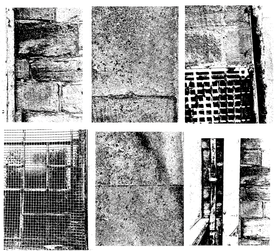
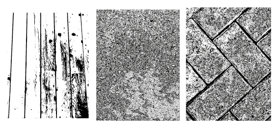
Texture extracted from places. (exterior)
Can the textures add to the narrative. My idea next is to construct pages which look into all the areas I’ve been exploring to start building a collection. This also supporting development of a typeface
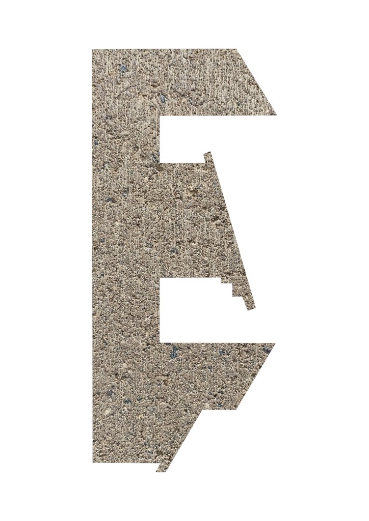
Location texture applied to letterforms created from place structure
Observations from Civic Centre placed upon grid extracted from exterior experience. Can forms start to be created from this? What if these are the core letterforms which need to be connected and intertwined to make words?
Does it need to be legible straight away?
Observations from Civic Centre placed upon grid extracted from exterior experience. Can forms start to be created from this? What if these are the core letterforms which need to be connected and intertwined to make words?
Does it need to be legible straight away? Or can these be abstract letters which can be put together by the viewer or even added to.

What’s working well here? I think from above it’s working better with more raw forms? Instead of going straight into a digital space? These feel more connected to the places? What happens now if I include the textures from the places with words? Does this start to build a narrative which can be explored by the viewer.
Tutorial with Dan 16th March 2023
Main points from our conversation:
Is there a method I am using when creating these materials? For example looking at the places and extracting the shapes. Define what this method is and document it. Make it clear of this method so you can apply it and set rules in the design process.
Typology – Is the items I’m collecting typology? A set of items. Look up and explore typology and how this refers to the collection of items I’ve been doing.
Look up – Michael Wolf (hong Kong typology)
Could my items become a set of typologies? not a typeface? There is many components being documented here.
Typology – a system used for putting things into groups according to how they are similar
Outcome? Is this a series of books… smaller pamphlets or zines which come together. Could it be a small box of items which contains the design elements as well as the written narratives.
Peer to Peer – 16th March 2023
Tove spoke about keeping the forms raw and making exploring the digital creations within a more raw format… Make them less organised and more rough, to play into the feeling of the building.
Can the letterforms and textures be combined? Not to worry about the legibility of the forms, can they be abstract to represent the feeling of the place, does this play a part in the narrative.
Takeaways:
How can the forms I’m already be created start to be grouped and created into a ‘set’.
Think about how new forms can be more raw, avoid going straight to the digital space (let this come later)
Explore texture and material to support the design.
Design Developments w/c 12th April
Fluxus Project
Coming from a point of design and the object. This explores how a number of items can be presented and put together for someone to hold. It hasn’t got a fixed narrative or structure. It includes multiple mediums in different formats. It also feels very personal and that you can draw what you want from it.
I can see my narrative, marks and letterforms fitting into a similar format. Tactile and able to be held.
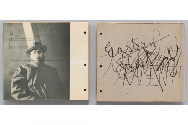

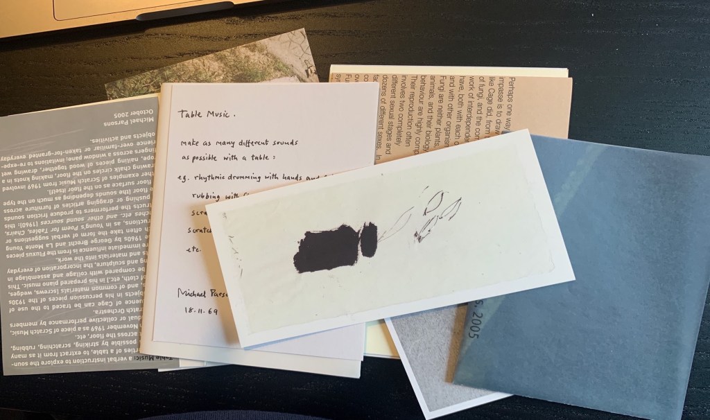
Playing, John Cage.
A design of multiple elements using multiple paper forms. Text, imagery boxed together to give an experience for the user. It’s a collection of objects which are accompanied by texts narrating elements of the project. I’m looking at this due to the nature of its construction. In my project I want my outcome to be tactile and hands on, the viewer to be able to hold it and experience it. The capturing of my materials and ethnographic research deserves a hands on outcome not solely digital. I feel this may take away from the experience.

Christine Graber-Rosenberger Cover Design
Letterforms, cut, collated and presented in a way which leaves the user able to move it around? Create their own view. This is a cover design however Its deconstructed nature has drawn me in. They aren’t full letterforms and they’re accompanied by other forms. A collection of forms found? A narrative which has many routes and outcomes?
Did the designer collect these forms and consciously cut them up? What if we saw all the forms full? Would this change the feeling of this piece?

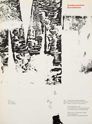
Hans Ferdinand Egli Cover Design
The use of raw materials (in this instance ink) to realise ideas. There is something raw and tactile about this which leads to thinking about where it comes from? Has it been used? is it old? Is the material taken from the location? The element of illegibility captures you aswell. Does this play into the narrative?
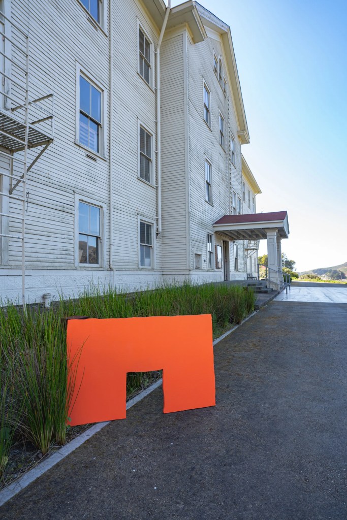
Headlands Centre for the Arts Branding
“Inspired by the landscape of the Headlands campus” Using existing areas within a location to create and communicate. This project by Inventory Form and Content Studio looks at the landscape around the location of the Headlands Campus to create the new forms. These simple, raw forms make up the new identity for the arts centre. It’s not been refined to a degree where it’s clean cut, its got an aspect of hand drawn to it.
These forms for me relate to what I’m currently exploring within my project. They’ve been observed within the location and documented (landscape and buildings). They’re directly taken from the location which attaches them to that areas instantly. I also feel that due to their presentation they’re more accessible to all. Do the forms represent the type of work which happens at the centre? Can we draw narratives from the shapes which are presented? Is there a way we can merge and combine shapes to create new narratives for future ideas for the centre?
Form this work I want to explore how the raw forms I’ve been exploring can be used in that state rather than digitally changing them to much? Does keeping them in their raw form become connected to the places more? OR can there be a space for both raw and digital?

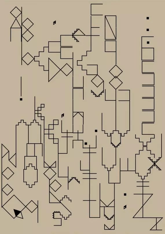
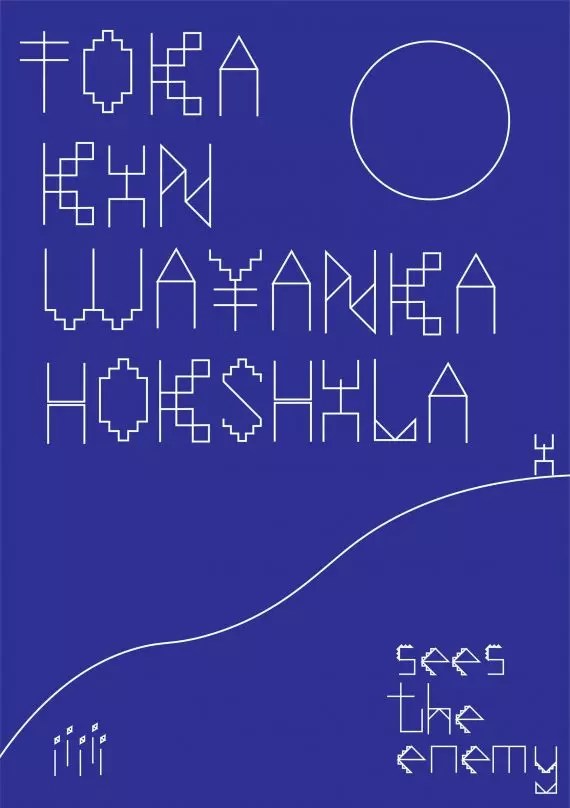
Lakota Letterforms, Bobby Joe Smith III
The letterforms stood out for their structured and story led presentation. The Font which comes from forms commonly found in traditional Lakota quill and beadwork.Their construction is pieced together to construct a font which represents the tools used within Lakota communication. They’re not only used for the font but also they’ve been pieced together to create more abstract and narrative led pieces. It’s geometric forms remind me of parts of buildings which have been formed together to construct the font (a whole font could potentially represent one area) and once stitched and collaborated together form narratives.
Could I look at a similar approach with the places I’m analysing? Is there elements which can be extracted and placed down to start building up a library? Is there other elements which will work alongside these fonts such as patterns, materials, textures and narrative?
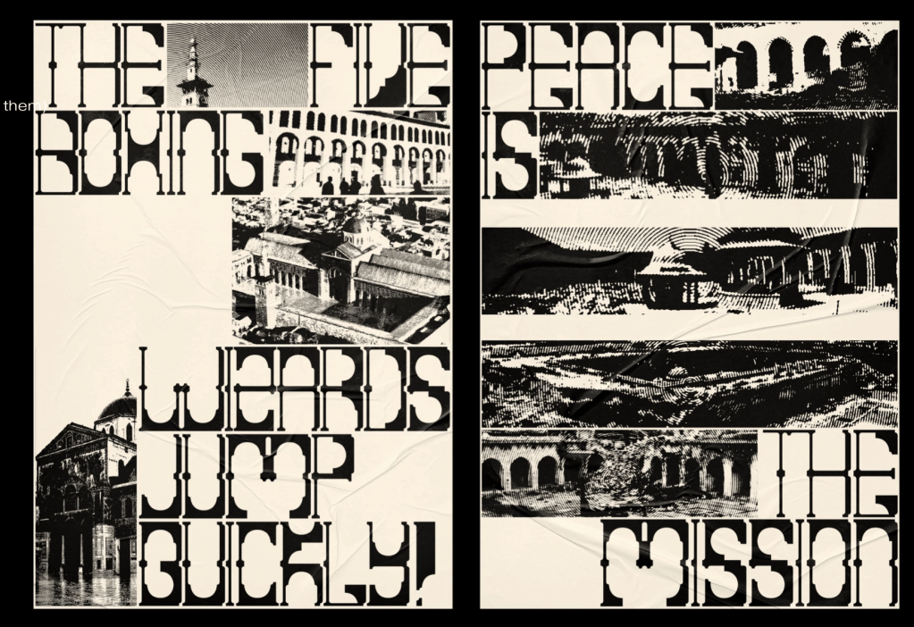
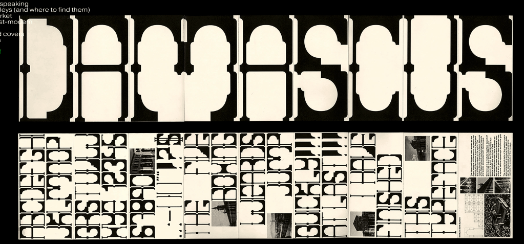
Damascus Typeface by Thaqif Nazri
A modular typeface based on the structures of the mosque itself. The main arched pillar has been used as framework to construct the typeface. It directly relates to the architecture but also creates a new story. It’s simplicity to take an existing element is what makes this stand out, something new (which isn’t related to the building) has been created. This also allows for play to happen and how it’s communicated as shown below.
Influenced by the direct take from the building and how its form work so well together. What would be interesting here is if textures, materials from the mosque were used in the display of the typeface. Would that add further narrative and play? Or would that distract and takeaway from the typeface?
If we look at the work of Bobby Joe Smith III above you can see the relation in how they have presented their work. However Bobby Joe Smith has come from forms used (not direct references to an area as such) but still the construction and piecing together creates a story. If stand alone (presented as alphabet) it may not present a narrative and connection?
Herbert Bayer
Ongoing / documented research journal
Weekly Reflection
